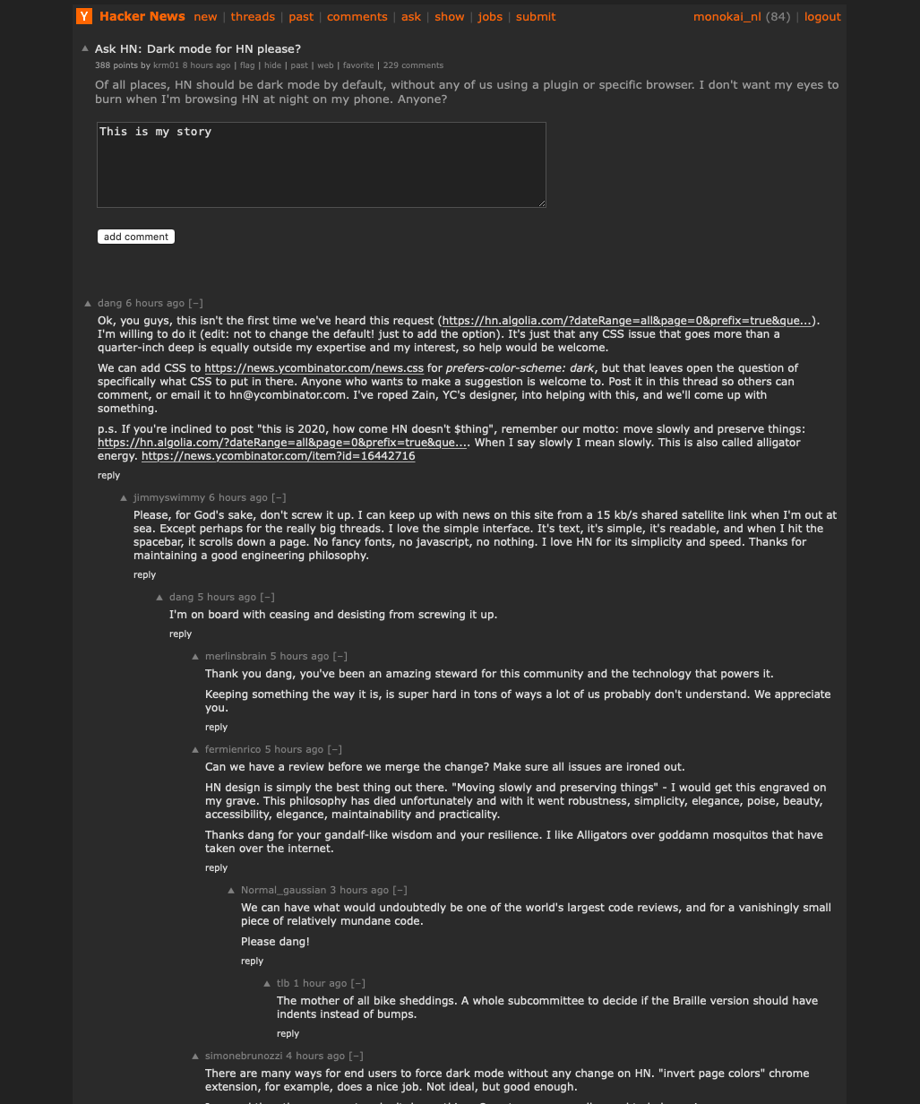
Ok, you guys, this isn't the first time we've heard this request ( https://hn.algolia.com/?dateRange=all&page=0&prefix=true&que... ). I'm willing to do it (edit: not to change the default! just to add the option). It's just that any CSS issue that goes more than a quarter-inch deep is outside both my expertise and my interest. We can add CSS to https://news.ycombinator.com/news.css for prefers-color-scheme: dark , bu…
Please, for God's sake, don't screw it up. I can keep up with news on this site from a 15 kb/s shared satellite link when I'm out at sea. Except perhaps for the really big threads. I love the simple interface. It's text, it's simple, it's readable, and when I hit the spacebar, it scrolls down a page. No fancy fonts, no javascript, no nothing. I love HN for its simplicity and speed. Thanks for maintaining a good engin…
Ask HN: Dark mode for HN please?
291–300 of 469 posts
Re: Ask HN: Dark mode for HN please?
#292I also have noticed that I never use the site specific Dark mode implementations as it is a lot more convenient to globally enable dark mode (at night) rather than playing around with toggles for every website that supports it.
Re: Ask HN: Dark mode for HN please?
#293Ok, you guys, this isn't the first time we've heard this request ( https://hn.algolia.com/?dateRange=all&page=0&prefix=true&que... ). I'm willing to do it (edit: not to change the default! just to add the option). It's just that any CSS issue that goes more than a quarter-inch deep is outside both my expertise and my interest. We can add CSS to https://news.ycombinator.com/news.css for prefers-color-scheme: dark , bu…
@media (prefers-color-scheme:dark){body{filter:invert(1) hue-rotate(180deg)}} One-liner inverts the brightness and preserves the orange.
@media (prefers-color-scheme: dark) {
body {
background: #222222;
filter:invert(1) hue-rotate(180deg) brightness(0.9)
}
}
Edit, also works on hn.algolia.comRe: Ask HN: Dark mode for HN please?
#294Re: Ask HN: Dark mode for HN please?
#295Earlier quoted context omitted.
Screenshot: https://imgur.com/a/mxaNky4 Whipped this up real quick... keeps the spirit of HN I think, and is pretty minimal. Not my best CSS but tables/current CSS make some selectors a little tricky and after all, it's less than 1kb added, no markup or stack changes needed, and this is 'Hacker News' right? :D @media (prefers-color-scheme: dark) { body { background-color: #1F2430; } #hnmain { background-color: #23283…
Love this. One addition, consider reducing the brightness on text so it doesn't glare as much.
[1]: https://www.theregister.co.uk/2019/07/10/firefox_68_arrives_...
Re: Ask HN: Dark mode for HN please?
#296Maybe spruce up the whole site too.
pg told me that he wanted HN to look like the output of `top`. The older it gets, the more we approach that goal. I've never seen a proposed redesign that didn't either add too much whitespace or too little (well, always the former), which makes me think that the current design is in the ballpark of optimal, despite its being unfashionable. Also, HN is very much a text site and that goes deeper than look-and-feel. Th…
Re: Ask HN: Dark mode for HN please?
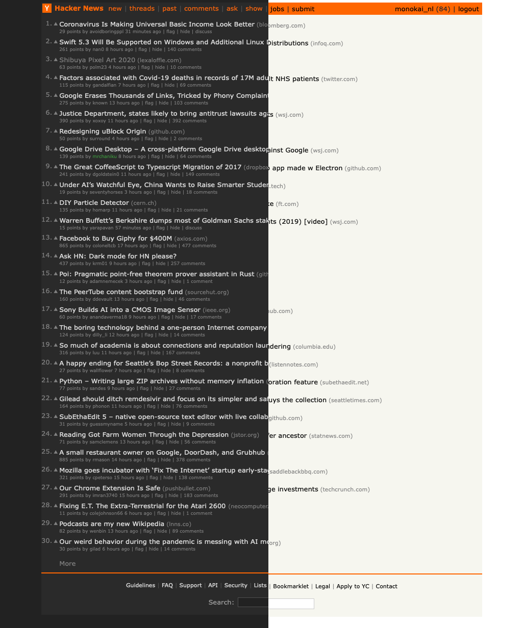
#297https://monokai.nl/lab/hacker-news/hn-dark1.png
https://monokai.nl/lab/hacker-news/hn-dark2.png
https://monokai.nl/lab/hacker-news/hn-dark3.png
The principles I followed:
- Alligator energy. No need to redo the layout or apply the latest design trends. HN is fine as is.
- Respect the original design. The dark version uses the same color hierarchy as the elements in the original design.
- No-nonsense. All colors are pure grayscale.
- Simple. Only minimally adjusted the CSS ( https://monokai.nl/lab/hacker-news/news.css ). This can be easily implemented in the current CSS using some media queries. I only added one thing in the HTML which is a span around the karma points at the top.
- Keep the orange. This was a puzzle. I think the original bar is too jarring on a dark background. But, HN is not HN without a touch of orange. I decided to style the top links only. This keeps the soul of HN.
- Readability. You should be comfortable reading this dark mode in low light. Too much contrast doesn't read nicely, but the original HN text has a lot of contrast with its #000 on an off-white background. My dark background is off-black and the text is turned down a notch from pure white. If you need less contrast, you can turn down the brightness of your display.
- The upvote triangles are unicode now inserted via CSS. Saves a request and doesn't render pixelated on Retina.
- Best thing. All comments are placed on a big slab of #2a2a2a. That's triple the answer to you know what.
Re: Ask HN: Dark mode for HN please?
#298Earlier quoted context omitted.
Screenshot: https://imgur.com/a/mxaNky4 Whipped this up real quick... keeps the spirit of HN I think, and is pretty minimal. Not my best CSS but tables/current CSS make some selectors a little tricky and after all, it's less than 1kb added, no markup or stack changes needed, and this is 'Hacker News' right? :D @media (prefers-color-scheme: dark) { body { background-color: #1F2430; } #hnmain { background-color: #23283…
For those who want something more traditional I've modified to have a slight orange tint on the title bar, and higher contrast for text. Seems to be better for a11y too. Screenshot: https://imgur.com/a/XW1OCYb @media (prefers-color-scheme: dark) { body { background-color: #232834; } #hnmain { background-color: #1F2430; } a:link.storylink, #hnmain > tbody > tr:first-child > td a, .commtext, .commtext a:link, td { colo…
I've added this code to fix the reply textarea colour:
.fatitem textarea { background-color: #232834; color: #fafafa; }
Re: Ask HN: Dark mode for HN please?
#299Earlier quoted context omitted.
Please, for God's sake, don't screw it up. I can keep up with news on this site from a 15 kb/s shared satellite link when I'm out at sea. Except perhaps for the really big threads. I love the simple interface. It's text, it's simple, it's readable, and when I hit the spacebar, it scrolls down a page. No fancy fonts, no javascript, no nothing. I love HN for its simplicity and speed. Thanks for maintaining a good engin…
I'm on board with ceasing and desisting from screwing it up.
Re: Ask HN: Dark mode for HN please?
#300Earlier quoted context omitted.
Can we have a review before we merge the change? Make sure all issues are ironed out. HN design is simply the best thing out there. "Moving slowly and preserving things" - I would get this engraved on my grave. This philosophy has died unfortunately and with it went robustness, simplicity, elegance, poise, beauty, accessibility, elegance, maintainability and practicality. Thanks dang for your gandalf-like wisdom and…
We can have what would undoubtedly be one of the world's largest code reviews, and for a vanishingly small piece of relatively mundane code. Please dang!