Unofficial Apple Archive
applearchive.org
Unofficial Apple Archive
1–10 of 155 posts
Re: Unofficial Apple Archive
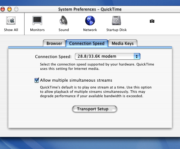
#2Apple's design of 10-15 years ago looks excellent even today. Truly - good design does not lose its attractiveness as styles and standards change. Most icons, fonts, panels, colors of most of their old software and promotional materials look very pleasant, even in low resolution.
Re: Unofficial Apple Archive
#3Apple's design of 10-15 years ago looks excellent even today. Truly - good design does not lose its attractiveness as styles and standards change. Most icons, fonts, panels, colors of most of their old software and promotional materials look very pleasant, even in low resolution.
It comes down to your taste, I thought aqua and the lickable interface was ugly then, and now.
Re: Unofficial Apple Archive
#4The amount of content here is incredible. Did Apple create this, or fans?
Re: Unofficial Apple Archive
#5The amount of content here is incredible. Did Apple create this, or fans?
It says it is unofficial. Must have taken a ton of effort to get this stuff together. Very cool!
Re: Unofficial Apple Archive
#6Thank you very much for this.
Re: Unofficial Apple Archive
#7The amount of content here is incredible. Did Apple create this, or fans?
It's unofficial, there was a discussion on Reddit yesterday with people asking if the author would provide access the content to archive it in case Apple DMCAs it, to which he gave some childish strop in response about how he deserves the in(fame)y. You'll find it on /r/DataHoarders if you care to look.
Re: Unofficial Apple Archive
#8My own little moment of fame: WWDC June 8, 2009, Keynote, 21 minutes and 22 seconds in: Bertrand Serlet says (about improvements to Preview): "We have added lots of little touches. The one I like...we have added a little bit of AI to actually infer the selection"
My colleague and I (we co-developed the "little bit of AI") never saw this comment (and the applause) live: we were still lining up outside of Moscone West. As Apple employees we weren't allowed in until all the guests and paying attendees had entered. Still, we watched the video afterwards and got a huge kick out of the mention.
BTW, the AI we added did not use neural nets or deep learning.
Re: Unofficial Apple Archive
#9Check out the employee holiday bonus from 1983:
https://www.applearchive.org/1983-feed/apple-holiday-bonus
Re: Unofficial Apple Archive
#10Apple's design of 10-15 years ago looks excellent even today. Truly - good design does not lose its attractiveness as styles and standards change. Most icons, fonts, panels, colors of most of their old software and promotional materials look very pleasant, even in low resolution.
the original osx pinstripe look is pretty hideous, and the faux glossy emboss look hasn't aged well either
https://images.techhive.com/images/article/2016/01/mac-os-x-...