Don't forget to also read from the same author "Neumorphism will NOT be a huge trend in 2020" https://uxdesign.cc/neumorphism-will-not-be-a-huge-trend-in-...
Neumorphism in User Interfaces
11–20 of 65 posts
Re: Neumorphism in User Interfaces
#12A few years down the line we'll see people experimenting with bringing in more textures and decorative details and then, hey, here we are back in the world of faux leather-bound planners and music players made out of jeans and whatnot. And I, for one, will be delighted, because I've been tired of everything having to be flat shapes on bright white backgrounds for at least half the past decade.
The problem with all these crazy textures, drop shadows, and chunky buttons, is that they get tacky very quickly. While plain simple layouts are timeless.
Nothing in nature is that flat or that simple. Millions of years of evolution have made our eyes adapted to look at things with texture. The idea of creating interfaces that only convey information that is needed does not mesh with human nature.
A good analogy for this is exercise. You would think that the more you use a machine the more wear and tear it will gain. Counter intuitively our bodies are designed to be used and are actually more healthy the more you use it.
Same with the world our eyes interact with. You would think our user interfaces should be minimal but our eyes are designed to work with noise. Flat interfaces don't really exist in nature and they should not exist in UI.
I propose a new design movement. Like the Paleo diet, I call it Paleo design.
Re: Neumorphism in User Interfaces
#13A few years down the line we'll see people experimenting with bringing in more textures and decorative details and then, hey, here we are back in the world of faux leather-bound planners and music players made out of jeans and whatnot. And I, for one, will be delighted, because I've been tired of everything having to be flat shapes on bright white backgrounds for at least half the past decade.
The problem with all these crazy textures, drop shadows, and chunky buttons, is that they get tacky very quickly. While plain simple layouts are timeless.
People are going to misuse any design guideline -- that doesn't say anything about the guidelines themselves. Plain, simple layouts lend themselves to abuse just like textures, shadows and chunky buttons. The results are equally silly -- your average super-flat, plain, simple layout with flat, simple icons is as annoying to interact with as the tackiest Winamp skin you can remember.
Skeumomorphism has become this mythical beast that supposedly meant every interface was hard to use, cluttered and unintuitive. But we actually had a lot of very good, very useful interfaces back when it was a thing. In fact most programs written after GUIs became common enough had pretty good interfaces. Outrageous skins and things like Kai Power Tools were exceptions, not the norm.
Re: Neumorphism in User Interfaces
#14What about the older design flavors? Isomorphism use to be popular but was replaced by epimorphism and a flavor of monomorphism. Bimorphism was sort of a niche trend along with homomorphism and endomorphism. If you didn't notice all these words are borrowed from concepts that already exist in math that are over 3 decades old.
Maybe I should just stop making up garbage vocabulary for my design ideas. Morphism is a well defined word in both math and computer science so if you want to give a name to a new design follow your old trend of calling something flat design or skeu design or neudesign rather then borrowing a word from a field that has way more legitimacy then a design idea concocted up by some designer last month.
Re: Neumorphism in User Interfaces
#15This article uses the spellings "neuomorphic" and "Neuomorphism" in places, which just highlights the fact that dropping the "o" was a mistake and obscures the origins of the word.
Re: Neumorphism in User Interfaces
#16A few years down the line we'll see people experimenting with bringing in more textures and decorative details and then, hey, here we are back in the world of faux leather-bound planners and music players made out of jeans and whatnot. And I, for one, will be delighted, because I've been tired of everything having to be flat shapes on bright white backgrounds for at least half the past decade.
The problem with all these crazy textures, drop shadows, and chunky buttons, is that they get tacky very quickly. While plain simple layouts are timeless.
I'm not convinced a design principle based off of a vacuum moulded plastic aesthetic is going to age well either.
Re: Neumorphism in User Interfaces
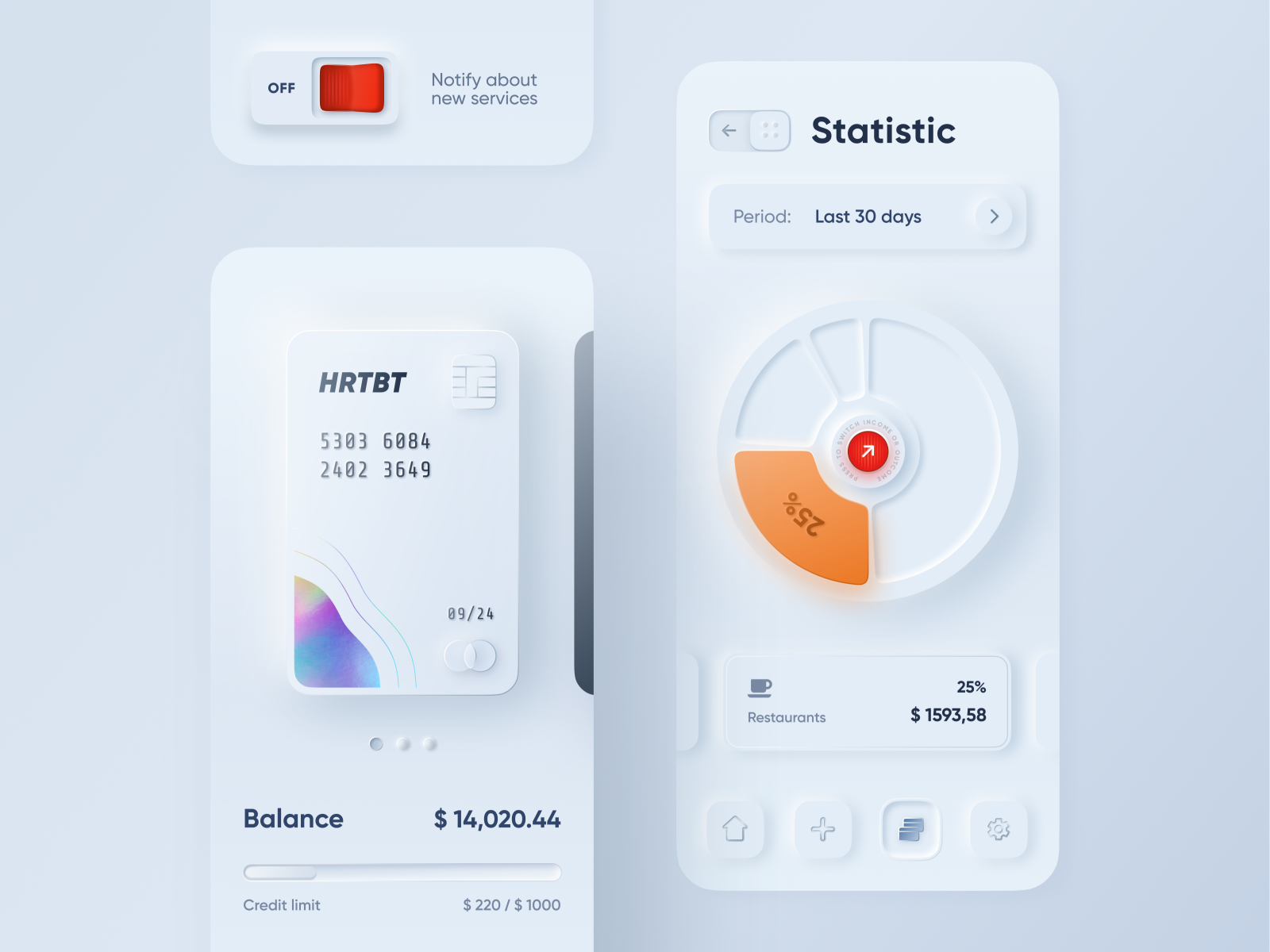
#17> This shot by Dribbble user alexplyuto gained over 3000 likes and pushed the trend forward. [1]
That mockup is aesthetically pleasing, but from a usability perspective it's terrible: every UI element looks like a button. The progress bar (?) looks like a slider. How do users know which elements they're supposed to interact with? Why do we make the same mistakes over and over?
[1] https://miro.medium.com/max/3200/1*gza8htfpZ-5eDabA7_kTJw.pn...
Re: Neumorphism in User Interfaces
#18FWIW there is already some push back on this trend in design circles. I just want buttons and form elements to look like you can interact with them again.
Why the push back? I'm not a designer but these look just as interactable as anything from Material Design
In the dribbble screenshot highlighted in the article, everything looks interactive. The UI looks like it's composed entirely of buttons, sliders, and spin wheels.
If a design goal is to make interactive elements seem interactive, and make non-interactive elements seem non-interactive, this has failed. It's bizarro Material Design.
Re: Neumorphism in User Interfaces
#19> This shot by Dribbble user alexplyuto gained over 3000 likes and pushed the trend forward. [1] That mockup is aesthetically pleasing, but from a usability perspective it's terrible: every UI element looks like a button. The progress bar (?) looks like a slider. How do users know which elements they're supposed to interact with? Why do we make the same mistakes over and over? [1] https://miro.medium.com/max/3200/1*g…
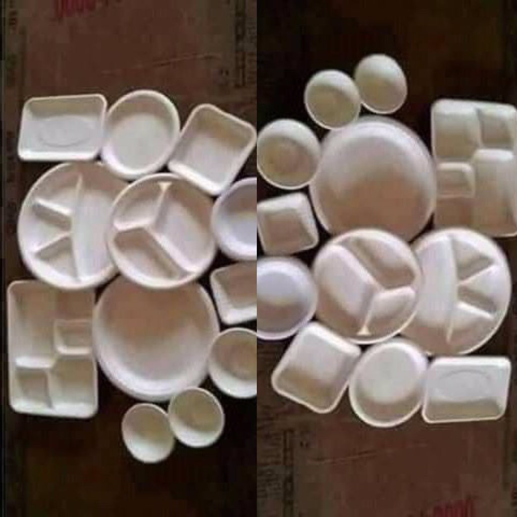
This picture immediately reminded me of this optical illusion:
Re: Neumorphism in User Interfaces
#20FWIW there is already some push back on this trend in design circles. I just want buttons and form elements to look like you can interact with them again.
My personal pet-peeve is designers removing hyperlink underlines from everything. You can never tell what is a link and what it just plain text, sometimes hovering over it doesn't even activate any response. Links have underlines for a reason dammit. Even right now above this edit text box, all the links at the top of hacker news (" psweber 8 minutes ago | parent | on: Neumorphism in User Interfaces ") have their und…
There’s a relatively hidden option to re-enable this on iOS, at least; the “Button Appearance” Accessibility setting.