Live data from Hacker News

Windows 95 UI Design

twitter.com

241–250 of 312 posts

Re: Windows 95 UI Design

#241

Earlier quoted context omitted.

Do not worry for the market is ready for this. Iphone started with fixed backgrounds, then later they demonstrated the oh so amazing feature of custom backgrounds. In some 80s computer chronicles episode you can find the ex-act-same-speech from a windows sales rep explaining how win 1.0 was limited, but now you can set up your own background pattern. iOS 15 will introduce ML generated computer vision trained custom t…

Yes, it's funny when some new app announces "now we have dark mode!" with much fanfare and commotion, when the ability to adjust the colours and appearance of individual UI elements across the whole OS was the norm back in Windows 3. https://guidebookgallery.org/pics/gui/settings/appearance/wi...
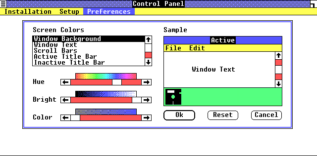
It was there in the first version, even.

https://guidebookgallery.org/pics/gui/settings/appearance/wi...
Re: Windows 95 UI Design

#242

Earlier quoted context omitted.

So exactly like right clicking on items to see if a contextual menu pops up in Windows 95?

It's easy to discover when there are only two buttons on your mouse. If it had one and pressing strongly did something else, you'd be right.

It's just as easy to press harder "force touch" as it is to right click.

Sorry, but the Windows 95 user interface had the exact same discoverability issue.

Re: Windows 95 UI Design

#244
post #57

Earlier quoted context omitted.

Sounds like you probably weren't using computers back in the Win 9x days. For us who remember it, Windows 95 is synonymous with BSOD.

I don't like to downvote comments, but this one is particularly bad. First of all, BSOD where not that common, and for sure they are not what all of "us" remember about Windows 95. Secondly, Amiga and Mac had their own version of the BSOD, there were just far less Amiga and Mac around. Third: Windows 95 bootstrapped the PC gaming era, having the GUI code in the Kernel (for performance reasons) and not having the WHQL…

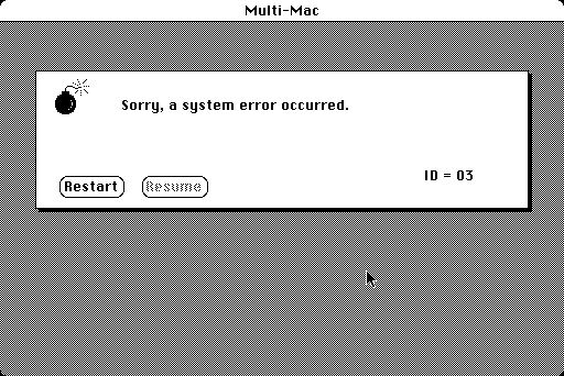
Agree with your comment, but a minor correction. The sad Mac was rare, only happened at boot, and was caused hardware problems (equivalent to a POST failure). The equivalent to a BSOD was the "Sorry, a system error has occurred" message:

https://www.versionmuseum.com/images/operating-systems/class...

Re: Windows 95 UI Design

#245
post #55

It looks a bit ugly but it is very functional and straight to the point. Needed just a little visual touch to account for modern monitors. Instead we have fucking light gray text on white background, window borders/title area that are indistinguishable from the rest accompanied by great hunting game of: find an interactive element on on a screen

It doesn't look ugly to me. It looks better than most modern interfaces.

Re: Windows 95 UI Design

#246

Earlier quoted context omitted.

Toolbars came with explanations that popped up if you hovered. They also were primarily shortcuts as everything could be reached using the menus anyway.

Ribbon has explanations that popup if you hover Ribbon contains everything that is available in the menus, and is collapsible. Ribbon also supports keyboard accelerators

They also swosh around.

They also aren't predictable.

Re: Windows 95 UI Design

#247

Earlier quoted context omitted.

Originally of course there was only one mouse button, and you would ctrl-click for the context menu

Two button mice were for sure the standard on non-Macintosh PCs well before Windows was in popular usage.

And 3 wasn't rare, I think.

Re: Windows 95 UI Design

#248

Earlier quoted context omitted.

Not sure about that. I personally found Windows 95 (or XP/Windows 7 in classic mode) looked great on flat screens - better than on CRTs actually.

This is actually true for Win 95 / classic Win UI. (However, you may want to reconsider the bevels, since the graphics tend to be a bit too heavy on a flat screen.) P.S.: Many (including them myself) consider Snow Leopard (OS X 10.6.x) as the epitome of a UI, which matched usability, conceptual space and visual design next to perfection considering the visual and stylistic preferences of the time. That said, I can al…

Not sure why a comment which agrees with an objection made to a previous argument is downvoted. (Not sufficiently stubborn?)

Re: Windows 95 UI Design

#250

Earlier quoted context omitted.

> Now my screen is the very picture of elegance and sophistication. Is it? Windows 10 looks like installing a custom skin on Windows XP went wrong and now you're stuck with "Windows Classic (Flat)" set up for weird colors.

Thank you. I feel like the world is taking crazy pills. Windows 7 was gorgeous. Windows 8 was a mess but at least the were trying to do something bold with consistency with their Windows Phone Look and Feel. Then Windows 10 shipped and I thought I got some pre alpha developer build accidentally, and it just... Never updated. I've heard iOS be criticized for being overly flat these days but I just got an iPad and foun…

Windows 3's design was a first shot.

Windows 95 was extremely polished and well done.

Windows XP was a response to PCs becoming mainstream and figuring what the everyman wanted was more flair and fashion.

Windows 7 was a response to desktop Linux (Compiz et al.) capturing people's imaginations.

Windows 8 was a response to iOS while trying to avoid Apple's skeuomorphism patents (fortunately).

Windows 10 was realizing that none of that really mattered, they already have all the users anyway, so they just need long-term UI stability now.

Post reply on HN