Live data from Hacker News

Windows 95 UI Design

twitter.com

181–190 of 312 posts

Re: Windows 95 UI Design

#181
post #29

Earlier quoted context omitted.

Serious question: if it was so much better, why is it gone now?

I started my professional programming career in the Windows 3.x days. Some things that come to mind: * The web solved the software distribution problem. There were some pretty good tools for building GUI apps in the 90s but the tools for getting software to the customer sucked . Complex installers, no autoupdates, "DLL hell" incompatibilities. * There never really were any great tools for building cross-platform GUIs…

Cross-platform is more of an excuse than a reason. The idea is always that you write an app once, and it magically works on Windows and Mac and phones, and toaster ovens.

Except that never actually works, for anything but the lowest common denominator trash apps. Unfortunately people are convinced that this is something that should be pursued; the only real result is lowering the bar across the board and eroding compliance with long-established platform UX guidelines.
Re: Windows 95 UI Design

#182

A generation was raised on usable designs which clearly communicated interactability with a consistent visual language. It is only natural that they would come to think of computers as inherently ordered, understandable devices. Machines had always been this way. It was obvious to this new generation that the affordances of youth were purely redundant. Clutter. Overhead. Junk! Widget by widget, pixel by pixel, bevels…

I've noticed this happening as well, but I guess every system is built on the affordances and cultural knowledge of the time it was built.

The original Macintosh (and Windows before 95) were built for people who were more or less familiar with computers already BUT who didn't know so much about the mouse, etc. (And even if the Mac might have been "easier to use" people wouldn't just jump into an expensive machine without knowing what they would be getting). Hence they would "handhold" more. Even the 1st iPhone was more user friendly (design wise) than the newer ones.

Now kids know how to swipe "intuitively" and design will seem less obvious (for people unaccustomed with it) with time.

Re: Windows 95 UI Design

#183
post #89

Earlier quoted context omitted.

My 3 year old rules any tablet. Can get to the movies and pictures quick. Will even make phone calls when they get hold of a phone. The right phone calls. It is an advance.

What if we put Win98 on a tablet with an application that had Caillou inside of it? Guarantee they'd be cruising the fuck out of Win98, as well. Environment is everything.

Somehow, we managed to fuck around with autoexec.bat to get Doom to run when we were kids...

Re: Windows 95 UI Design

#184
post #20

The Windows 95 UI was inspired by NextStep. See https://en.wikipedia.org/wiki/NeXTSTEP#/media/File:NeXTSTEP_... Before Windows 95 was released there was CTL3D.DLL which gave a NextStep-like look & feel to Windows 3.1. See this image for the improvement made by CTL3D.DLL: http://www.win3x.org/screens/15nvtbm.gif

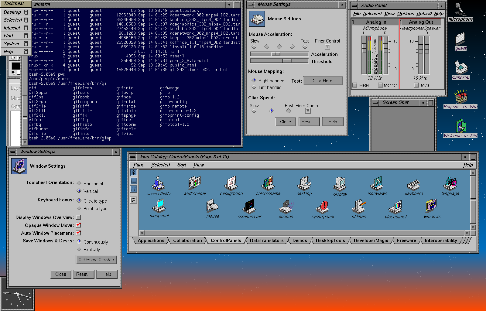
a) The NextStep UI you post seems nothing special compared to other Unix-es of the time (SGI IRIX, https://www.securitronlinux.com/wp-content/uploads/2017/04/1..., and Sun Solaris and IBM AIX come to mind). I believe that these precede the NextStep.

b) The Windows 95 UI looks nothing like NextStep (or SGI IRIX and the other X Windows UIs of the time) to my eyes. In particular, they made a distinct move away from the drab grey look of all Unix UIs, which was a really welcome splash of color. I still find that grey look reminding me of my days in the Unix lab at college, and I find it hard to relate to the enthusiasm of Apple fans for the boring grey look of macOs, which is clearly a '70s Unix look!

Re: Windows 95 UI Design

#185
post #12

UI is different on the web and mobile devices but if you fire up the Win 10 file explorer, almost all of the items shown are still there or arguably better. Maybe resize (which you can now do from any window edge) is a little more finicky.

The most annoying thing about Windows 10 is how it makes clear improvements in some areas, but then decides to be utterly brain dead in other areas. The task manager is hugely improved. The file explorer is better. The copy/move file dialog is far more useful. But then they abandon the Control Panel and give us this flat UI abomination that doesn’t even support one of the original ideas that made Windows 95 such a hi…

It's very frustrating when the hide elements that are very useful. They're trying to guide people away from what works toward things that don't work, in their quest to make PCs work like cell phones.

Sort of related: MS has done something that stopped my DVD function from working. My drive plays CDs, but it won't recognize DVDs. I uninstalled the latest update, but that hasn't fixed it. I've searched and found this problem has existed and been reported for years now, as though it's a continual effort to prevent DVDs from working on all Windows machines over time. There are a multitude of 'fixes' that have worked for some and not for others, because there are many different ways to create the same problem. It strikes me as Microsoft's attempt to steer people away from "legacy" hardware (my new laptop wasn't even offered an option for a DVD drive) and toward the cloud. Well, I paid a lot of money for my DVDs and I don't have the money lying around to purchase the entertainment that I already purchased just because Microsoft has seen fit to break a product that I paid for. I've already wasted hours of time trying to fix it and I'm resentful of these people who have no respect for their customers.

Re: Windows 95 UI Design

#186

Earlier quoted context omitted.

The really-RAD thing doesn’t have a good equivalent today, but I also think developers asked for something that created slightly more maintainable code even if at the cost of slightly less RAD. C#/VB with WinForms was the successor to VB6 and doesn’t sacrifice much in terms of development speed but added a lot of modern conveniences (high dpi etc..) that would have cost too much to add to VB6.

High DPI support in WinForms is a dogs dinner and it didn't arrive until well after VB6 was dead.

Adding HighDPI support certainly wasn’t the reason WinForms took the place of VB6, but it’s one of the things that VB6 doesn’t have that WinForms now does (it’s far from great but it’s something).

Perhaps better examples of things that were difficult to shoehorn into VB6 apps but first class in WinForms: multithreading, x64, Unicode.

Re: Windows 95 UI Design

#187

Earlier quoted context omitted.

And Apple UI designers (IMO rightfully) were against exactly these hidden context menus. You can see in the older versions of Pages/Keynote/Numbers how UI was meant to work: Instead of right-click menus there was the Info button (promimently found in the shortcut list), which opened a non-modal context menu that could be placed anywhere on screen in a persistent way. This then allowed manipulating all the detail obje…

Not always. After working for years at Apple I was told (in response to a bug report I filed about missing menu items) that Mac menus might totally change their contents if you PRESSED A MODIFIER KEY. WTF! So every Mac menu conceivably had (has?) 7 sets of contents, 6 of which are essentially secret. Idiotic.

totally agreed there - these modifiers should go away.

edit: with my post I in no way wanted to indicate that Apple's UI is the pinnacle of design - just that they IMO made the right choice at first by avoiding context menus, or at least keep them optional.

Re: Windows 95 UI Design

#188

Earlier quoted context omitted.

And Apple UI designers (IMO rightfully) were against exactly these hidden context menus. You can see in the older versions of Pages/Keynote/Numbers how UI was meant to work: Instead of right-click menus there was the Info button (promimently found in the shortcut list), which opened a non-modal context menu that could be placed anywhere on screen in a persistent way. This then allowed manipulating all the detail obje…

> I'd say the one thing that MS Office always did really well in comparison is the format paster. Cmd-alt-c/v just isn't as intuitive and discoverable Office products have the worst copy/paste of any software I use. Somehow their rich-format copying never does what I want it to do, despite fussing with setting default paste options and learning the advanced keystrokes.

agreed on copy/paste, though I think that's a problem in general in Microsoft-land due to a lack of standardization across their products. what I meant was specifically the format paste feature (the yellow paintbrush icon in Office apps).

Re: Windows 95 UI Design

#189

Earlier quoted context omitted.

Idk, my mom found windows 95 etc very hard to use but has no trouble with her iPhone, iPad or even a Mac (let alone the TV or can-speak-to appliance). Maybe part of is it is that a lot of problems that required UI solutions before just work magically now. Like file sharing, networking or dealing with different document formats. You don't need nearly as many controls for the most part so the UI can be simpler.

That is actually a good point. Simple stuff might have become simpler. That said I am firmly in the "we lost something between 95 and here" camp for now. And to while it does explain why pads are different it doesn't explain why we needed to mess up the desktop in the process.

And the market for simple stuff that is simple to do is a lot larger than the desktop market.

That's probably what we learned from the iPhone.

Re: Windows 95 UI Design

#190

Earlier quoted context omitted.

This made me think, how long did it take for cars to acquire basically their modern standard interface, and have personal computers been around that long? Apparently, the Austin 7 popularized what are now standard controls for cars in 1922 (although it wasn't the very first example), and the IC auto was patented in 1886, which means it was about 36 years before people mostly settled on one interface. By comparison, m…

Me and the wife have a car each. The reverse gear is in a different position in each. On mine the headlights are controlled with a rotary switch at lower right of the steering wheel, in hers you twist part of the left stalk. If you accidentally press the centre of my headlight control you raise or lower the lights - hilarious. Some cars have the handbrake on a stick behind the steering wheel, some have it as a lever…

Oy, going from BMW to Fiat was fun.

BMW has R in the top left, while Fiat has it where BMW put 6th.

Post reply on HN