A few minor things missing in OP (mostly CJK related) - Code point is sometimes not enough to determine the glyph. For example, U+5199 must look different in Simplified Chinese and Japanese. Typically this is handled by using different fonts, but more formally it should be marked with different lang attributes (in case of HTML). - Top-to-bottom writing mode is still pretty much in use in Japanese. HTML support is poo…
Text Rendering Hates You
111–120 of 172 posts
Re: Text Rendering Hates You
#112What's more, Unicode has a lot of control characters, that don't get rendered into glyphs but affect text rendering. These can be pretty tame, like space and non-breaking space - but some are rather nastly, like pushing and popping a stack of RTL-vs-LTR state (yes, it nests).
Re: Text Rendering Hates You
#113I realize it’s probably too late, but as a graphics person, every time I read about text antialiasing, I wish we could rewind and fix the terminology of “Subpixel antialiasing” and “Greyscale antialiasing”. It seems problematic that greyscale antialiasing involves subpixel sampling and color channels. I’d suggest “LCD antialiasing” to replace “subpixel antialiasing”. And regular antialiasing doesn’t really need a ter…
Re: Text Rendering Hates You
#114Re: Text Rendering Hates You
#115> Synthetic bold: paint every glyph multiple times with a slight offset in your text-direction. Designers forgetting to include a bold version of their web fonts is one of my biggest bug bears. It always stands out, especially on Safari on iOS as you zoom in and out.
> forgetting Or rather deliberately not including to decrease download size. Though OpenType variable fonts are a thing now. e.g. Inter https://rsms.me/inter/ has a variable version
Excluding bold copy on the page or using system fonts in the design seem like better alternatives for saving bandwidth. Or appropriate use of the font-display property. Otherwise I see this as choosing custom fonts and only half implementing them for a design.
And variable fonts still need two sets of outlines to interpolate between glyph weights, so they may not completely answer the problem.
Re: Text Rendering Hates You
#116Earlier quoted context omitted.
Japanese is one of the few languages with a worse writing system than English. Hats off to them for it. I do miss the pre-war spellings though, where they wrote things based on 10c pronunciation, eg AU is pronounced OH (like in French). Tibetan is also in pretty desperate need of spelling reform. I’d love to hear replies about other terrible writing systems.
In the scheme of writing systems it's hard for me to see why English is so bad. In general writing (like spoken grammar) is so heavily used that all the "rough corners" get sanded smooth pretty rapidly and continuously. For example, though the histogram of Kanji/Hanzi has a very steep drop-off, it's not that hard for people to recognize and keep track of, because characters that were hard to read at first tend to get…
For example, people routinely mispronounce the name of the President of China. (It’s closer to Shi than Zi.) Why? Because English has a strong preference for retaining native spellings even when the other language has a completely incompatible set of pronunciation rules. With Chinese this is extra silly because pinyin is only one of a million ways of romanizing Chinese and basically the least English compatible method.
English spelling is like a Hofstader puzzle: to be able to master it, you must master the spellings of all languages plus English itself recursively going back to the Great Vowel Shift. It’s not a good system.
Re: Text Rendering Hates You
#117High-DPI (namely 200+ DPI, aka Retina) text rendering on desktop computers is one of the more impactful hardware developments for programmers in a while. When you're looking at text all day every day, having every single glyph take a massive step up in fidelity (4x the pixel budget!) is not to be sneezed at.
This for sure. I love my iMac 27” 5k simply because how text looks on it so much better than even a 28” 4K. 220 DPI is a magical number
I fired mine up a few weeks ago and simply couldn't believe that we used to use screens that low resolution and blurry. My eyes have become spoiled.
Re: Text Rendering Hates You
#118High-DPI (namely 200+ DPI, aka Retina) text rendering on desktop computers is one of the more impactful hardware developments for programmers in a while. When you're looking at text all day every day, having every single glyph take a massive step up in fidelity (4x the pixel budget!) is not to be sneezed at.
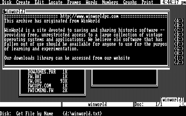
I miss my amber Hercules screen
https://en.wikipedia.org/wiki/Framework_(office_suite)
Picture: https://winworldpc.com/res/img/spotlight/Famework%201.0%20-%...
Re: Text Rendering Hates You
#119That article links to this page about what a massive hack ClearType (Microsoft's subpixel anti-aliasing in Windows) is and I love it: http://rastertragedy.com/RTRCh4.htm#Sec1
Re: Text Rendering Hates You
#120Earlier quoted context omitted.
Half sure, 90% no.
There are over 2.5 billion active Android devices ( https://twitter.com/Android/status/1125822326183014401 ). There were over 700 million active iPhones in 2017, likely more today ( https://fortune.com/2017/03/06/apple-iphone-use-worldwide/ ). So conservatively there are over 3 billion smartphones. Microsoft claims there are over 1 billion Windows 10 installations ( https://news.microsoft.com/bythenumbers/en/windowsd…
> so that means that less than 2 billion Windows installations are in existence.
In what world is 3 billion out of 5 billion >= 90%? I repeat "Half sure, 90% no."