target="_blank" would certainly help usability of the "Info & Download" links.
Thanks for the website, klageveen!
151–160 of 289 posts
Thanks for the website, klageveen!
No one has mentioned Lucida Sans Typewriter. It was the default console font on Solaris, and it was may favorite code font for more than a decade. I even made a Windows version of that font, for my own use, using a bitmapped font editor. Here's a screenshot of Solaris showing that font: http://agilo.acjs.net/files/screenshot_solaris.png You can buy it from Adobe: https://www.fonts.com/font/adobe/lucida-sans-typewrite…
There is no tilde in Lucida's snapshot, but I would rate the font very low on the readability of the other characters. The other parameters (serif, form of the "g", etc) are of no importance to me if the first test fails.
I'm surprised that the list doesn't mention consolas. It ships default with visual studio and it's so good that I use it on arch Linux as my terminal font and with intellij. It was designed with programming in mind and has some nifty characteristics like a slash through zero. This list also misses out on 'operator mono' which is a well thought out font for programming.
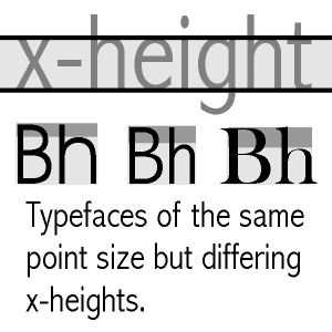
This is a really cool site, thanks! It also helped me understand something about the font sizes that always puzzled me (but never enough to actually look it up). All of the fonts there have the size of 16, but some are clearly bigger than others. Compare e.g. Inconsolata and Meslo: http://app.programmingfonts.org/#inconsolata http://app.programmingfonts.org/#meslo Having them side by side, you can see that they conta…
Width can always vary. Combinations of greater width and x-height make the letters look bigger.
At least, that’s the way I’ve always understood it.
This image shows it clearly:
http://kapundahigh.weebly.com/uploads/6/1/5/4/61545621/xheig...
Earlier quoted context omitted.
I don't think the author needs to go to such lengths just to support some proprietary fonts, specially considering that there are great free and open options.
Sure, but that's not really an answer to the question!
Please come back and let us know what you find!
Earlier quoted context omitted.
One of the early proponents of using proportional fonts for code was Bjarne Stroustroup - his "The C++ Programming Language" books all do that, and he briefly explains it in the intro as being more readable, and urges the readers to give it a go. I wasn't convinced, personally, but the idea was already around then.
The Smalltalk system also used proportional fonts, and predates that book by many years.
Earlier quoted context omitted.
There's nothing wrong with the original IBM VGA console font, for that matter. Font perception is a very subjective thing, though. Also, I think increase in screen resolution contributes somewhat. I find that I'm a lot pickier about fonts after getting a 4K display.
I use a reproduction of the IBM VGA console font called Nouveau IBM [1]. Very happy with it: https://i.imgur.com/cT0pCL4.png [1] https://www.dafont.com/nouveau-ibm.font
Earlier quoted context omitted.
There's nothing wrong with the original IBM VGA console font, for that matter. Font perception is a very subjective thing, though. Also, I think increase in screen resolution contributes somewhat. I find that I'm a lot pickier about fonts after getting a 4K display.
> There's nothing wrong with the original IBM VGA console font Oh boy... Don't get me started on this. Those semi-consistent application of serifs, wide vertical traces and the overall MDA-ness of it drives me nuts. It's not like IBM didn't have anything better to choose from. disclaimer: I make the 3270 font, which is based on the 3270 terminal font, which is the better thing I mentioned in the above paragraph.
Which, again, just goes to show that this stuff is all very subjective.
Does anyone have any known good reference sites for going about creating your own font? I've thought about this a lot yet never had the time to do. I think creating my own would be incredibly cool!
I'm surprised that the list doesn't mention consolas. It ships default with visual studio and it's so good that I use it on arch Linux as my terminal font and with intellij. It was designed with programming in mind and has some nifty characteristics like a slash through zero. This list also misses out on 'operator mono' which is a well thought out font for programming.
Hi, I'm the author of programmingfonts.org. Operator Mono certainly is pretty. I always loved consolas on Windows (honestly, it's the only thing that rendered properly on Win7). That said, I can only include fonts that are freely available, or where the owner of the font allows me to (in the case of Input Mono). I have tried for a few others, but haven't been so lucky there. So, no proprietary or otherwise commercial…