They claim that the new scale gives a continuum from dark to light, but if you look at the example it goes dark at both ends with the brightest colors in the exact middle. Why the discrepancy?
New Map Scale Is More Readable by People Who Are Color Blind
31–40 of 52 posts
Re: New Map Scale Is More Readable by People Who Are Color Blind
#32I've been using Color Oracle [1] to simulate colour-blindness as part of my standard developer workflow recently. For such a common disability, it's shocking how little work most people put into ensuring accessibility for colour-blind people. [1] https://colororacle.org/
Thanks for the link. Is the macOS version working for you? I can't get it to work on High Sierra.
Do you have Java installed? It works for me.
There's another app from a Japanese lab but can't remember the name.
Re: New Map Scale Is More Readable by People Who Are Color Blind
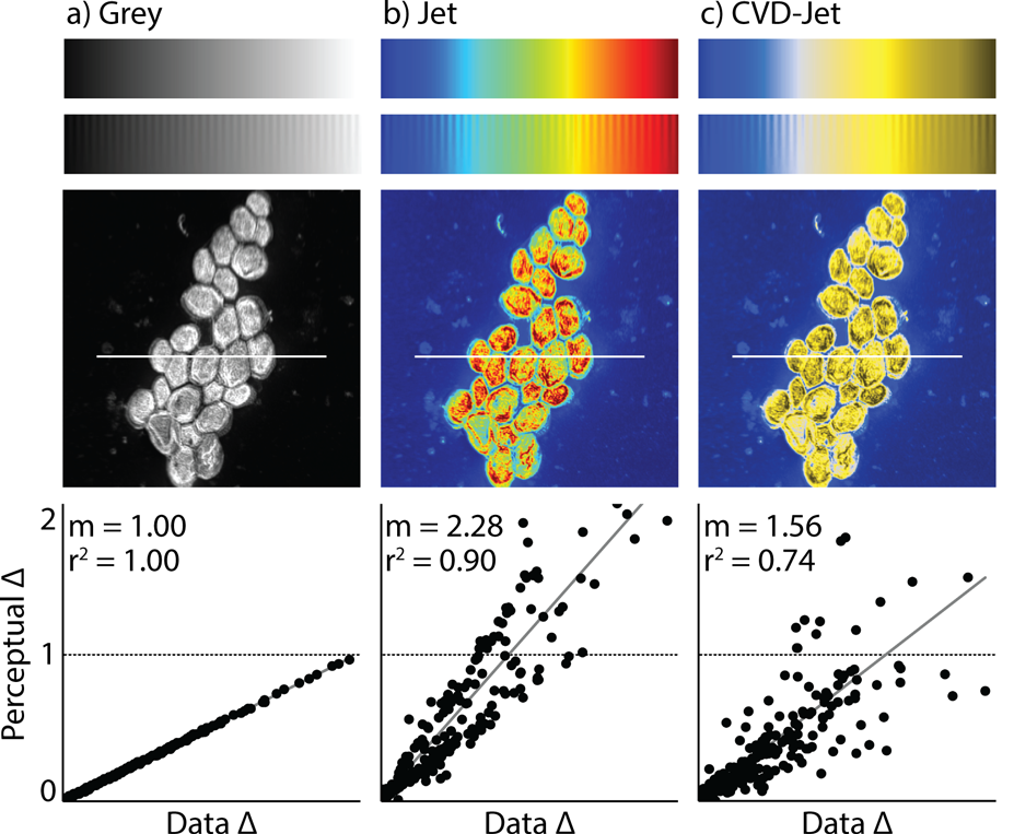
#33They claim that the new scale gives a continuum from dark to light, but if you look at the example it goes dark at both ends with the brightest colors in the exact middle. Why the discrepancy?
I don't think it does. The picture here: https://static.scientificamerican.com/sciam/assets/Image/UPj... is CVD-Jet, not their new scale. The blue-and-yellow rightmost picture is described as "as a person with red-green color blindness sees the rainbow image [in the center]". This scale does put the brightest colors in the center.
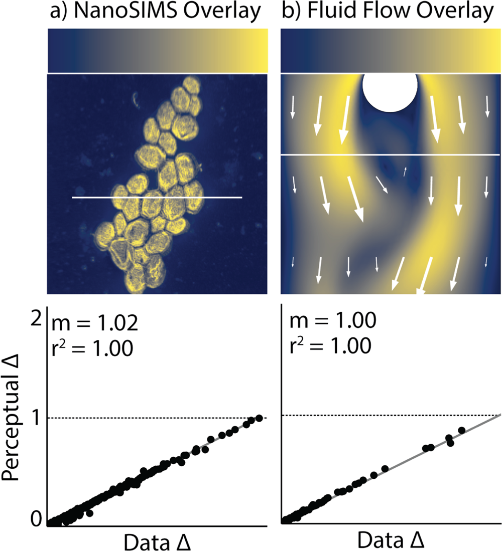
Their proposed scale, cividis, does not have a brightness in the middle of the scale. It's the second image in the article: https://static.scientificamerican.com/sciam/assets/Image/jou...
Re: New Map Scale Is More Readable by People Who Are Color Blind
#34I wish the article would have provided the formula for cividis... that is, how to transform a range of values from 0 to 1.0 into standard RGB values.
Quick conversion for css etc,
multiply each number by 255 to get RGB val, and call Math.round() on each or let the browser round it.
Re: New Map Scale Is More Readable by People Who Are Color Blind
#35They claim that the new scale gives a continuum from dark to light, but if you look at the example it goes dark at both ends with the brightest colors in the exact middle. Why the discrepancy?
I don't think it does. The picture here: https://static.scientificamerican.com/sciam/assets/Image/UPj... is CVD-Jet, not their new scale. The blue-and-yellow rightmost picture is described as "as a person with red-green color blindness sees the rainbow image [in the center]". This scale does put the brightest colors in the center. Their proposed scale, cividis, does not have a brightness in the middle of the scale. I…
Correct, one of the links in the article shows a pretty clear comparison between rainbow scale, how that looks to someone with color deficiency (with the dark portions on the ends), and their proposed scale.
https://www.comsol.com/blogs/a-simulation-color-table-for-en... - midway down the page.
Re: New Map Scale Is More Readable by People Who Are Color Blind
#36I am always pleased to see annoucements and discussions on colour blindness. Forgive me for sharing again my writeup on this syndrome from my own experience, if you don't yourself have any such deficiencies you might find it interesting! https://mcconnellsoftware.github.io/colourblind-in-software-...
Thank you for the write up - this was good to read. Someone close to me was just diagnosed with color blindness and this was very helpful.
Thanks! (If you ever see them in a super pale pink shirt, check if they believe it's white and may've been ruined in the laundry. Been there, done that)
Re: New Map Scale Is More Readable by People Who Are Color Blind
#37I am not colorblind, but work with data visualization in Matlab a lot. This hilarious SciPy2015 talk[1] convinced me to switch to the Parula color scheme. There's no way I'm going back to Jet.
Re: New Map Scale Is More Readable by People Who Are Color Blind
#38I am not colorblind, but work with data visualization in Matlab a lot. This hilarious SciPy2015 talk[1] convinced me to switch to the Parula color scheme. There's no way I'm going back to Jet. [1] https://www.youtube.com/watch?v=xAoljeRJ3lU
Shouldn't it have convinced you to switch to Viridis instead?
Re: New Map Scale Is More Readable by People Who Are Color Blind
#39Earlier quoted context omitted.
Thanks for the link. Is the macOS version working for you? I can't get it to work on High Sierra.
Do you have Java installed? It works for me. There's another app from a Japanese lab but can't remember the name.
I can see the app running - but doesn't change the display when I select a simulator option from the drop down menu. Will play around with it. Thanks!
Re: New Map Scale Is More Readable by People Who Are Color Blind
#40I am always pleased to see annoucements and discussions on colour blindness. Forgive me for sharing again my writeup on this syndrome from my own experience, if you don't yourself have any such deficiencies you might find it interesting! https://mcconnellsoftware.github.io/colourblind-in-software-...
Ha! I enjoyed this read. I am also colorblind. I do think one of the more interesting parts of being colorblind is the fact that I do not rely on color for ANYTHING. For example - Stoplight? What position is lit is my first thought. I think this train of thought has had some unintended benefits in terms of my ability to process things analytically