Live data from Hacker News

Make. It. Simple. Linux Desktop Usability

medium.com

11–20 of 57 posts

Re: Make. It. Simple. Linux Desktop Usability

#11
post #6

I don’t understand a lot of the criticisms at modern ui/ux patterns in this post. Ex: complaining about the hidden settings menu in chrome. Most people just want their applications to work and have the most common functions easily accessible. I am sure most users of chrome don’t ever need to delve into settings and are happy with the minimal set of options presented to them and that user testing backs this decision.

I don't think I understand the author's critique of the Chrome/Firefox menu button either other than the weird choice of iconography. I'm curious as to what he would propose as a solution to the problem.

I do agree with the author on his sentiment on the lack of discoverability with applications nowadays. It might've been better to showcase the `chrome://settings` interface since it's a prime example of less suitable mobile design bleeding into the desktop UX. Funny, I just noticed that they actually use a proper hamburger icon for toggling the hidden settings menu, not the triple dots.
Re: Make. It. Simple. Linux Desktop Usability

#12
post #4

If more people read this and comment (one way or another), we might get a more usable desktop on Linux. I’m going back to Linux after years on the Mac and windows, and it’s killing me. Finding anything is a pain in the butt, hence me posting this.

I don't want to look like a linux advocate, i like mac UI better, but if you find gnome painfull (and you should), try cinnamon. It does not have searchable menu like asked in this article, but it has everything else, and i personnally find the interface lean and efficient on laptops (i still like mac UX better).

Re: Make. It. Simple. Linux Desktop Usability

#13
From the second part:

https://cdn-images-1.medium.com/max/1600/1*EXYbO_qnV2m8fv4mB...

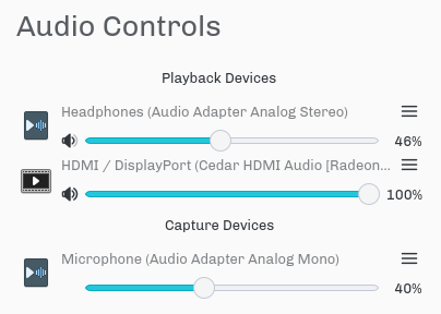
> Adjusting the volume in KDE Plasma — why is there more than one slider for playback? Hardly intuitive

Because there are multiple outputs and you can assign a source to whichever outputs you want. Why shouldn't the controls reflect the actual capabilities of the device?

The next step is saying that the device is too capable and needs capabilities removed to make it easier to understand. No thank you.

Re: Make. It. Simple. Linux Desktop Usability

#15
post #4

If more people read this and comment (one way or another), we might get a more usable desktop on Linux. I’m going back to Linux after years on the Mac and windows, and it’s killing me. Finding anything is a pain in the butt, hence me posting this.

Give it a try to "kde neon".

Re: Make. It. Simple. Linux Desktop Usability

#16
I feel like the author needs to explain why the menu-based user interface is better. That's taken for granted, but is it actually true?

And consider that the response to that is likely to be different for people who learned computing on environments like Windows (where global menu bars would be really weird), Mac OS (where they're normal) or various earlier UNIX GUIs (where who knows, anything goes and each application probably does it differently anyway), or on smartphones or tablets, which is where a lot of younger people are getting their first experiences of computers.

Re: Make. It. Simple. Linux Desktop Usability

#17
post #11
post #6

I don’t understand a lot of the criticisms at modern ui/ux patterns in this post. Ex: complaining about the hidden settings menu in chrome. Most people just want their applications to work and have the most common functions easily accessible. I am sure most users of chrome don’t ever need to delve into settings and are happy with the minimal set of options presented to them and that user testing backs this decision.

I don't think I understand the author's critique of the Chrome/Firefox menu button either other than the weird choice of iconography. I'm curious as to what he would propose as a solution to the problem. I do agree with the author on his sentiment on the lack of discoverability with applications nowadays. It might've been better to showcase the `chrome://settings` interface since it's a prime example of less suitable…

> other than the weird choice of iconography

I think that by now, we're well on our way of educating people on the meaning of the hamburger icon...

Re: Make. It. Simple. Linux Desktop Usability

#18
>Now, with a menu bar you could reach the “About” dialog box with one single click, and dragging the mouse around. With this thing, you need at least three clicks, and you need to know where you have to click. A giant step backward with no apparent advantages.

This guy talks about some menu options like everyone accesses them 10 times a day. Who cares if 'About' is tucked away somewhere. Has anyone ever used the 'About' button in a browser? What for?

I much rather have a clean screen with fewer buttons than the 'About' button sitting there, never being used.

edit: read the other parts as well now and while some of it is nit-picky I recommend the series to all! worth a read.

Re: Make. It. Simple. Linux Desktop Usability

#19

>Now, with a menu bar you could reach the “About” dialog box with one single click, and dragging the mouse around. With this thing, you need at least three clicks, and you need to know where you have to click. A giant step backward with no apparent advantages. This guy talks about some menu options like everyone accesses them 10 times a day. Who cares if 'About' is tucked away somewhere. Has anyone ever used the 'Abo…

About buttons are there to find the exact version of the software you are using - and who is behind it. It is useful.

Sometimes to contact the devs.

Re: Make. It. Simple. Linux Desktop Usability

#20

>Now, with a menu bar you could reach the “About” dialog box with one single click, and dragging the mouse around. With this thing, you need at least three clicks, and you need to know where you have to click. A giant step backward with no apparent advantages. This guy talks about some menu options like everyone accesses them 10 times a day. Who cares if 'About' is tucked away somewhere. Has anyone ever used the 'Abo…

It's not just about "About". I often want to revisit a web page and the same logic applies there. In Safari, the "History" menu is always right at the top of the screen. With a single click, I can look at recent pages, and hover over previous days.

In Firefox on Linux, I needed to learn to click on the bookshelf icon (?!) in the menu bar, then History. Then the menu acts like a wannabe iOS app and slides the history into the menu with an animation. It feels a lot more cumbersome for no good reason at all.

Both app and web designers have quickly understood that mystery meat navigation is a dead-end[1] now matter how clean it looks. I don't understand why the GNOME and elementary teams keep doubling down on it.

[1] https://thenextweb.com/dd/2014/04/08/ux-designers-side-drawe...

Post reply on HN