Gosh there are a lot of these programs, aren't there? For some reason I find it really hard to read these tree map visualisations. I know the theory and all that, but for me they just aren't an intuitive way of displaying that kind of information. For me a radial graph (i.e. pie chart like) is much easier to grok - I don't even have to think about it, I just get it. Seems like there must be plenty of people who don't…
The DaisyDisk website is surprisingly ugly and does not do their app justice.
Here's what the app looks like: http://www.creativeapplications.net/wp-content/uploads/2009/...
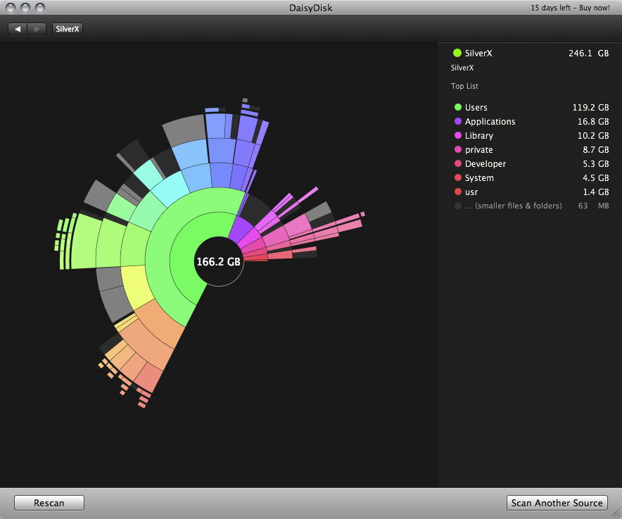
Ever since I've ditched macOS I've been waiting to find a similarly designed app for Windows.
EDIT: Just tried Diskitude, but it's unfortunately nothing like DaisyDisk. It doesn't do the same drill-down DD does.