In the late '90s I was asked to do image segmentation of multispectral data of brightfield microscope data. That is, given a picture of a bunch of cells, find all of the cells. There were two problems: image segmentation of sick cells is really hard (they're very blobby & fragmented), and the computer I had available took more than 20 minutes per image. It was literally both cheaper and faster to have a grad student…
Sorry if this is a stupid question, but can't you do this without converting the image into an RGB 3D space? (i.e. iterate through the pixels and count the ones within a certain range of what you want)
3D scatterplot of an image
61–70 of 78 posts
Re: 3D scatterplot of an image
#62"One Million Colors" https://upload.wikimedia.org/wikipedia/commons/thumb/d/d6/1M...
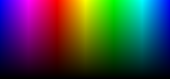
"RGB HSV Image" https://www.gimp.org/tutorials/Digital_Black_and_White_Conve...
Re: 3D scatterplot of an image
#63In the late '90s I was asked to do image segmentation of multispectral data of brightfield microscope data. That is, given a picture of a bunch of cells, find all of the cells. There were two problems: image segmentation of sick cells is really hard (they're very blobby & fragmented), and the computer I had available took more than 20 minutes per image. It was literally both cheaper and faster to have a grad student…
Sorry if this is a stupid question, but can't you do this without converting the image into an RGB 3D space? (i.e. iterate through the pixels and count the ones within a certain range of what you want)
Re: 3D scatterplot of an image
#64This reminds me of a machine vision application for large-scale bakeries. When you bake bread, the color of the surface changes as the bread rises and completes the baking process. In the application I remember, the average color of a loaf was tracked on an RBG plot as a function of time. The idea was that the baking process followed a trajectory in the RGB space that was dependent on the temperature of the oven and…
Re: 3D scatterplot of an image
#65Earlier quoted context omitted.
Do you have any examples of this? Sounds cool
I did a Jupyter notebook http://nbviewer.jupyter.org/github/Yorwba/image_frequency_sc... I should have probably written more comments, but I really need to go sleep now.
library(imager)
download.file("https://upload.wikimedia.org/wikipedia/en/2/24/Lenna.png",'lena.png', mode = 'wb')
lena Re: 3D scatterplot of an image
#66"based on the pixel values" I daresay technically this applies to all useful visualizations of the data. I don't think they'd be very useful if they weren't, in some way, based on the pixel values.
Sure, but here the pixel values are directly used as spatial coordinates, so it makes sense to mention this.
Re: 3D scatterplot of an image
#67This is cool, but I wonder why most of the demo images - and a lot of the images I uploaded - seem to have their colors aligned in a single plane.
Partly it is because real objects are often made out of a single colour. The camera sees different parts of the object under different lighting conditions. That mainly only changes the brightness. Specular highlights also desaturate the base colour, but nothing changes the hue. So all the pixels for that object tend to be aligned on a plane in the colour space plot. In the example images, the sand in the sand+sky pic…
Re: 3D scatterplot of an image
#68There is a really cool use of clustering with these scatterplots to do color quantization (i.e. reducing the number of colors). If you want 16 colors, just find 16 clusters and their centroids (e.g. let k=16 for k-means clustering). Replace each pixel with the closest centroid. Then, your image is quantized (and can perhaps be stored more efficiently)!
Effectively you are non-uniformly resampling based on distribution, so relative values/distances go out the window but you keep "detail" in the lower fidelity signal.
Re: 3D scatterplot of an image
#69Earlier quoted context omitted.
Partly it is because real objects are often made out of a single colour. The camera sees different parts of the object under different lighting conditions. That mainly only changes the brightness. Specular highlights also desaturate the base colour, but nothing changes the hue. So all the pixels for that object tend to be aligned on a plane in the colour space plot. In the example images, the sand in the sand+sky pic…
But I'd expect to see distinct clumps, not a straight plane...
Now imagine you rolled the card into a cylinder. The result would depend on the lighting, but most likely you'd be able to see some shading across the object, so that there are some darker and lighter pixels. In, the HSV colour space you'd now have a line - all the H and S values for those pixels would be the same, but there would be a range of values for V.
Now imagine you replaced the matt card with a shiny piece. You might see a whitish specular highlights where the object reflects a light source or the sky. The added whiteness would have made some pixels have a lower saturation (S). So now you have variation in S and V, but not H. That would form a plane in the HSV plot.
Re: 3D scatterplot of an image
#70This is cool, but I wonder why most of the demo images - and a lot of the images I uploaded - seem to have their colors aligned in a single plane.
Maybe planar colors make for better-looking images (a more cohesive feel) and the demo images were chosen because they look good.
Well, not that flat actually, the way the image were processed also makes them flatter than they really are see
https://uploads2.wikiart.org/images/vincent-van-gogh/the-sta...
for example.