Live data from Hacker News

Does Your Product Logo Actually Matter?

kalzumeus.com

11–20 of 54 posts

Re: Does Your Product Logo Actually Matter?

#11
> I’m very, very open to the notion that there exist circumstances under which this test would have come down the other way.

There almost certainly are circumstances in which result would have been reversed. Testing the hypothesis that logo A is better than logo B, he did get a significant result (n = 17,000, p < 0.01). But if he was attempting to test the hypothesis that logos from population A (custom-designed) are better than logos from population B (off-the-rack), his results are completely insignificant, since n in that case was 2. You'd have to test many more logos to reach that sort of conclusion.
Re: Does Your Product Logo Actually Matter?

#12
Logos evolve over time - If it is not right the very first time, it can be improved gradually. Unfortunately, it works the other way round as well.

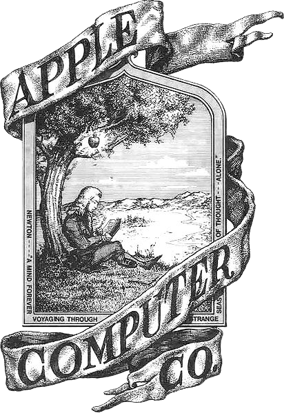
Bad to Good - Apple: http://upload.wikimedia.org/wikipedia/commons/f/fa/Apple_fir...

Good to Bad - Pepsi: http://upload.wikimedia.org/wikipedia/en/e/e9/Pepsi_logo_200...

Re: Does Your Product Logo Actually Matter?

#13
post #10

The new one flattened the design of the page, giving a scamsite-look to the site. The old one make it clear (not that it's necessary) what bcc sells and is more inviting for the target imo.

Agreed, this test also shows how websites need a certain amount of complexity to seem legit (even if the experts consider the complexity inferior). If the design is too bland it definitely gives me a scamsite feeling.

Re: Does Your Product Logo Actually Matter?

#14
The key lesson - the thing that gets glossed-over in opinion, assumption, and fluff = all that matters are the actions taken by individuals from his target market.

How the thing looks to you is neither here nor there. It's what it does subconsciously to middle-aged women teachers that counts... Wrong as that may sound.

Assumption, anecdote, opinion - back it up with data! We're engineers (literally or metaphorically).

Re: Does Your Product Logo Actually Matter?

#15
post #2

those logos are exceedingly ugly - both the old one and the new one. on the old one the text looks squashed, the blue background has a funky hue, you duplicate the word bingo, the white glow overlaps with the background of the page - leading to odd white spaces ... just me?

Unless you are running a site that has to convey a strong sense of exclusiveness or security you can usually get away with a logo that is considered ugly by many.

Same applies to page layouts as long as the value for the user is there.

Re: Does Your Product Logo Actually Matter?

#18
The problem with the new design is it looks like a logo I'd see on a squatters page. Relatively bland. Not really linked to the site.

The original logo, while not extremely attractive, at least lets me know, "OK, this is really about bingo cards, there's a bingo card in the logo. Not just someone who got the name to the domain."

If I hit the new logo, I'd probably retype the URL or go back to a search engine to make sure that I was at the site that I intended to go to.

Re: Does Your Product Logo Actually Matter?

#19
post #16

Every time I see this product referenced or talked about, I consider spending 3 days creating something better, with a better website, and undercutting their price.

It would be harder than you think. Patrick is patio11 on HN (http://news.ycombinator.com/user?id=patio11). He's smarter than the average bear.

Re: Does Your Product Logo Actually Matter?

#20
post #2

those logos are exceedingly ugly - both the old one and the new one. on the old one the text looks squashed, the blue background has a funky hue, you duplicate the word bingo, the white glow overlaps with the background of the page - leading to odd white spaces ... just me?

> on the old one the text looks squashed

If you're just looking the screenshot in the blog (as opposed to clicking thru to a larger view), I think it really is squashed. Try going straight to http://images1.bingocardcreator.com/blog-images/logo-wager/o..., it looks a bit better.

I'm also not a teacher looking to buy bingo cards, but the new logo is just terrible. Is that really the best you could find on 99 Designs? (99D is down right now, but I was going to see if I could fetch a better one quickly.) I'm not at all surprised it performs worse that the current one. I'll bet it performs worse that just the text "Bingo Card Creator" displayed in basic font with sufficient contrast to the background.

While I can imagine the old logo being better executed, just as an anecdotal impression, the concept behind the old logo seems pretty much spot on to me.

Post reply on HN