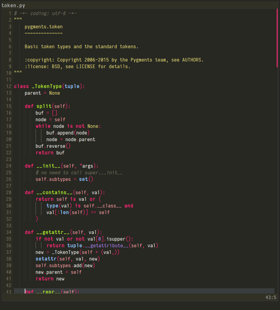
Slightly OT.. Does anyone know the font used in the screenshots here? https://github.com/owainlewis/emacs-color-themes
Looks like Anonymous Pro. http://www.marksimonson.com/fonts/view/anonymous-pro
21–30 of 128 posts
Slightly OT.. Does anyone know the font used in the screenshots here? https://github.com/owainlewis/emacs-color-themes
I don't know what it is about this font but it doesn't feel monospaced. Using this font I constantly keep second guessing myself as to where I've placed whitespace. Maybe I just need to use it more, I don't know.
I think the lower width:height ratio is part of your whitespace issue, combined with the seemingly liberal kerning.
Slightly OT.. Does anyone know the font used in the screenshots here? https://github.com/owainlewis/emacs-color-themes
It is a really good font, however, it just doesn't work for me on terminal & terminal based applications. Somehow I find that there is too little spacing between the lines.
I don't know what it is about this font but it doesn't feel monospaced. Using this font I constantly keep second guessing myself as to where I've placed whitespace. Maybe I just need to use it more, I don't know.
Glancing at it I'm not sure if I would immediately be comfortable with it - it's a much narrower glyph than the type I'm used to. I think the lower width:height ratio is part of your whitespace issue, combined with the seemingly liberal kerning.
This. I occasionally try new dev fonts but so far I still end up using Menlo and/or Consolas.
Slightly OT.. Does anyone know the font used in the screenshots here? https://github.com/owainlewis/emacs-color-themes
Looks like Anonymous Pro. http://www.marksimonson.com/fonts/view/anonymous-pro
Slightly OT.. Does anyone know the font used in the screenshots here? https://github.com/owainlewis/emacs-color-themes
Earlier quoted context omitted.
Why do you dislike ligatures in your coding font? Just curious.
Not the parent, but I’ve had an issue where the fi ligature occupies just one character width, which looks very wrong with an otherwise monospace font. If the ligature is done right (resulting glyph is double-width), then I would probably like it.