Live data from Hacker News

Go fonts

blog.golang.org

91–100 of 182 posts

Re: Go fonts

#91
post #82
post #71

I'm surprised that people haven't commented on the implicit story here: the intention to deliver the "Shiny" cross-platform graphical toolkit for Go. If that happens, Go becomes one of the very few programming languages with a default cross-platform UI library.

Let's hope it won't be as ugly as the Java crap. Or Tk.

Do you mean the old Java crap, like

https://netbeans.org/images_www/screenshots/platform/jmonkey...

https://netbeans.org/images_www/screenshots/platform/nbAWSAd...

https://netbeans.org/images_www/screenshots/platform/lg_soft...

https://netbeans.org/images_www/screenshots/platform/GGSSEph...

https://netbeans.org/images_www/screenshots/platform/platypu...

https://netbeans.org/images_www/screenshots/platform/blueMar...

or the new Java crap like

http://fxexperience.com/wp-content/uploads/2011/05/Charts-Ba...
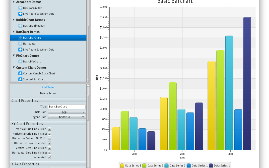
http://docs.oracle.com/javafx/2/best_practices/img/saleshist...

https://blog.idrsolutions.com/wp-content/uploads/2014/03/vie...

??
Re: Go fonts

#92
post #89

The monospace font looks interesting. Fixed-width serif fonts are not that common. But creating fonts for Go? That sounds like a solution in search of a problem.

Fixed-width serif is exactly what I wanted! It's refreshing to be able to switch from serif to sans-serif, I do that on my Kindle about once a month and the text immediately becomes less boring.

Re: Go fonts

#93

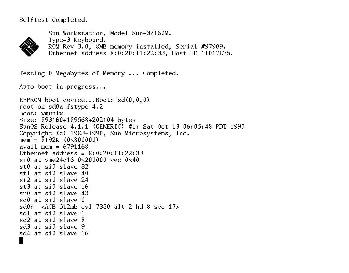
The monospace font reminds me of the console on old Sun workstations running SunOS. It's pretty hideous. The alphanumerics feel rather slapdash, like this whole thing was put together by the foundary on a Friday afternoon and made to meet the minimum requirements but without much love.

> The monospace font reminds me of the console on old Sun workstations running SunOS.

Yes! It really does: http://toastytech.com/guis/sv411boot.png

But I think it's mostly to do with the non-uniform line thickness (look at the asymmetry of the 'x').

To me it looks better than the SunOS font, but it certainly does resemble it. That's probably why it looks "old" to me, and not in a particularly nostalgic way. Then again, I didn't use Suns all that much.

Re: Go fonts

#94
post #81

This reminds me of Java applications that you can immediately tell are Java because of the weird font. I don't see an advantage over using native system fonts. As far as I know you don't need a license to use fonts installed on the system running the application. Why does the font need to be bundled? The wide spread adoption of this is going to make go programs stick out like a sore thumb.

> I don't see an advantage over using native system fonts As touched on in the article, you need a standardized font you have control over for automated testing, to make sure you're getting reproducible results. OS fonts are too inconsistent for that. Now, why they couldn't use any of the literally hundreds of other open-source fonts instead that Google made…

I suspect partially to avoid the Google branding (which seems like a good reason), and partially because of Rob Pike's Bell Labs and Plan 9 history (which would be more nostalgia than anything else, but not necessarily a bad reason).

Re: Go fonts

#95
post #39

Go has a cross-platform GUI toolkit? Should I wait for it instead of learning Qt/C++?

It's experimental, so I wouldn't. Pick it up when it gets better.

Qt/C++ skills are both good to have anyway, so it won't be time wasted.

Re: Go fonts

#97
> What options for native UI does IDEA provide? It's mostly a Swing app.

You're right; it's typical bullshit by JetBrains shills. Eclipse has SWT with native UI widgets and IntelliJ is and will always be a sloggy Swing application.

Re: Go fonts

#98
post #78

Earlier quoted context omitted.

Why is it not possible to just use the system font for these UI elements?

I help maintain/develop an app that allows users to draw and simulate logic circuits on a canvas. Text plays a minor but important role for labeling various components, showing bit and hex values, etc. The app uses system fonts, and it's a huge mistake. The sizes and exact layout and connectivity of various logic blocks depends on text size, and when that changes (and it does from platform to platform), it leads to l…

I don't know what toolkit you are using, but when I want to place text with e.g. SDL_ttf, I can compute the width and height of a string knowing its font. IMO relying on a specific font is exactly like throwing magic numbers in a codebase. I can understand that it simplifies things, but it doesn't feel right.

Re: Go fonts

#99
post #97

> What options for native UI does IDEA provide? It's mostly a Swing app. You're right; it's typical bullshit by JetBrains shills. Eclipse has SWT with native UI widgets and IntelliJ is and will always be a sloggy Swing application.

Whoa there. I was asking a question, somewhat incredulously. Maybe the person who wrote that comment is misinformed. Maybe they know something we don't.

Nowhere did I suggest they were 'JetBrains shills' and neither should you, unless you have some evidence of it.

Post reply on HN