Go fonts
blog.golang.org
Go fonts
1–10 of 182 posts
Re: Go fonts
#2Interestingly strange they wouldn't just choose an existing open source font that got along with their license. I guess even you've got Google's wallet behind you it opens a lot of doors.
Re: Go fonts
#3This fonts are pretty cool. But I don't understand why they just used Roboto or Noto fonts.
Re: Go fonts
#4Yuck, the monospace font feels too dense, and dislike the serifs.
Re: Go fonts
#5[deleted]
Re: Go fonts
#6"The experimental user interface toolkit being built at golang.org/x/exp/shiny includes several text elements, but there is a problem with testing them: What font should be used?"
I am really amused by this opening. I guess it is part of the culture to "recreate" something unnecessary and perhaps better when there is resource to spare.
Re: Go fonts
#7From the designers of the Lucida typeface family.
The monospace serif typeface has pleasant, natural thick-thin strokes, giving it a substantial, typewriter-y appearance instead of the weak lines in most monospace serif typefaces -- remember Courier New?
Re: Go fonts
#8Yuck, the monospace font feels too dense, and dislike the serifs.
I think the rendering is horrible too, with plenty of colour fringing and unevenness.
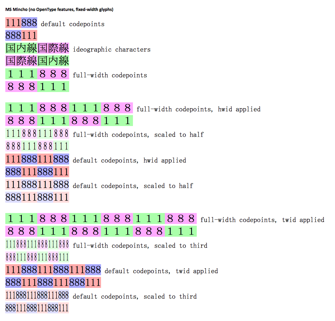
The monospace font reminds me of the generic "Asian product manual font" - although the individual shapes are slightly different, it has a similar feeling to MS Mincho:
http://lists.w3.org/Archives/Public/www-archive/2013Jul/att-...
Re: Go fonts
#9Why wouldn't they just use Google Droid? Strange.
Re: Go fonts
#10It'd be nice to see font examples with syntax highlighting as well.