Live data from Hacker News

A Map of the World Won Japan’s Prestigious Design Award

spoon-tamago.com

41–50 of 105 posts

Re: A Map of the World Won Japan’s Prestigious Design Award

#41

> "AuthaGraph... faithfully represents all oceans and continents" What does this mean? Literally, that is impossible, so what's it actually preserving and distorting? It looks like angle is distorted. Is that it?

It looks like this is just another "equal area" projection. Many of these exist. Map projections are design to minimize certain distortions but at the expense of additional other distortions. Obviously since the world is round, you cannot minimize all of them. Other examples of distortions that a projection can aim to minimize are: distance, direction, scale, angle. An example of another existing equal area projectio…

Correct, but this is one that has two important properties: It tiles, so it can be used for web maps, and you only need to rotate it to always have it point north, so it can be used for mobile maps.

Google Maps, and similar tile systems, can’t have the local area undistorted and pointed in the right direction without these properties – and this map fulfills them.
Re: A Map of the World Won Japan’s Prestigious Design Award

#43
post #8
post #4

The point is just that this is a map which faithfully represents relative areas? We've known how to do that for hundreds of years; see https://en.wikipedia.org/wiki/Map_projection#Equal-area . It's of note that there are some ways in which a flat map can never accurately represent a spherical geometry; for example, not even any small patch of a globe can be represented on a flat map with all distances kept faithful.…

It tiles, so it can be used for web maps, you can just rotate it slightly and always have it north-pointing, so it can be used for mobile maps, and it shows the world in an equal view. And it doesn’t distort the shape of continents either, only the composition. This is amazing.

Can't you tile any projection? At least can't you nicely tile all those that have a rectangular boundary?

Rotating north-wise for close-up views would work of course, but close-up you could just use a "proper" UTM projection instead. For the global view this map feels gimmicky/artsy and not useful for everyday usage.

Disclaimer: I like this work very much and I am super happy a map won this award! I just feel that it has very little use outside of design or art.

Re: A Map of the World Won Japan’s Prestigious Design Award

#47
post #35

Earlier quoted context omitted.

For one thing there is massive distortion of relative distances in southern parts... New Zealand or Australia to Antarctica is something like 4 hours flight, not halfway across the planet.

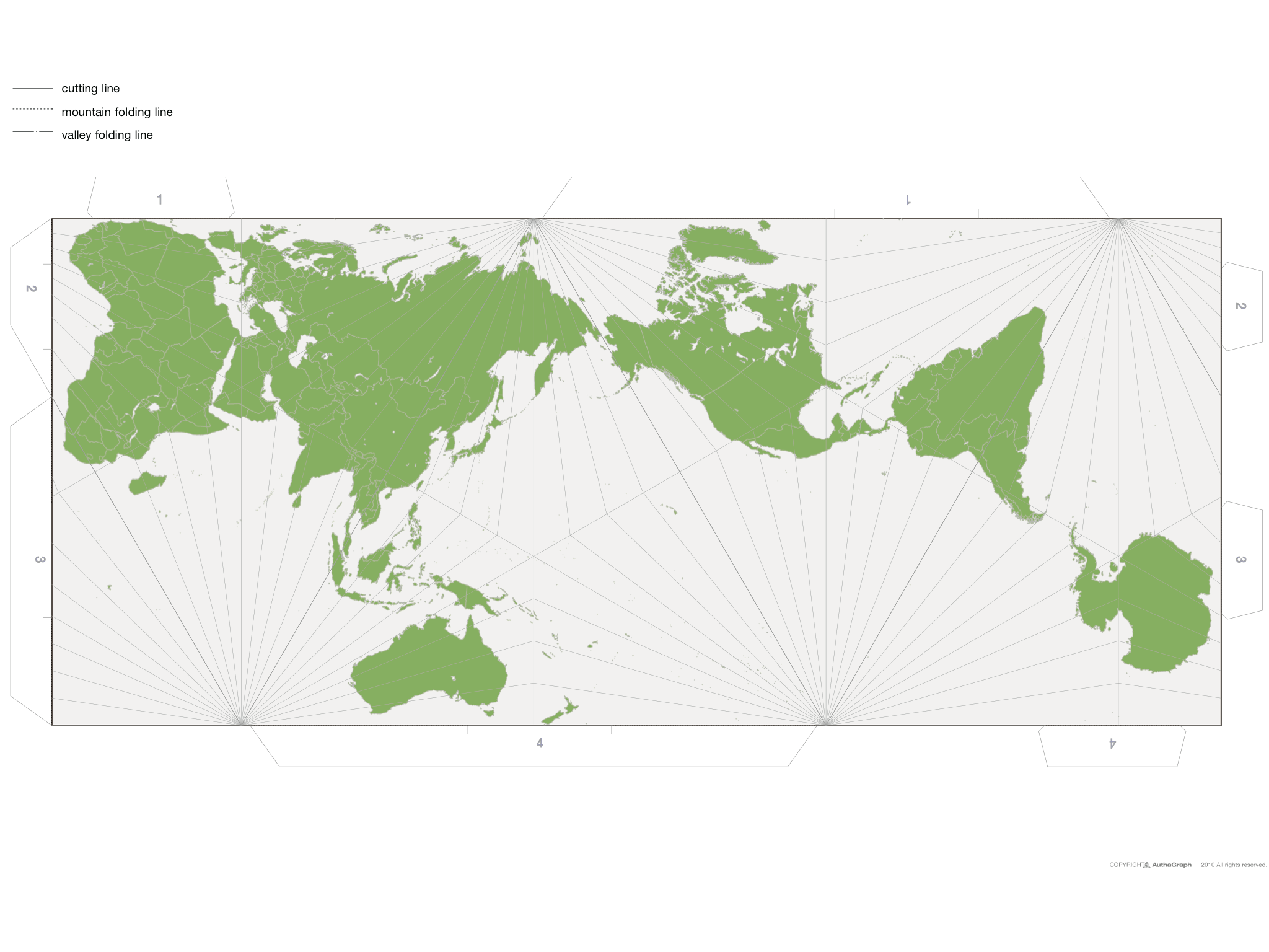
Except for the fact that it tessellates so all you need to do is make the map a bit bigger and that distortion goes away (seen in [0]). 0. http://www.spoon-tamago.com/wp-content/uploads/2016/10/autha...

A map shouldn't need an infinite series of other maps to be useful.

Re: A Map of the World Won Japan’s Prestigious Design Award

#48
post #22
post #20

Earlier quoted context omitted.

What does it mean, "as accurately as possible"? Is that stretched-out Brazil accurate? Or that shrunk China? Pretty sure a lot of areas of this map aren't very accurate.

Do you think it may be your bias based on your entire lifetime of looking at Mercator projections? The purpose of this project is to make it an accurate representation. The observations you make are precisely why this made was made.

The question is: why "areas" are more accurate than distances/angles in a map?

So: this map has very good properties in some sense, very bad in others.

Re: A Map of the World Won Japan’s Prestigious Design Award

#49
post #10

The Good Design Award is not prestigious anymore, nowadays they routinely allow about any company to feature a good design logo on all kind of ridiculous items like PET bottles and so on.

This is exactly what I was thinking too.

They give "awards" to soooo many applicants, and it has honestly seemed like a circlejerk sham.

Re: A Map of the World Won Japan’s Prestigious Design Award

#50

Can anyone working in cartography comment on this? What is the state of active research in cartography? Map making used to be one of the most prized technical skills and I was wondering where the field is moving. First thing that came to mind was new d3 transform...

I don't work as a cartographer but I studied geography for a Bachelor's and Master's. That being said, my knowledge has atrophied a lot.

I was exposed to hundreds of map projections in school, so I'm still kind of trying to figure out what the novelty is here. It just looks like a Japan-centrerd equal-area projection. The tetrahedron is kind of neat. Projections are generally planar, cylindrical, or conical. By using a mosaic of planes, I imagine the formula for this projection would be unbelievably complex, making it much less general purpose.

When you want to represent a spheroid on a 2d surface, you have to distort one or more of shape, area, direction, distance. The objective when selecting a projection is to understand the intended purpose and audience.

If I had to make a guess, I'd say the relevance here is the exploration of what projections we most commonly use and if they're still the best choices for today's purposes and audiences.

I would love to see what Tissot's indicatrix looks like for this projection.

Post reply on HN