Live data from Hacker News

A Map of the World Won Japan’s Prestigious Design Award

spoon-tamago.com

31–40 of 105 posts

Re: A Map of the World Won Japan’s Prestigious Design Award

#31
I haven't calculated the distortions yet, nor found anyone who has, but I'm guessing it's inferior to dymaxion or waterman, plus it cuts out a little bit of the map to make it fold right.

However, it's a RECTANGLE, that's huge. that means we can use it on screens and that non-map geeks would be OK with it.

Re: A Map of the World Won Japan’s Prestigious Design Award

#32
post #22
post #20

Earlier quoted context omitted.

What does it mean, "as accurately as possible"? Is that stretched-out Brazil accurate? Or that shrunk China? Pretty sure a lot of areas of this map aren't very accurate.

Do you think it may be your bias based on your entire lifetime of looking at Mercator projections? The purpose of this project is to make it an accurate representation. The observations you make are precisely why this made was made.

I specifically chose countries that are close to equator, because they are not distorted on Mercator very much.

Re: A Map of the World Won Japan’s Prestigious Design Award

#33
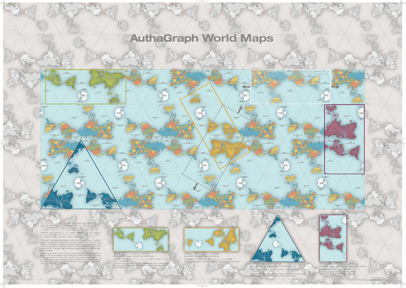
The projection seems closely related to some examples which use a Tetrahedron as projection surface. But according to the description of the process they used some sort of sub-tiled Triakis tetrahedron[1] as intermediate projection surface. This "inflation" process then rounds off the original tetraeders edges and mitigates maximum angle distortion to the four corners of the tetraeder, which can be conveniently placed in places where they are far way from land masses to distort.

To get the rectangular final shape one of the 4 triangular-surfaces is split into two and rotated to the neighboring sides. (Much like that one triangle south of Australia on a Dymaxion map)

Tetrahedric class projections:

conformal:

- Lee Tetrahedric projection

-- http://www.csiss.org/map-projections/Miscellaneous/Lee_Confo...

- Snyder's Tetrahedron (Conformal)

-- http://www.csiss.org/map-projections/Polyhedral_Globes/Tetra...

equal-area:

- Snyder's Tetrahedron (Equal-Area)

-- https://www.mapthematics.com/ProjectionsList.php?Projection=...

-- http://www.csiss.org/map-projections/Polyhedral_Globes/Tetra...

gnomonic:

- including a primer on Tetrahedral Pseudoglobes by Carlos A. Furuti

-- on prognos.com (currently unreachable) http://www.progonos.com/furuti/MapProj/Normal/ProjPoly/Foldo...

-- cached: https://web.archive.org/web/20150322140625/http://www.progon...

[1] https://en.wikipedia.org/wiki/Triakis_tetrahedron
Re: A Map of the World Won Japan’s Prestigious Design Award

#34
post #15
post #8

Earlier quoted context omitted.

It tiles, so it can be used for web maps, you can just rotate it slightly and always have it north-pointing, so it can be used for mobile maps, and it shows the world in an equal view. And it doesn’t distort the shape of continents either, only the composition. This is amazing.

What do you mean the continents are not distorted. South America looks pretty distorted to me, so does Australia.

A lot less than on Mercator, which is the only other projection with the same properties.

Re: A Map of the World Won Japan’s Prestigious Design Award

#35

> "AuthaGraph... faithfully represents all oceans and continents" What does this mean? Literally, that is impossible, so what's it actually preserving and distorting? It looks like angle is distorted. Is that it?

For one thing there is massive distortion of relative distances in southern parts... New Zealand or Australia to Antarctica is something like 4 hours flight, not halfway across the planet.

Re: A Map of the World Won Japan’s Prestigious Design Award

#37
post #35

> "AuthaGraph... faithfully represents all oceans and continents" What does this mean? Literally, that is impossible, so what's it actually preserving and distorting? It looks like angle is distorted. Is that it?

For one thing there is massive distortion of relative distances in southern parts... New Zealand or Australia to Antarctica is something like 4 hours flight, not halfway across the planet.

Not once you tesselate the maps

Re: A Map of the World Won Japan’s Prestigious Design Award

#38
post #24
post #18

Earlier quoted context omitted.

But map should be accurate in the first place. It's not like you can just ignore things you don't want to see there just because they are naturally to big and take up too much space

Actually humans can do that. We orient ourselves using landmarks. If you look at theme park maps, ski resort maps, maps of tourist areas downtown produced by local organizations, subway maps.... All of them are wildly inaccurate in terms of proportions and distances. But notice - almost all are oriented to people not very familiar with that area. Certain big monuments may be left out (the highway that runs by water p…

Harry Beck invented the schematic map in 1931 for the London Underground (the worlds first underground railway). At first it wasn't widely accepted as a good idea (because it distorted relative distances) but over time has become a design icon and repeated elsewhere.

http://www.bbc.com/culture/story/20150720-the-london-undergr...

https://tfl.gov.uk/corporate/about-tfl/culture-and-heritage/...

Re: A Map of the World Won Japan’s Prestigious Design Award

#39
post #35

> "AuthaGraph... faithfully represents all oceans and continents" What does this mean? Literally, that is impossible, so what's it actually preserving and distorting? It looks like angle is distorted. Is that it?

For one thing there is massive distortion of relative distances in southern parts... New Zealand or Australia to Antarctica is something like 4 hours flight, not halfway across the planet.

Except for the fact that it tessellates so all you need to do is make the map a bit bigger and that distortion goes away (seen in [0]).

0. http://www.spoon-tamago.com/wp-content/uploads/2016/10/autha...

Re: A Map of the World Won Japan’s Prestigious Design Award

#40
post #36

Cutting the map in the Pacific just makes a lot more sense rather than cutting it in the Atlantic. Do we really need most of the space in the middle of the map to be water?

This is a fairly standard practice for maps that are targeted for users in Japan, Korea, and China (perhaps other counties as well).

I'm not sure about the why. Maybe because it puts the target countries more towards the center of the map rather than the periphery?

Post reply on HN