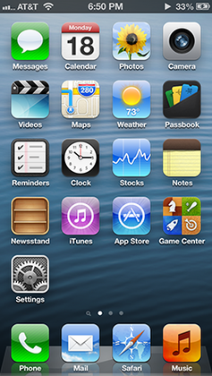
I like the minimalistic UI of El Capitan. It gets out of the way, and puts in focus what I really want to look at: the content, Web pages, my code, my photos. My computer is a tool, it's not an artwork I turn on to look at. Buttons still look pushable, input fields still look editable. The Dock didn't lose any functionality whatsoever by having the 3D effect removed. In my opinion, the El Cap UI requires just as much…
The Dock absolutely lost usability; all the icons look the same now. I practically stopped using the dock because I never find the apps I'm looking for quickly; I've switched to using Spotlight for opening apps instead. The old "Pages" icon was instantly recognisable. The new one looks, at first glance, exactly the same as text edit and notes. I don't think that the UI actually needs to get out of the way. We humans…
Getting a bit fed up of listening to fellow designers preaching about "cognitive overload" over a few button shapes and icons then proceeding to ship designs where all the controls are un-styled blue text with the occasional semi-abstract line art icon.