Live data from Hacker News

Things we learned by visualizing our work hours

reflect.io

11–20 of 29 posts

Re: Things we learned by visualizing our work hours

#11
post #5

Earlier quoted context omitted.

I missed it as well then realised NoScript was blocking it.

Thank you! It is blocked by uBlock Origin as well. So if you are seeing the article but without any visualizations check your ad blocker. Definitely not a good sign for a startup. Edit: Also, they claim insights about what influences productivity. However the visualizations shown (after you disable adblocking) do not reflect the claimed insights. Edit2: Downvote this all you want. I assume you have a personal stake,…

uBlock Origin isn't blocking them for me.
Re: Things we learned by visualizing our work hours

#12
post #6

Earlier quoted context omitted.

Also I see some values for "productivity". What's the metric?

The metric is pulled from RescueTime. It's the percentage of time spent on applications that are classified as "Productive".

That seems like a questionable metric.

Re: Things we learned by visualizing our work hours

#14
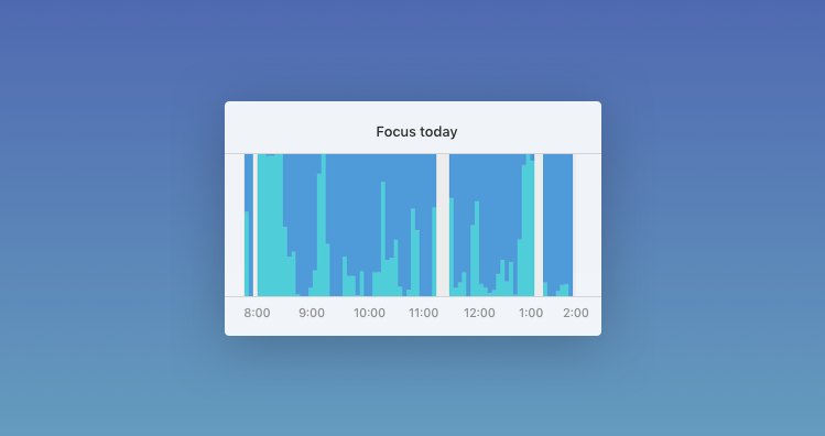
You can go so much further with these RescueTime data. I recently created a simple vis showing how day was spent:

https://medium.com/@vojto/fixing-rescuetime-charts-458edd86a...

tldr: https://cdn-images-1.medium.com/max/1600/1*_IbFy8gq6Fqmu1ZZX...

And also keep in mind that hours spent being distracted isn't the only metric. Another important thing is how often you interrupted your work for something unimportant.

For that purpose we built a mini app: http://focuslist.co/escape/#

Re: Things we learned by visualizing our work hours

#17
RescueTime is a very powerful tool if you want to understand better how you spend the time on your computer and smartphone.

Unfortunately, they do not offer in-depth analysis of the data.

I build my own tool to print customized charts and I would appreciate hearing your opinion on this..

Here is the repo: https://github.com/ilbonte/rescuetime-again and this is an output example: http://i.imgur.com/PptwdMU.png

Re: Things we learned by visualizing our work hours

#18
post #17

RescueTime is a very powerful tool if you want to understand better how you spend the time on your computer and smartphone. Unfortunately, they do not offer in-depth analysis of the data. I build my own tool to print customized charts and I would appreciate hearing your opinion on this.. Here is the repo: https://github.com/ilbonte/rescuetime-again and this is an output example: http://i.imgur.com/PptwdMU.png

this looks awesome!
Post reply on HN