Live data from Hacker News

Introducing the new Google+

googleblog.blogspot.com

51–60 of 300 posts

Re: Introducing the new Google+

#51
post #33

Google seem to keep making worse the thing that matters most to me. What I want is to conveniently read. I want to see content, from a variety of sources. I want density. I want to catch up and be aware. It was like that in the earlier days. Every update kept reducing the amount of visible content, and severe reductions in density. Here is a screenshot of my screen - http://i.imgur.com/fM2WIVf.png (1920x1200) - almos…

It's not just a Google thing. Recently there was a HN thread on devmag.io -- they have the same problem. I measured it: in the same space HN gives me 18 stories, Devmag.io gives me barely 2. Unfortunately, I think Google people know and they just don't care. They don't want people who know what RSS is, people who care about information density; they are going after the Pinterest crowd, the sort of people who read Cos…

Hang on, the problem with Pinterest is the aggressive user hostile "sign in" stuff on the apps and mobile pages. But Pinterest is, for what it is, really freaking good. If you want humanitarian faces or Japanese ceramic or Scandi Furniture or etc you'd be daft to ignore Pinterest.
Re: Introducing the new Google+

#52
post #44

Google seem to keep making worse the thing that matters most to me. What I want is to conveniently read. I want to see content, from a variety of sources. I want density. I want to catch up and be aware. It was like that in the earlier days. Every update kept reducing the amount of visible content, and severe reductions in density. Here is a screenshot of my screen - http://i.imgur.com/fM2WIVf.png (1920x1200) - almos…

Maybe I just don't see it in that screenshot but it looks like it doesn't have that option like Keep has where you can change the multi-column layout to a single one. Although in Keep sometimes you can change the view and it just ignores your setting, reverting back to the default layout. Keep seems like one of those things they never dogfooded. Like the way you open Keep on the web and it loads your entire history i…

> ... you can change the multi-column layout to a single one

It is a setting. I mentioned in my comment that you can switch to that layout and get a total of 4 sentences on the screen. And a lot of white space.

My pet peeve with Keep is how it keeps rearranging lists as the page is loading. I can't work out what the criteria is, but can rule out most recently changed and most recently used.

Re: Introducing the new Google+

#53
Old Way: Two separate concepts called the same thing. Google+ (Unified profile/account/sharing system across services) and Google+ (Social network).

This backfired because what people made the natural inference that the purpose of the former was to force use of the later when the opposite was what Google was aiming for. The purpose of the social network was to promote the unified login, but instead it poisoned the well.

New way: Concept of a "Google+ account" has been folded into the main Google Account as a new cross-service "About Me" account https://aboutme.google.com/ . Google+ (Social Network) is now just a client of the former, so the G+ website is shedding all the features related to its old dual system integrator role.

That's what I can make out, anyway.

Re: Introducing the new Google+

#55
They're still stuck on oversharing. Following a collection pops up a warning explaining that it's going to be public everywhere forever, with the options 'OK got it' and 'Cancel'... I wonder which option is more popular.

Re: Introducing the new Google+

#56

Google seem to keep making worse the thing that matters most to me. What I want is to conveniently read. I want to see content, from a variety of sources. I want density. I want to catch up and be aware. It was like that in the earlier days. Every update kept reducing the amount of visible content, and severe reductions in density. Here is a screenshot of my screen - http://i.imgur.com/fM2WIVf.png (1920x1200) - almos…

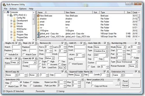
Just because you can fit more information into a space, doesn't mean you should. At a certain point it hurts user experience.

http://www.bulkrenameutility.co.uk/Shots/BRU_Main_Screen.gif

UI design is largely about directing flow. Scrolling down is certainly not the end of the world, and hiding less-commonly used features helps make those which are used stand out.

Re: Introducing the new Google+

#57
Collections is kind of like Pinterest. Communities is kind of like Reddit. Plus was kind of like Facebook. Buzz was kind of like Twitter.

They really need to stop imitating and start innovating. At this point I don't even think they know who they're targeting they're just trying to do a little bit of everything but they don't do it well enough for me to want to use it.

Re: Introducing the new Google+

#58
post #33

Earlier quoted context omitted.

It's not just a Google thing. Recently there was a HN thread on devmag.io -- they have the same problem. I measured it: in the same space HN gives me 18 stories, Devmag.io gives me barely 2. Unfortunately, I think Google people know and they just don't care. They don't want people who know what RSS is, people who care about information density; they are going after the Pinterest crowd, the sort of people who read Cos…

I was with you until you dissed Pinterest. Pinterest is very information dense. It utilizes every inch of screen space, and it does so without looking cramped at all. It's a huge design success.

It seems very image-oriented though. I wouldn't try to read news on it.

Re: Introducing the new Google+

#59
Good. Collections is the best feature of Google+ and a way better implementation of the circle feature. Communities is another strong point of the service, even though Collections alone would have been enough for me.

The mobile design on Android is disconcerting to say the least, according to the material spec, tabs are at the top. Putting them at the bottom allows one handed navigation BUT is way too close to the navigation bar and usually cause many false taps.

Post reply on HN