Designing a Mobile App for Maximum Growth
firstround.com
Designing a Mobile App for Maximum Growth
1–10 of 28 posts
Re: Designing a Mobile App for Maximum Growth
#2+1
Re: Designing a Mobile App for Maximum Growth
#3Assuming that users who installed the app already understood the need to provide their location data. This allowed them to axe out the long-winded welcome flow and make the permissions request the second screen. The text was changed to say that users needed to “Enable Location Permissions”
Just so wrong.
Re: Designing a Mobile App for Maximum Growth
#4awesome article. really nice to see a guide on how to build effective onboarding from an experts view
Re: Designing a Mobile App for Maximum Growth
#5Assuming that users who installed the app already understood the need to provide their location data. This allowed them to axe out the long-winded welcome flow and make the permissions request the second screen. The text was changed to say that users needed to “Enable Location Permissions” Just so wrong.
Yup - I wonder if the article misrepresented the actual change because it seems a bit odd?
This article has a lot of good points but some are really debatable. Not long ago, Hopper (app for flight price monitoring) published their experience in re-doing their onboarding [0]. Some take aways from that go against what this one says.
Ultimately you have to see what works for you and what doesn't. Copy & paste (just like the Social links paragraph funnily) will never just work without some thought.
[0] https://medium.com/@hopper_travel/the-notification-problem-5...
Re: Designing a Mobile App for Maximum Growth
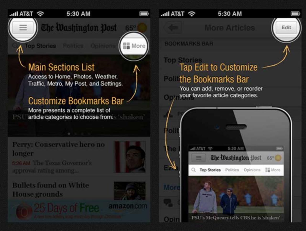
#6Not a fan of screen overlay tooltips as in [1]. My first instinct as a user is to get them out of my way, and I do that every time, feeling guilty. And adding a "next" button and going through tooltips one-by-one doesn't make this any better, just more annoying.
Actual games (such as GTA or Cut the Rope) do a great job with onboarding, and apps tend to take the simpler show-everything-in-the-beginning way.
Two alternatives I've tried as an indie dev:
- Gamification, where you ask the user to perform one task, such as "drag X to Y." Only after they performed the action move on to the next prompt, and perhaps not even immediately.
- Utilizing badge counts or "bouncing" animations to indicate some action that needs to be performed. The benefit is that the user can try it on their own time, and you're not rushing them. The downside, though, is that some users may never actually click.
On the flip side, these approaches can add complexity in both code and how you structure your UI.
[1] http://s3.amazonaws.com/marquee-test-akiaisur2rgicbmpehea/R9...
Re: Designing a Mobile App for Maximum Growth
#7When you look at user tests, no one pauses to read this text. And the very few who do immediately forget what they read...
Even though some of the technologies discussed are hillariously obsolete, nearly everything published on joelonsoftware.com 10+ years ago remains surprisingly relevant:
You could explain things in the manual, but everybody knows that users don't read manuals, and they probably shouldn't have to. http://www.joelonsoftware.com/uibook/chapters/fog0000000058....
Re: Designing a Mobile App for Maximum Growth
#8Not a fan of screen overlay tooltips as in [1]. My first instinct as a user is to get them out of my way, and I do that every time, feeling guilty. And adding a "next" button and going through tooltips one-by-one doesn't make this any better, just more annoying. Actual games (such as GTA or Cut the Rope) do a great job with onboarding, and apps tend to take the simpler show-everything-in-the-beginning way. Two altern…
I like the tooltips better than either of the approaches you've suggested. If I'm confused, I glance at them and then am less confused. If I'm not confused, I just dismiss them, not feeling guilty.
I hate "help" mechanisms that keep popping up in normal operation, because usually I know exactly what I'm doing in normal operation.
Re: Designing a Mobile App for Maximum Growth
#9It should be no surprise that decreasing the tutorial from 6 pages to 2 will increase number of users "registered" from 40% to 80% (or more). In my experience, tutorial dropoff follows a power law, that is, every new hurdle you place before the user can use your app gives them one more chance to bail. You can try all the fancy design tricks you want, but the end result is still the same...you're creating friction points.
In reality there's a delicate balance. Train users to use your app early and take the hit in registrations. You should end up with more engaged users who retain better. Or let everyone in and teach them as they use your app and risk retaining them because they don't understand what the hell they're doing. There is no silver bullet.
Re: Designing a Mobile App for Maximum Growth
#10Not a fan of screen overlay tooltips as in [1]. My first instinct as a user is to get them out of my way, and I do that every time, feeling guilty. And adding a "next" button and going through tooltips one-by-one doesn't make this any better, just more annoying. Actual games (such as GTA or Cut the Rope) do a great job with onboarding, and apps tend to take the simpler show-everything-in-the-beginning way. Two altern…
I like the tooltips better than either of the approaches you've suggested. If I'm confused, I glance at them and then am less confused. If I'm not confused, I just dismiss them, not feeling guilty. I hate "help" mechanisms that keep popping up in normal operation, because usually I know exactly what I'm doing in normal operation.
You're on point, these help mechanisms should be rare and few, or they would be a nuisance as well.
The problem with forced screen of tooltips in the very beginning is that you haven't had a chance to explore the app yet, and so it's hard to mentally assign importance to them. And later, they're gone.