Wow, Gruber's not a fan [1]. Can't say I'm surprised, but this seems harsh even coming from him.
Google’s look, evolved
351–360 of 447 posts
Re: Google’s look, evolved
#352What's most interesting to me is not so much the logotype itself (which is nice; the tilted 'e' is the perfect sans reference to the angled stroke in Catull), but that one of the top-tier identity components is a unified loading spinner. While Apple, Facebook, and Microsoft all have their own branded spinners, Google has probably had both the most visually adventuresome and the most inconsistent spinners across all i…
Maybe they're backing the spinner with latency data collection across all their apps...
Re: Google’s look, evolved
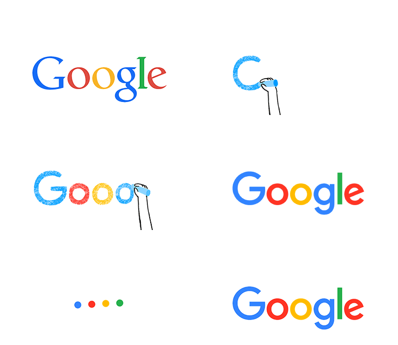
#353I love it. Quite often logo redesign processes gets completely out of hand, but this was a significant improvement over the older version: Cleaner, more modern and beautiful in all its simplicity. Bravo!
I don't like it. To me it looks like a doodle a 12 y.o. made and reminds me of comic sans.
Re: Google’s look, evolved
#354Earlier quoted context omitted.
I don't like it. It seems more juvenile in the same way comic sans gets criticized for. The loss of character on the lower case g is especially unfortunate. Non est disputandum I guess.
I really like this new look, but really hated Facebook's move away from Klavika earlier this year. This to me feels more friendly, fun, and still has personality whereas I feel Facebook's new logo is dull and lifeless.
To me, Facebook's logo is far better than Google. Facebook is much less childish.
Re: Google’s look, evolved
#355Just when I thought we might be starting to pivot away from flat design - does anyone know of a different design paradigm that is being used by smaller/fringe designers who are tired of flat/minimal UX/UI?
There are many, but my vote goes for flat 3d [0]. It is a natural progression from purely flat. It adds more context, and gives the designer more room (an extra dimension!) to be innovative without being intrusive.
Flat animated is sort of where it is at now. Google's material would fall under flat animated as well as much of iOS 8/9, but drop shadows and gradients are better replaced with subtle tones and accenting along the lines of posterized Anime art [1].
As a designer if you can make Google and Apple's latest efforts look dated, you've done an excellent job. Flat 3d sort of does that.
--
[0] https://www.google.com/search?q=flat+3d+ui&es_sm=93&source=l...
[1] https://www.google.com/search?q=posterized+art&es_sm=93&sour...
Re: Google’s look, evolved
#356Just when I thought we might be starting to pivot away from flat design - does anyone know of a different design paradigm that is being used by smaller/fringe designers who are tired of flat/minimal UX/UI?
Flat design is easy to accomplish for designers who never learned how to draw, or do computer modeling. Unfortunately, most design programs don't actually teach these foundational skills. That means there are a lot of designers out there who are forced to work in an oversimplified print-design style to hide their incompetence. As someone who hires for this stuff, finding skilled designers is unimaginably hard. I hear…
While flat design can certainly help cover up incompetence, I don't know if I'd agree with "that's where this all comes from." A lot of it is driven by functionality: flat designs generally scale better visually across devices, and generally produce smaller file sizes so downloading images is faster.
Agree strongly that good designers are very hard to come by - it takes years of experience combined with some level of innate talent to be a top level designer.
Re: Google’s look, evolved
#357Great design, but it's funny how you can infer what a company actually is by contrast to what it's trying too hard to be. Google has a very childish logo (the doodle even emphasis that) to have the company look like a fun and happy company, whereas people fear it's going to become the next big brother. When you see it that way, it's almost an admission of guilt. No company would put so much emphasis on child imagerie…
I think you're trying a bit too hard here. Google has had this sort of branding for a long time, including pre-snowden.
They went from "lively and fun" with bright colors to "childish" with the font on this latest iteration ( once again, the doodle says it all). Given the company's bank account, and the fact that we're talking about the company's main logo, i don't think this kind of evolution is only due to one designer's decision.
Re: Google’s look, evolved
#358Earlier quoted context omitted.
Twice the median for "the city" overall? Including waitresses, garbage men, bank tellers, etc? If a skilled surgeon (or someone 5+ years into their career at Goldman, etc) makes 4 times the median of your city, what does the median have to do with what they're worth? Sorry, not trying to be rude, but whenever I hear people saying they "can't find anyone", they still counter that they're offering enough...and yet they…
Twice the median total would still be $70,000 so I'm not sure what you're getting at. You don't think $70k seems like a reasonable salary for a skilled graphic designer?
Didn't you just say you haven't been able to find one with the money you're offering? I'm not sure where you're located, but it's certainly possible that you're not paying enough.
Re: Google’s look, evolved
#359I expected more attention to detail for a project this big. They are using the new logos in a few places now. All suffer from various problems. The one on the Google Official Blog ( http://googleblog.blogspot.co.uk/2015/09/google-update.html ) has hinting problems most noticeably on "l" symbol (zoomed version – http://i.imgur.com/1kRZB5o.png ). The same with the logo on the Google Translate ( https://translate.google…
This reminds me of how Microsoft, when they changed their logo to a squared off Windows flag, didn't even try to hint it and it was a blurry mess everywhere.
Re: Google’s look, evolved
#360Not only the logo, they have changed the size of search box: http://searchengineland.com/google-adds-more-height-to-their...
And not for the first time! I remember when the buttons and search field had your OS's default button height and styling. Those days are sadly long-gone.