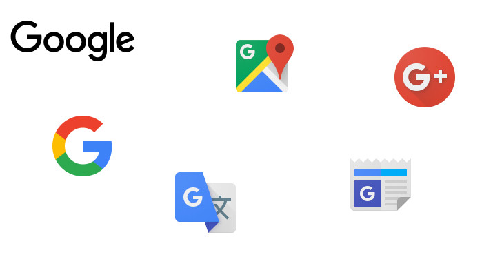
I'm sure Groupon will be just thrilled to see all the Google app icons updating to contain a bold, sans-serif letter G.
http://www.androidpolice.com/wp-content/uploads/2015/09/nexu...
201–210 of 447 posts
http://www.androidpolice.com/wp-content/uploads/2015/09/nexu...
Wow, this is an very bold and risky move. The familiarity with the Google search prompt plays a significant role in user retention. Is this a sign of Google worrying about their current situation?
I myself do not like this redesign, but I also did not like the old one. I am basically very averse to changes like this (probably a mental issue). I also do not like how Chrome hijacks the window style, or how Android automatically updates to a new Youtube app with a drastically new UI. I am probably a minority though, and still capable to use custom styles to change the logo back to the old "Backrub" logo, but I wonder if there are more who see these major redesigns as an invasion of sorts into their daily routines. Just as you created a mental map of the application, they change the location of the buttons, or show a different favicon.
If it is not too much to ask (or risky to maintain), think of keeping an "old.*.com" domain. There are users who will gladly make use of that. Being able to use your own design, or turn off "with this new logo we save 9999 bytes on mobile" distractions is also UX. And it would be good UX for me.
With this new logo, for me, the counter now starts at zero for Google. A clean slate. For all I care they may be the Facebook they so desperately desire to mimic.
Google's userinterface, in gmail.com, at least, has gotten progressively worse, and worse, and worse, and worse since its inception in my experience and everyone I've asked about this. ... don't know what else to say. I question if their designers use their own products. Latest bugs worth mentioning: Chrome still has an issue that can cause microphone to not work in Hangouts. Gmail.com has added a "Your plug-in googl…
Google maps is incredibly frustrating to use. I can't understand what user testing they do.
Google's userinterface, in gmail.com, at least, has gotten progressively worse, and worse, and worse, and worse since its inception in my experience and everyone I've asked about this. ... don't know what else to say. I question if their designers use their own products. Latest bugs worth mentioning: Chrome still has an issue that can cause microphone to not work in Hangouts. Gmail.com has added a "Your plug-in googl…
Google maps is incredibly frustrating to use. I can't understand what user testing they do.
Google's userinterface, in gmail.com, at least, has gotten progressively worse, and worse, and worse, and worse since its inception in my experience and everyone I've asked about this. ... don't know what else to say. I question if their designers use their own products. Latest bugs worth mentioning: Chrome still has an issue that can cause microphone to not work in Hangouts. Gmail.com has added a "Your plug-in googl…
Google maps is incredibly frustrating to use. I can't understand what user testing they do.
Earlier quoted context omitted.
I think these things might make a small difference but overall it's not important. I view Heineken as a boring lager which has little character, probably due to being produced in industrial quantities. A jaunty 'e' isn't going to fix that. Same for google. So long as they continue to bang out appropriate search results I'm with them. Right until they don't.
Logo design and typography are intended to affect you subconsciously, not consciously. That tilted 'e' is meant to advertise the brand in the middle of dozens of other logos in the store, and draw consumers in from that myriad of choices based on psychological cues and associations they may not even be aware of. The effect is important in aggregate - some large number of potential customers conditioned over a lifetim…
Objective support for this hypothesis is thin on the ground.
In reality logos are nowhere near the top of the list of factors that drive a buying decision. Whatever bounce effect businesses get from a new logo can usually be explained just as much by novelty as by implied psychological voodoo.
Generally, I'm suspicious of management-by-logo. When I see logos being updated at vast expense for no good reason, I worry about the direction a company is heading in.
Google's userinterface, in gmail.com, at least, has gotten progressively worse, and worse, and worse, and worse since its inception in my experience and everyone I've asked about this. ... don't know what else to say. I question if their designers use their own products. Latest bugs worth mentioning: Chrome still has an issue that can cause microphone to not work in Hangouts. Gmail.com has added a "Your plug-in googl…
Google maps is incredibly frustrating to use. I can't understand what user testing they do.
Google's userinterface, in gmail.com, at least, has gotten progressively worse, and worse, and worse, and worse since its inception in my experience and everyone I've asked about this. ... don't know what else to say. I question if their designers use their own products. Latest bugs worth mentioning: Chrome still has an issue that can cause microphone to not work in Hangouts. Gmail.com has added a "Your plug-in googl…