Live data from Hacker News

Hack: A typeface designed for source code

sourcefoundry.org

231–240 of 249 posts

Re: Hack: A typeface designed for source code

#231

Earlier quoted context omitted.

But is rare that you're the only one changing and using the code. Fixed width code looks similarly aligned on all systems with fixed width fonts. A code written in Helvetica would render bizarro on an editor running Futura.

> A code written in Helvetica would render bizarro on an editor running Futura. Don't be so sure of that. If you were to load any of my code in your favorite editor and font, you would never know that I wrote it in a proportional font or what font I used. It would just look like ordinary well-formatted code. The reason is simple: I don't use column alignment at all. Column alignment is the only reason that code forma…

That is interesting. How exactly do you format your code? I'm super curious. Maybe a code sample? :)
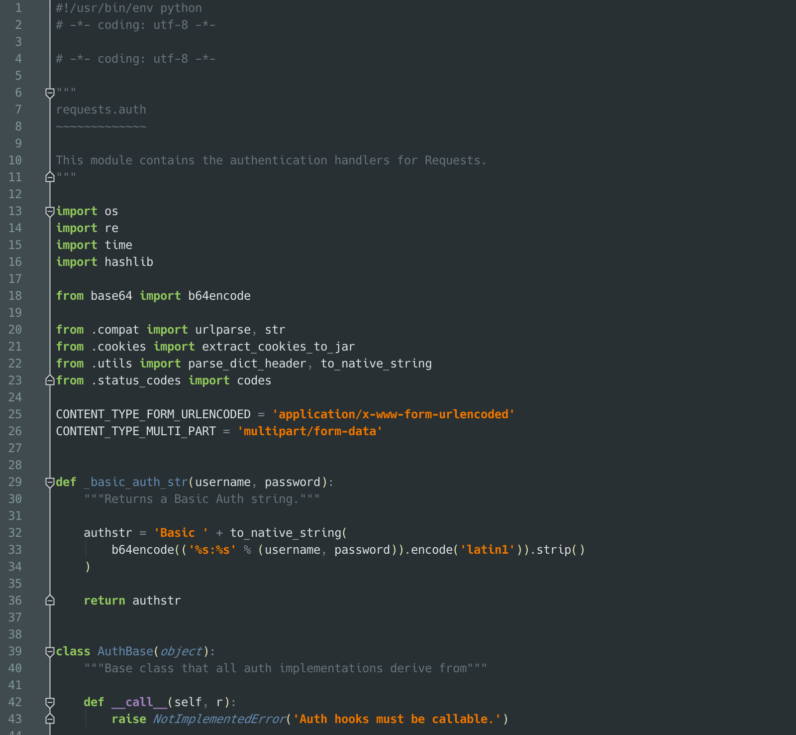
Re: Hack: A typeface designed for source code

#233
post #73

I'm slightly surprised that almost nobody here uses Menlo or Monaco, even though several screenshots in the thread are clearly made on OS X. I'm curious why that's the case. Do people generally dislike the system-provided fonts or are the alternatives considered "better"?

Yes, Menlo is my go-to font, I use it in the terminal and with Xcode. Always had.

Re: Hack: A typeface designed for source code

#234
post #51

Hack is DejaVu sans mono. Below is a gif I took switching between DejaVu sans mono and Hack. Aside from line height I fail to see the difference. http://gfycat.com/SomberUnitedGermanshepherd

So that's why my editor is not changed at all after using Hack, I feel guilty blaming my editor, I thought it's broken.

Re: Hack: A typeface designed for source code

#237

Why does source code have to be shown in fixed width? I've been using non-fixed width fonts for about a year now and I find it much nicer on the eyes. The only downside I've found is that sometimes things don't line up quite as nicely, which is purely cosmetic.

Proportional is still very contreversial. A few of us have made the transition, and won't go back to fixed-width, but many value the ability to do ASCII art (aka space-based alignment). Other than that, there is absolutely no advantage to using a type writer font on a modern display.

I've been using a proportional font since the beginning of the year. It took one week to adjust (things look weird for a few days).

I tried the Input font time ago and didn't like the way it looked, but maybe I have to fiddle with its settings and find a way to make it look nicer. I'm using DejaVu Sans inside emacs now. The only shortcomings with the font are that l (lowercase el) and I (uppercase I) to be indistinguishable, but it's rare that they cause trouble. Uppercase o and zero are distinguishable (zero is narrower), but maybe a marker inside the zero would be handy. Not sure about that. Context usually is enough to make them apart.

Overall a page of code formatted proportionally is much nicer to look at than a monospaced one, so I'm not going back.

It would be nice for editors to support alignment with proportional fonts inside lines (see http://nickgravgaard.com/elastic-tabstops/). Maybe this is not going to play with Python and similar languages but automatic transformation of spaces into tabs and vice versa has been around for years and we have more CPU cycles than we need now.

Re: Hack: A typeface designed for source code

#238

No one has yet mentioned the ultimate hacker font -- Glass Tty VT220: http://christfollower.me/misc/glasstty/ Then there's UW ttyp0 for those who still prefer their fonts bit-mapped: http://people.mpi-inf.mpg.de/~uwe/misc/uw-ttyp0/ And UniVGA, an emulation of the VGA font that provides much of Unicode (useful for a little Turbo Pascal nostalgia trip with an appropriate color theme, or the FPC IDE): http://www.inp.nsk…

ttyp0 is way better than Terminus, which is so popular among Linux/Unix people. But if the world ever goes HiDPI, I guess bit-mapped fonts will die out.

> But if the world ever goes HiDPI, I guess bit-mapped fonts will die out.

No, it's the other way around. Anti-aliasing is a hack to make low-res displays slightly more palatable. Once the resolution gets good enough, there's no point in anti-aliasing your fonts anymore, and bitmaps start making a lot more sense.

Re: Hack: A typeface designed for source code

#239

No one has yet mentioned the ultimate hacker font -- Glass Tty VT220: http://christfollower.me/misc/glasstty/ Then there's UW ttyp0 for those who still prefer their fonts bit-mapped: http://people.mpi-inf.mpg.de/~uwe/misc/uw-ttyp0/ And UniVGA, an emulation of the VGA font that provides much of Unicode (useful for a little Turbo Pascal nostalgia trip with an appropriate color theme, or the FPC IDE): http://www.inp.nsk…

If you're going for "Hollywood Hacker", a huge green OCR-A font is also pretty great.

http://i.imgur.com/dg5oMqS.png

Re: Hack: A typeface designed for source code

#240
post #13

I desperately want to find a new code font to love but I always return to Consolas.

Here is a very different font: https://github.com/mikekchar/MUmePlusGothic I sometimes need Japanese characters on the console, so I got in the habit of using this font. The only thing I did was return the backslash character to be an actual backslash character (rather than yen symbol, which most Japanese fonts do). Sorry, I don't have a picture of it (and I couldn't even find a good picture because they only show Ja…

There seems to be an issue with its lowercase "g" (Sublime Text 3 on Windows 7): http://i.imgur.com/CWCcR60.png
Post reply on HN