Live data from Hacker News

The Hamburger Menu Doesn't Work

deep.design

181–190 of 192 posts

Re: The Hamburger Menu Doesn't Work

#181

I hate the Nondescript Icon Movement. The Hamburger should die together with Three Dots, Angle Brackets and other geometric shapes that have a chutzpah to call themselves icons. Not to mention they killed the Tooltips! These things don't appear in the vacuum - the Hamburger Menu originated from the Celtic Knot Menu, which was originally at the end of the Ribbon. The Ribbon itself confused the use cases of the Menu an…

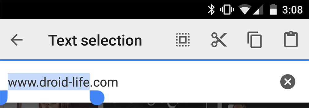
The one thing that frustrated me the most about Android was being confused about what the icons meant, especially when trying to copy text[1].

Select text > Think for a few seconds about which one of these similar looking icons means "copy" > press buttons until I figure it out.

[1] http://www.droid-life.com/wp-content/uploads/2015/02/cut-cop...

Re: The Hamburger Menu Doesn't Work

#182

> "and it’s consistent with the logic of the progressive disclosure design pattern." And this is the crucial misinterpretation. Progressive disclosure as defined and used by Xerox is about objects and related actions. And it's all about visible objects! [1] (Mind the classic example of a square in a drawing application: Clicking the shape discloses editing functions and displays handles to size the object.) And here…

[continued] To put this more clearly:

The hamburger icon/menu introduces a metaphor of its own that is not consistent with progressive disclosure as used elsewhere in common interfaces (see above). It's more a "and here is the rest that you may be missing"-icon that isn't motivated by any consistent notion of the interface, but by concern for screen real estate. As a user, we may not assume the content of the menu, but by empirical knowledge and by considering functions that we are missing and that may be hidden somewhere.

The hamburger menu _is_ the application. It's content may be related to only by expectation and assumptions regarding the extent of the application's basic functionality. Arguably, in the light of this considerations, the icon is communicating rather sparsely what it is and what it does. (Actually, it exposes a global, unrelated view on the basic extent of the app.)

While its use may be arguable for an application (esp. mobile apps), it's highly problematic, when used in web sites and web applications. (The difference: While in the former case it's located rather in the window chrome, thus relating to the viewport as an object, it's part of the view in the latter – like a wormhole to the global context.)

Re: The Hamburger Menu Doesn't Work

#183

Earlier quoted context omitted.

>people who are not you are confused by it and don't understand it This is the history of computers and users. So many technologies that seem completely intuitive now started out just like this. being confused by it and don't understand it is only a problem if stays that way like shortcut key combos. Hamburger menus are like "right click". it's not that bad and when people have seen it a few times it won't be some co…

People still don't understand right click. Hate to break this to you. UI that isn't clear and visible on the screen is unhelpful UI.

Yet oddly we appear to be going down a route where UI is hidden a lot:

a. long-press on a touch-screen device to select text, show a menu etc.

b. buttons with hieroglyphics to indicate what to do (worse than the old floppy disk for save) - eg. iOS' share button is a box with an arrow going into it (which is confusing to me as I do not want to put my concept into a box - I want to share it OUTSIDE my box of a device).

c. Sliding from sides of the screen to show notification areas, control panels (iOS), or "split screen" apps (Samsung Note), or charms (Windows).

d. Using different gestures to do things like take screenshots on Samsung note devices (swipe your entire hand across the screen)

e. Hiding UI elements until something is done, eg. scrollbars on OSX by default until you scroll (which you would need the scrollbar to actually do...)

They are all very simple once you know them but it must be very difficult as a first-time user, particularly if you are an older first-time user where your ability to absorb information like a sponge is diminished.

Every couple of years interaction is reinvented it seems! This differs from the decades of computer use where the only massive changes were scrollwheels on mice.

Re: The Hamburger Menu Doesn't Work

#184

I hate the Nondescript Icon Movement. The Hamburger should die together with Three Dots, Angle Brackets and other geometric shapes that have a chutzpah to call themselves icons. Not to mention they killed the Tooltips! These things don't appear in the vacuum - the Hamburger Menu originated from the Celtic Knot Menu, which was originally at the end of the Ribbon. The Ribbon itself confused the use cases of the Menu an…

The one thing that frustrated me the most about Android was being confused about what the icons meant, especially when trying to copy text[1]. Select text > Think for a few seconds about which one of these similar looking icons means "copy" > press buttons until I figure it out. [1] http://www.droid-life.com/wp-content/uploads/2015/02/cut-cop...

Android buttons can have hints associated with them, so if you long-press on a button, a tooltip/hint will be presented (if the developer bothered adding tooltip text)

Re: The Hamburger Menu Doesn't Work

#185

Chrome has a hamburger menu, even on a huge desktop screen with plenty of room for a proper menu. OSX has an excellent universal menu which, due to consistent placement, behaviour, and content, provides a high level of usability. Chrome's hamburger menu duplicates some - but not all - of its functionality, and includes some bonus functions not available in the main menu at all. It also has a submenu named - and you m…

Weirdly, the shortcut for this menu on Windows is......

drumroll please....

alt-F, like it is the File menu.....

Re: The Hamburger Menu Doesn't Work

#186

Before hamburger menus became popular, weren't people complaining about the exact opposite problem? That is, if you break out the menu items into more prominent interface elements (e.g., tab bar items), then you're at risk of cluttering your visual design with less-common functions. As in all things design, I suppose a balance needs to be found, but I personally don't find anything wrong with a hamburger menu per se.…

> I personally don't find anything wrong with a hamburger menu per se. The trouble, which the article describes with some case studies on engagement before and after hamburger menu implementations, is that people who are not you are confused by it and don't understand it to be a menu. fwiw, I've encountered this quite a bit when helping users switch from Internet Explorer to Firefox or Chrome -- both of which use the…

> bookmark a page

Last I checked bookmarking a page is just clicking the star button to the right of the search bar. Though maybe Firefox on Windows has a different UI nowadays. You could also (still, thankfully) just enable the menu bar in Firefox.

Re: The Hamburger Menu Doesn't Work

#187
omfg how much crack did you smoke before you wrote that piece of .. text

"Let’s end the hamburger era" -- this kind of recommendation/ motivational stuff is what is wrong with the world. You don't like something, YOU don't do it. Don't force your ideas upon others, no matter how good you think they are.

Waste of internet space blog.

Re: The Hamburger Menu Doesn't Work

#188
post #166

Earlier quoted context omitted.

Ok, ok. How about these buttons? [Select] [DO!] [Context] You're right of course. At some point a trade off has to be made among usability, discover-ability, and simplicity. (Pick any two). Adding another button reduces simplicity, but enhances the other two. Apple's one-button mouse—at the other extreme—makes things simple and discoverable, but often not as useable as I'd like. I still don't know how OSX's equivalen…

I do think using three buttons are good -- I'm not so happy with the classic "Xerox Parc/Smalltalk" layout -- I'd prefer to have a button on the thumb (like many logitech mice have) and a scroll-wheel in the middle that's not a button. Which leaves us with a bit of a problem for touch screens. While it might be ok to demand users to learn one and two-finger touch -- three finger touch might be going a bit too far...…

I used to use an MX Revolution mouse[1] that had what you describe. Multiple thumb buttons, that amazing flywheel scroll wheel, that other thumb wheel. I loved that mouse.

Unfortunately I love trackballs more than mice now, and am severely limited in my choices. The Trackman is nice, and has a couple of extra buttons, but it would be so nice to have something close to what I had with that Revolution mouse.

In response to your comment above, no I wasn't being ironic :). I'm sure I've seen similar schemes before that informed my "idea", though.

[1] http://www.amazon.com/Logitech-Revolution-Cordless-Laser-Mou...

Re: The Hamburger Menu Doesn't Work

#189
Regarding NBC, their failure wasn't in the hamburger menu itself. They didn't use it properly.

Their design had what looks like a menubar which is the precise anti-pattern to a menu-button. Those items, and what is showing already as top page content, is guaranteed to catch everyone's attention first. Those menu-button items are not only hidden and require an extra click, by design they have been made less important. And since so many sites have de-cluttered themselves by simplification, users' first impression is that they got rid of everything for the better... except it wasn't what they did, so basically everything under that menu was unreachable.

Two things would have been better. First, they could have kept the menu icon but had it expanded on the top page so that people would see those items as top page content, and also make the intuitive connection that there was a button that's associated with them. When the reader goes deeper, the menu items could then safely be hidden, with the user intuitively fetching them via the button as needed. Second, they could have given the button a name, instead of use the icon. For example, Amazon's "shop by department" button is the equivalent of NBC's hamburger menu. But since they have a menubar, instead of having a menu-button on a menubar, they put a menu-item instead by giving it a name and an equal member of the top selection. This upholds the primary design pattern in use.

NBC's designers went for the hamburger without knowing how to use it or understanding what made it popular. You cannot mix competing philosophies and color is no substitute for broken intuitions. Even now that they settled for the menu-bar, they don't have an at-state, under "more" we see the same items in the menu in different order, and they use the pinned menu that doesn't go away even when you scroll -- a design already falsified by the frame paradigm of 1999.
Re: The Hamburger Menu Doesn't Work

#190
I'm surprised no-one has mentioned Android version 2 (vintage), which had a hamburger menu as a physical/soft button. It was then ditched and replaced with a app switcher button.

That hard button was even better from a real estate point of view, and since it was consistent across all apps it seems like users ought to have grasped it.

The surprising and important thing here is that, even if the user knows the menu is there and that, if asked, it could help them, it doesn't appear salient and doesn't get clicked.

Post reply on HN