Global land temperatures since 1900 visualized
1–10 of 35 posts
Re: Global land temperatures since 1900 visualized
#2Interesting idea, and great visualization. I do think that the timeline controls could be smoother (more refined).
Winters are more exciting imo - but there is no way to copy a URI for a specific time :(.
Re: Global land temperatures since 1900 visualized
#3Interesting idea, and great visualization. I do think that the timeline controls could be smoother (more refined). Winters are more exciting imo - but there is no way to copy a URI for a specific time :(.
You mean something like http://halftone.co/projects/temperatures/date/2003/4? Good idea, thanks!
Re: Global land temperatures since 1900 visualized
#4Interesting idea, and great visualization. I do think that the timeline controls could be smoother (more refined). Winters are more exciting imo - but there is no way to copy a URI for a specific time :(.
You mean something like http://halftone.co/projects/temperatures/date/2003/4 ? Good idea, thanks!
FYI: I get a 404 on this link.
Re: Global land temperatures since 1900 visualized
#5Possibly the coolest loading screen I've seen.
It would be nice to have a "play" button that automatically goes 1 year back every second or something like that.
Re: Global land temperatures since 1900 visualized
#6Possibly the coolest loading screen I've seen. It would be nice to have a "play" button that automatically goes 1 year back every second or something like that.
Good to see your comment. I thought my machine was just too slow.
Re: Global land temperatures since 1900 visualized
#7Earlier quoted context omitted.
You mean something like http://halftone.co/projects/temperatures/date/2003/4 ? Good idea, thanks!
FYI: I get a 404 on this link.
I don't think he was sarcastic, he probably really meant that such shortcut urls are good ideas and thanks the parent for it.
Re: Global land temperatures since 1900 visualized
#8Its great - but as far as I can see the north was cold the south was hot until 1990, then the north heated up.
I assumed it was much smoother over the century.
Ok, we're all boned. Impressive visualisation - what did you use - can you do a post on how you built it?
Re: Global land temperatures since 1900 visualized
#9Its great - but as far as I can see the north was cold the south was hot until 1990, then the north heated up. I assumed it was much smoother over the century. Ok, we're all boned. Impressive visualisation - what did you use - can you do a post on how you built it?
make sure that you have it on the same month for each year sampled. The dragbar actually changes both year and month. If you instead use the dropdown menu to change the years, it's much more difficult to discern any warming
Re: Global land temperatures since 1900 visualized
#10Its great - but as far as I can see the north was cold the south was hot until 1990, then the north heated up. I assumed it was much smoother over the century. Ok, we're all boned. Impressive visualisation - what did you use - can you do a post on how you built it?
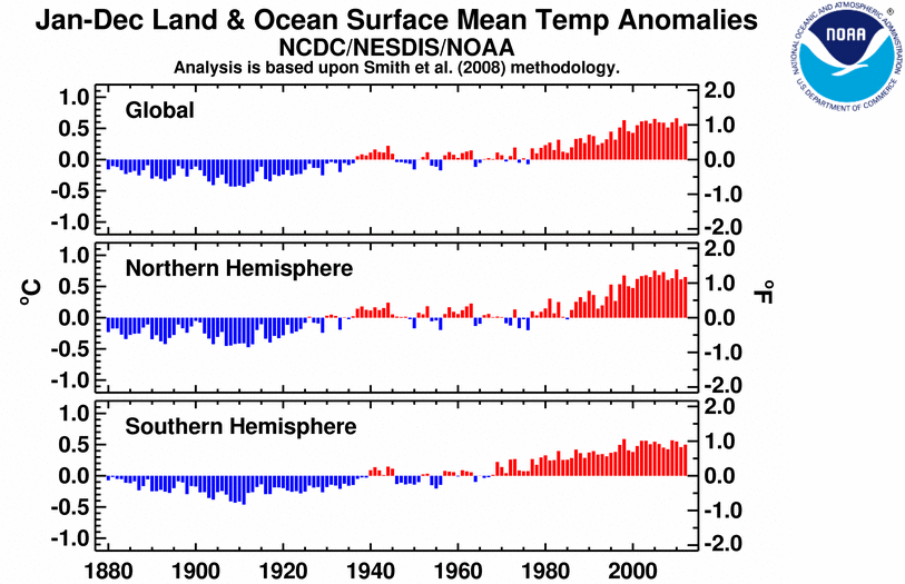
It's not as pretty, but NOAA's single graph looks smoother for both hemispheres[0]. Then again, one's an average of an anomaly, the other is averages of real temperatures.
[0]http://www.ncdc.noaa.gov/sotc/service/global/lo-hem/201201-2...