Better text rendering in Chromium-based browsers on Windows
developer.chrome.com
Better text rendering in Chromium-based browsers on Windows
1–10 of 133 posts
Re: Better text rendering in Chromium-based browsers on Windows
#2Chromium on linux has a similar issue, white text / dark background, very noticeable on low DPI 1080p screens
You can instantly notice it when you try to read comments on youtube (w/ dark theme)
Re: Better text rendering in Chromium-based browsers on Windows
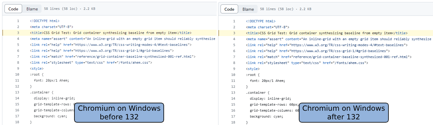
#3I feel like the before/after picture is a prank. I can’t tell a difference, at least looking at it on my iPad.
Re: Better text rendering in Chromium-based browsers on Windows
#4I had noticed this in Chrome, and it always irked me! I definitely can see the difference.
Re: Better text rendering in Chromium-based browsers on Windows
#5I feel like the before/after picture is a prank. I can’t tell a difference, at least looking at it on my iPad.
The text looks fatter / darker on the right
Re: Better text rendering in Chromium-based browsers on Windows
#6I feel like the before/after picture is a prank. I can’t tell a difference, at least looking at it on my iPad.
If you look at the non-highlighted black text, in the new version - the text is darker. I agree it's minor, but it's definitely darker.
https://developer.chrome.com/static/blog/better-text-renderi...
Note: I'm not affiliated to Chromium in any way.
Re: Better text rendering in Chromium-based browsers on Windows
#7I feel like the before/after picture is a prank. I can’t tell a difference, at least looking at it on my iPad.
The text is just higher contrast, if you pull out a color dropper tool or zoom way in on the text you can see the after image has darker text
Re: Better text rendering in Chromium-based browsers on Windows
#8I feel like the before/after picture is a prank. I can’t tell a difference, at least looking at it on my iPad.
[deleted]
Re: Better text rendering in Chromium-based browsers on Windows
#9I feel like the before/after picture is a prank. I can’t tell a difference, at least looking at it on my iPad.
It's a very subtle difference but noticeable in the anti-aliasing.
I don't have Windows right now, so I haven't tested if the change's closer to Firefox - but Firefox always had some heavy antialiasing on Windows, which I wasn't a fan of.
Re: Better text rendering in Chromium-based browsers on Windows
#10I feel like the before/after picture is a prank. I can’t tell a difference, at least looking at it on my iPad.
To me the one on the right looks slightly darker/bolder, but not qualitatively better. The stems on the letter "m" in "<meta" in lines 2 and 4 are badly hinted (smeared/mushy looking), and drawn differently even though they're in the same horizontal position in both lines.