Minimalist renditions of international brands
1–10 of 22 posts
Re: Minimalist renditions of international brands
#2These look really good on a solid black background. On a supermarket shelf with hundreds more, some would be downright eerie. Solid red wall of cereal boxes.
Re: Minimalist renditions of international brands
#3I'm most impressed with how progressively "upmarket" they become. You could charge multiples more for the minimal version in a different context.
As muji [1] is to a department store, the appropriate store for these would be to a supermarket.
I'm also reminded of the quote "Simplicity is the ultimate sophistication" (da vinci?)
[1] http://muji.us
Re: Minimalist renditions of international brands
#4I can't imagine being able to visually distinguish products in a grocery store selling these pared-down brands.
Re: Minimalist renditions of international brands
#5This is a pretty lazy foray into minimalism. It should be about breaking the product down to it's most basic components, not just removing the background layers of a psd.
Re: Minimalist renditions of international brands
#6These look really good on a solid black background. On a supermarket shelf with hundreds more, some would be downright eerie. Solid red wall of cereal boxes.
[deleted]
Re: Minimalist renditions of international brands
#7Maybe the reason the Nesquik box is bright yellow and has a colourful cartoon character on it is that kids in the supermarket who might not be able to read or differentiate Arial from Helvetica can still recognise, point to and blackmail their parent with tears to grab the box with Nesquik bunny which they've seen on the TV. This seems to be design in a vacuum.
Re: Minimalist renditions of international brands
#8The Schweppes and Lindt ultra-minimalist designs are really good. They retain all the brand recognition while removing all cruft. The other ones aren't bad, but they're not great.
Re: Minimalist renditions of international brands
#9Reminds me of the "No Name" Brand in Canada (maybe local to certain provinces; Google Images: tiny.cc/nonamepics). It's interesting because the brand has purposely gone minimal. It's easily distinguishable treatment and lack of loud elements actually make them much more distinguishable in supermarkets.
Despite what some have said, I think in general these are done fairly well. Some are great, some are worse, but overall it's decent.
Re: Minimalist renditions of international brands
#10I think the Corn Flakes example (http://static.dezeen.com/uploads/2010/12/dzn_Minimalist-Effe...) is a good example of how this approach of minimalism for grocery type consumer products does a lot of damage.
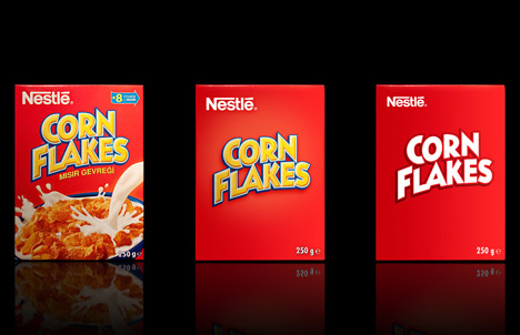
Yes, across the board we still know what the product is but the feelings and the senses of the brand are gone. The Corn Flakes doesn't look like a yummy breakfast anymore. It might as well be the cover of a super hero mag. As already mentioned, the product is no longer unique. It might as well be the store brand.
This isn't effective brand minimalism (in my naive opinion). It's packaging minimalism (minimizing printing costs).