Breaking the physical limits of fonts
github.com
Breaking the physical limits of fonts
1–10 of 24 posts
Re: Breaking the physical limits of fonts
#2One could actually learn to read these five pixel characters. Amazing
Re: Breaking the physical limits of fonts
#3One could actually learn to read these five pixel characters. Amazing
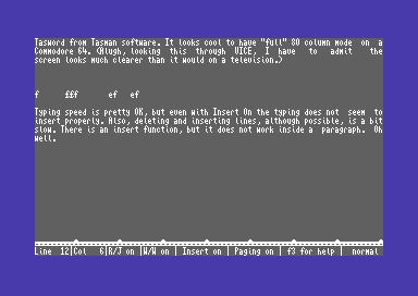
Not so amazing for those who, tired of the 40-column limit of their Commodore-64 or similar machine, took to such tricks to get up to 80 columns of text on screen (e.g. SpeedScript did this [1] as did TASword [2]). Was it easy to read? No, it wasn't. It was hardly readable to be honest but it did make it possible to get a full line of text on the screen.
[1] https://archive.org/stream/1987-12-computegazette/Compute_Ga...
[2] https://2.bp.blogspot.com/-g2rIQtaJyKE/V2VO_lF88vI/AAAAAAAAB...
Re: Breaking the physical limits of fonts
#4DPI scaling can ruin this effect too. Sub-pixel rendering is really a game for mature font renderers unfortunately.
Re: Breaking the physical limits of fonts
#5One could actually learn to read these five pixel characters. Amazing
Not so amazing for those who, tired of the 40-column limit of their Commodore-64 or similar machine, took to such tricks to get up to 80 columns of text on screen (e.g. SpeedScript did this [1] as did TASword [2]). Was it easy to read? No, it wasn't. It was hardly readable to be honest but it did make it possible to get a full line of text on the screen. [1] https://archive.org/stream/1987-12-computegazette/Compute_G…
Meanwhile, those of us still slumming it on our TI-99/4As were stuck with a word processor that didn't even try. Not only was TI-Write stuck in 40- (or perhaps 32-) column mode, but they didn't even bother changing the TI's default font, which mapped lowercase code points to small-cap glyphs, making text look nasty, hard to read, and nothing like printed output.
The dedication and achievements of the Commodore community never cease to amaze me.
Re: Breaking the physical limits of fonts
#6this would be a nice easter-eggy way to watermark photographs.
Re: Breaking the physical limits of fonts
#7Earlier quoted context omitted.
Not so amazing for those who, tired of the 40-column limit of their Commodore-64 or similar machine, took to such tricks to get up to 80 columns of text on screen (e.g. SpeedScript did this [1] as did TASword [2]). Was it easy to read? No, it wasn't. It was hardly readable to be honest but it did make it possible to get a full line of text on the screen. [1] https://archive.org/stream/1987-12-computegazette/Compute_G…
Meanwhile, those of us still slumming it on our TI-99/4As were stuck with a word processor that didn't even try. Not only was TI-Write stuck in 40- (or perhaps 32-) column mode, but they didn't even bother changing the TI's default font, which mapped lowercase code points to small-cap glyphs, making text look nasty, hard to read, and nothing like printed output. The dedication and achievements of the Commodore commun…
Weren't you able to change fonts?
Re: Breaking the physical limits of fonts
#8It certainly tested the physical limits of my aging eyes. The version on the poorly-calibrated display was a good bit easier to read than that on the well-calibrated display.
Re: Breaking the physical limits of fonts
#9This is really cool.
Re: Breaking the physical limits of fonts
#10Related submission on Millitext from 5 months ago, over 240 points, over 50 comments :