Live data from Hacker News

It's hard to justify Tahoe icons

tonsky.me

841–850 of 984 posts

Re: It's hard to justify Tahoe icons

#841

Earlier quoted context omitted.

Did they commit to additional production of the Vision Pro? I read their announcement as quiet cancellation of VR products. They announced some kind of vaporware pivot, but I didn't read a single analyst projection that Apple ever intended to bring another wearable to market. Customer usage statistics of the Vision Pro are so low Apple hasn't even hinted about reporting on them. Wearable products, outside of headphon…

> outside of headphones, have a decade-long dismal sales record Outside of headphones and watches

Do they sell many Apple Watches? Maybe it is an euro thing but I only very rarely see people wearing one.

I would see 9 garmins for 1 Apple Watch for instance and many more people wearing cheap casios or no watch at all.

Re: It's hard to justify Tahoe icons

#842
post #640

Earlier quoted context omitted.

That statement is just 100% demonstrably false. I don't think anyone seriously believes Uber, Airbnb and Robinhood won because of "beautiful apps".

"Beautiful" maybe, not "good UX" for sure. Prior to Uber, calling a cab using the phone app was...suboptimal and easier to actually call a taxi company. They also provided much better services, which is what make them stick around. RH made a lot of investment tool accessible to people that "I just want to buy stock of some company", I used tasty trades for a while, but their mobile app while has all functionality, bu…

The point still stands. The improvement in "usability" in those three cases did not come from app UI/UX.

Re: It's hard to justify Tahoe icons

#843

500+ comments and no one's mentioned the jack of all trades "share" button? I would really love to see the internal metrics around how many users press share because they're actually sharing something versus wanting to use any one of the myriad of other functions it hides. Exhibit A: In Safari I had to "share" this page to use the "Find on Page" feature to search whether anyone had mentioned the share button yet. Bon…

> Exhibit A: In Safari I had to "share" this page to use the "Find on Page" feature to search whether anyone had mentioned the share button yet. Bonkers. You can also long-press on the address bar to see a whole slew of even more hidden functionality

It's very hard to reply without making a snarky sarcastic comment at Apple's expense. Thanks for sharing that super intuitive interface trick, it's so obvious now I know it's there.

(seriously though, thanks).

Re: It's hard to justify Tahoe icons

#844
I have a different theory for the current enshitification we see. When OS updates became free Apple and Microsoft stopped caring about what customers want and what will sell. This allowed them to do whatever they wanted without repercussions. OS updates automatically and the new UI is forced on you along with the terrible UX taped on top. Every app and API was geared to the latest OS version alone for developer simplicity and this added to the pressure on the end customer. I don't know how this loop ends, but this sucks.

Re: It's hard to justify Tahoe icons

#845

Earlier quoted context omitted.

I worked at Uber. The UX designers were pretty obsessed with the iPhone app, making sure it was pixel perfect and the little cars in the city view moved smoothly and every transition was crisp and so on. The vast majority of new users at the time were on the comparatively ugly Android app. Things got pretty bad. More than 95% of all employees (and I'm guessing 99% of designers) were using iPhones at the time. There w…

Using the term "Legacy Taxi" to imply that a taxi you don't summon by phone is somehow out-dated is wild. I understand the reason you would use it, especially at a company like Uber, but it still seems hilariously delusional.

I've never worked for Uber and I see the old model as a barbaric non-starter, why on earth would I want to flag a car down instead

Re: It's hard to justify Tahoe icons

#846
post #830

Earlier quoted context omitted.

marketers are not designers and vice versa. of course the press release is going to be melodramatic no matter what the designers thought, or were told

“Marketers are not designers” is fine, except it was the designers themselves pushing the marketing drivel in those videos.

Who was driving that, though? If the project has high-level management buy-in, the people in the scripted videos are going to be on message if they want to stay employed.

Re: It's hard to justify Tahoe icons

#847
post #724
post #476

Earlier quoted context omitted.

100% this. I recall watching their launch video about Liquid Glass. It was filled with ego-driven "we're changing the world here" nonsense. They were designing in a bubble and wanted to do something different so they could justify the work. It was never about the user.

My hot take on this is that there is a business goal to Liquid Glass that extends beyond ego - but it's about the restoration of Apple UI as an exclusive status symbol, not as a usable experience. Apple looked at innovations in hardware form factor and, rather than trying to out-innovate in that sphere, said, instead: how do we make something in software that nobody would ever try to imitate, and thus position oursel…

we saw this exact playbook with ios 7. i don't think you need to attribute malice or read into it much.

ios 7 relied heavily on blurring effects-- a flex at the time due to the efficient graphic pipeline vs android they had. this was coming off the heels of Samsung xerox'ing and they wanted a design that would be too expensive for competitors to emulate without expensive battery hit. liquid glass is following in this tradition.

and similarly to ios 7, the move to flat design was predicated on the introduction of new form factors and screen. flat design lent itself well to new incoming screen sizes and ratios. prior there was really one or two sizes and that was it, easy to target pixel perfect designs against. as apple moves to foldables and more, this design flexibility is once again required.

as for no one trying to emulate it, i'm not so sure, OriginOS 6 ripped it off back in October.

Re: It's hard to justify Tahoe icons

#848
post #455

Earlier quoted context omitted.

> If a PM tells you to shove a UI style More than likely designers are making up work to justify their jobs. Not good for your career if you admit the desktop interface was perfected in ~1995.

This. The Windows 95 interface was optimal in many regards. Given how much faster computers are now, every UI operation should just be instantaneous. It's ridiculous that desktop interfaces and Web pages became heavier as computers got faster, so that a heavy website today does not load meaningfully faster than a plain text webpage in 1995. Edit: On Linux, you have desktop environments like LXQt for this. Unfortunate…

Even Gnome and KDE can feel much snappier if you remove effects and animations.

Re: It's hard to justify Tahoe icons

#849

I like seeing the icons. It helps me pick the right thing without reading. Seems easier for me.

You can’t read?

This violates Hacker News guidelines. HN explicitly asks users to be respectful and avoid personal attacks or insults. Responding with “You can’t read?” is a direct insult, adds no substantive discussion, and detracts from the conversation.

Try harder.

Re: It's hard to justify Tahoe icons

#850
post #739

Earlier quoted context omitted.

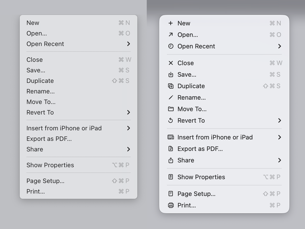
> most of your points are refuted in the article Sure, we can debate about the general points. Yet, we can't refute that my subjective opinion evaluation of the opening image looks better (for me) , reads better (for me) and is easier (for me) to parse. Either I don't fit the general guidelines, or the general guidelines need a revision, that's my point overall.

Well - that's just your --- opinion, man. But answer me this. You say "but most [but not all? - interesting] of the icons do make it easier, faster and more pleasant for my brain to parse the menu vs no icons." How does a list of icons that are used inconsistently, duplicated, used in other places, sometimes used and sometimes not used, not to mention illegible, positioned inconsistently, go directly against the broa…

> of the reasons I use Apple systems was they had the UI stuff nailed down (...) Lately it's just a mess

I have never daily driven an Apple device, so I can't comment on this; but from what I seen I do agree that Apple UI has not been as consistent lately.

> ps I assume by the opening image, you mean the first screenshot supplied by the author of the article

Yeah, sorry about that; that's correct, that's what I'm referring to. To remove ambiguity: https://tonsky.me/blog/tahoe-icons/sequoia_tahoe_textedit@2x...

> How does a list of icons that are used inconsistently, duplicated, used in other places, sometimes used and sometimes not used, not to mention illegible, positioned inconsistently, go directly against the broad (reasoned) rules of the Apple HIG, help 'make it easier' as you say?

Sure! First of all, I'm only commenting on the FIRST image of the blog. There are no duplicated images in it. The icons appear consistently used in that image (maybe export to PDF looks a bit off, but this is a pattern that I have seen repeated on other apps, so I'm used to it). I'm not sure how the icons would look on the actual display, but they look alright on my 4K display as shown on the blog. I also can't comment on they being used "inconsistently" across other parts because I don't use Apple devices.

I'm making a very narrow claim: On the first image, if I compare the menu on the left, with the menu on the right, I prefer the menu on the right. I have tried to "find X" on a menu on the left and then repeat a similar exercise on the right; I am faster on the right and I am more confident on the right. My brain seems to be using the icons as a "fast lookup" and the text to verify the action.

Now, does this translate to all other menus? No! The "File" example he shows is super confusing. Also, it's possible I would prefer the less cluttered version with less icons. But for me (all icons) > (no icons) on that specific example.

I have not put enough mental energy to agree with the author on all of his individual suggestions across the article, but they look overall fine on the individual examples he provides. I'm just find the first example... not particularly compelling.

> Well - that's just your --- opinion, man

Well... Yes. But unless we objectively measure how I use the computer, that's the best we have got to evaluate my preference.

All my classes on human-computer interaction and design has always been about "listen to your users".
Post reply on HN