I don’t have anything expert to add here except this is somehow a shockingly difficult problem. When I boot into windows, the fonts especially in some applications look horrible and blurry because of my high DPI monitor. Windows has like 10 settings you can try to tweak high dpi fonts and man none of them look good. I think my Linux boot on the same machine has much better font smoothness and of course the MacBook is…
Fractional scales, fonts and hinting
81–90 of 117 posts
Re: Fractional scales, fonts and hinting
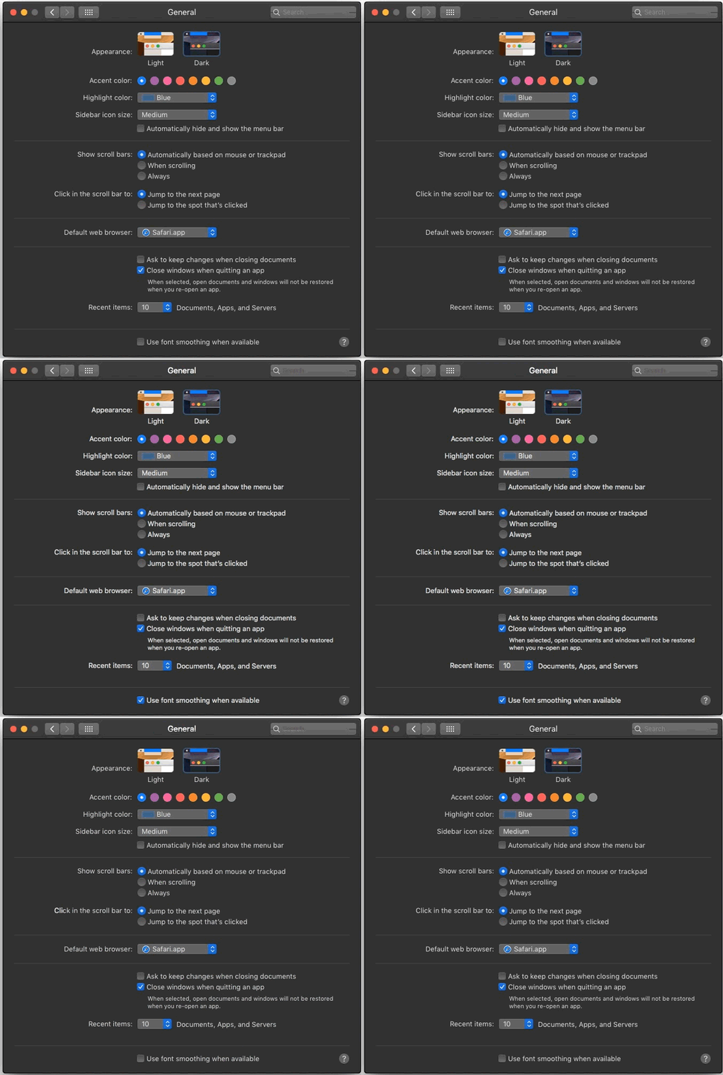
#82I don’t have anything expert to add here except this is somehow a shockingly difficult problem. When I boot into windows, the fonts especially in some applications look horrible and blurry because of my high DPI monitor. Windows has like 10 settings you can try to tweak high dpi fonts and man none of them look good. I think my Linux boot on the same machine has much better font smoothness and of course the MacBook is…
I guess we all have different issues we care about, but I'm always surprised when I have to point out how awful Windows is with fonts and people just shrug and say they didn't notice. For me it's painfully obvious to the point of distraction.
Re: Fractional scales, fonts and hinting
#83I wonder if we'll ever abandon resolution-based rendering for screens, instead using a PPI/DPI vector-based system? Since the 80s I've been wishing for a 300/600dpi resolution-independent screen. Sure, it's basically like wishing for a magic pony, but I was spoiled by getting a Vectrex[1] for a birthday in the 80s, and I really liked the concept. I know the Vectrex was a different type of rendering to the screens we…
I wish for this too. You can get tiny screens with that kind of pixel density. My ebook reader is 300ppi and my phone is almost 650ppi! It saddens me when I see people measuring things in pixels. It should all be measured relative to the font or perhaps the viewport size. The font size itself should just be how big the user wants the text which in turn will depend on the user's eyes and viewing distance etc. The size…
So software "pixels" are relative units now, but you would have them get larger or smaller as the user moves closer to or further from the screen? (I think I'm not quite getting it, sorry.)
Re: Fractional scales, fonts and hinting
#84Earlier quoted context omitted.
> Apple avoids trouble and work by always using HiDPI displays. Attach a MacMini to a non-HiDPI display and you could recognize that the font rendering is awkward. You may personally find the output awkward, but typographers will disagree. They didn't always have high density displays. They did always have superior type rendering, with output more closely matching the underlying design. Hinting was used, but they did…
I feel like youre arguing a different point here. I agree with the other person that hooking a macOS machine to a non-HiDPI monitor makes for an awkward (Id call downright bad) font experience, due to them having removed subpixel anti aliasing a few versions ago. It was so jarring to me that I took closeup pictures of the pixels, and they were all rendered really badly on a 1440p screen, to a degree that you can't cl…
[1] https://srdjan.si [2] https://bootcamp.uxdesign.cc/why-dark-mode-isnt-a-ux-panacea... [3] https://cdn.osxdaily.com/wp-content/uploads/2018/09/font-smo... [4] https://damieng.com/blog/2007/06/13/font-rendering-philosoph...
Re: Fractional scales, fonts and hinting
#85Haiku OS in my opinion solves this better by basing everything on default font size (in pixels). Eg it defaults to 12px, I used 20px for a 3840x2160 monitor. Some GUI widgets scale based on this. All text (when using be_default_font) scale based on this. Spacing / layout depends on this. The key difference (compared to a global x1.5 scaling factor) is that developers of each app decide how to use this information, so…
The real issue is that people want to be able to smoothly drag windows across monitors. This requires that each window be able to switch to a different DPI scaling when its "home" monitor changes. Something must also be done to deal with a single window being displayed across monitors with different resolution (which is what happens while dragging) though hardware scaling is probably acceptable there at some minor lo…
Re: Fractional scales, fonts and hinting
#86Honestly I'd love it if Linux just implemented a solution similar to what Apple does, which is rendering everything at 2x and then downscaling it to screen's native resolution. (So my "3008x1692" on a 4K screen is actually rendered at 6016x3384). Modern GPUs are strong enough to do this without breaking a sweat, and the result is very crispy and functional. Fractional scaling could still exist as a fallback for older…
That's what GTK used to do. The result looks much worse than fractional scaling, is much less crisp, uses a lot more battery, and means games run a lot slower.
Re: Fractional scales, fonts and hinting
#87Earlier quoted context omitted.
That's what GTK used to do. The result looks much worse than fractional scaling, is much less crisp, uses a lot more battery, and means games run a lot slower.
It is much more crispy for general graphics, with much less problem handling rounding errors and getting lost in antialiasing and fractions that you don't have a place to put into, since hardware does that for you globally for the entire framebuffer. It uses the same amount of battery power when done right (i.e. not using GPU, like GTK did, but the output encoder, like Apple does) and for games, compositors nowadays…
That said, the GPU and output encoder options chosen by Gtk3 and Apple have a major flaw: accelerated scaling is usually only available in sRGB colorspace, so you get either gamma-incorrect scaling or you need to fall back to a non-accelerated codepath.
Re: Fractional scales, fonts and hinting
#88Earlier quoted context omitted.
I wish for this too. You can get tiny screens with that kind of pixel density. My ebook reader is 300ppi and my phone is almost 650ppi! It saddens me when I see people measuring things in pixels. It should all be measured relative to the font or perhaps the viewport size. The font size itself should just be how big the user wants the text which in turn will depend on the user's eyes and viewing distance etc. The size…
> The font size itself should just be how big the user wants the text which in turn will depend on the user's eyes and viewing distance etc. So software "pixels" are relative units now, but you would have them get larger or smaller as the user moves closer to or further from the screen? (I think I'm not quite getting it, sorry.)
Re: Fractional scales, fonts and hinting
#89Earlier quoted context omitted.
The real issue is that people want to be able to smoothly drag windows across monitors. This requires that each window be able to switch to a different DPI scaling when its "home" monitor changes. Something must also be done to deal with a single window being displayed across monitors with different resolution (which is what happens while dragging) though hardware scaling is probably acceptable there at some minor lo…
This works seamlessly on Windows. My 1920×1080 15.6-inch laptop display is at 125%, and my 3840×2160 27-inch monitor is at 175%. Move a window between both, and the size automatically snaps to whichever monitor contains more than 50% of the window.
What Wayland is doing is making it so the window looks the same size on all screens, with the source matching the primary or highest dpi monitor, and the composite scaling the content to match other monitors. This makes it equally useful on all monitors, at the cost of non-primary monitors having lower clarity.
macOS handles it well by cheating: a window can only be shown on one monitor at any given time. Only while moving a window will it temporarily be allowed to be seen on two monitors at once.
Re: Fractional scales, fonts and hinting
#90It seems that they:
- Fail to properly position glyphs horizontally (they must obviously be aligned to pixels horizontally and not just vertically)
- Fail to use TrueType bytecode instead of the autohinter
- Fail to support subpixel antialiasing
These are standard features that have been there for 20 years and are critical and essential in any non-toy software that renders text.
How come GTK+ is so terrible?
EDIT: they do vertical-only rather than horizonal-only. Same problem, needs to do both.