LEAVE GITHUB ALONE
Redesigning GitHub Repository Page
81–90 of 315 posts
Re: Redesigning GitHub Repository Page
#82I like a lot of these suggestions. For instance, it's true that I never get anything out of the commit messages in the file browser (though "how recently has this file been updated?" is often useful). One other thing I've never understood about the GitHub UI is why the issues search defaults to open issues. I have literally never wanted to restrict my search in that way. Maybe it's just geared towards maintainers? As…
As a developer/maintainer of projects, the commit messages in the file browser and open issue view are both incredibly useful.
There's important metadata about the structure of a project when looking at the last commit of a group of files: do they all change together? They are more tightly coupled to one another if so. If all the files are touched by each commit, then there's an issue with the project's development process or organization of code. I also tend to run into issues frequently that were introduced by the last change to a particular part of the codebase. If I can navigate to the appropriate directory and look at the commit messages for each file, I can often be pointed directly at the commit that caused the problem and the files involved with the change.
Secondly, when developing, I'm already running the latest version or something later, so looking at closed issues contains no useful information whatsoever. I'm looking for two things: 1) What I should work on next, or 2) Is the problem I'm seeing already reported and has any work already been done on it?
Not showing open issues also has the negative UX that people will look to see if their issue already exists in whatever page they land on, and if they don't see it, create a new one. Therefore, defaulting to closed issues has the potential to raise the number of duplicate issues by some amount. Project maintainers don't like this much.
Re: Redesigning GitHub Repository Page
#83I think it's strange to focus on all these details without addressing what seems to me the overwhelming problem with the GitHub layout - the deprioritisation of the readme. Why is it below the fold? I was very confused for a considerable time when people would point me to GitHub for a description of a project, because there didn't appear to be a description, just a repo. Was I supposed to build it to see what it was?…
You can use the #readme anchor to link directly to the readme, e.g. https://github.com/ruby/ruby#readme
Quite useful when you want to point people directly at the description.
Re: Redesigning GitHub Repository Page
#84But maybe it’s time to fresh it up a little? Get rid of gradients, dirty washed-out colors, unnecessary separators, add a little more air.
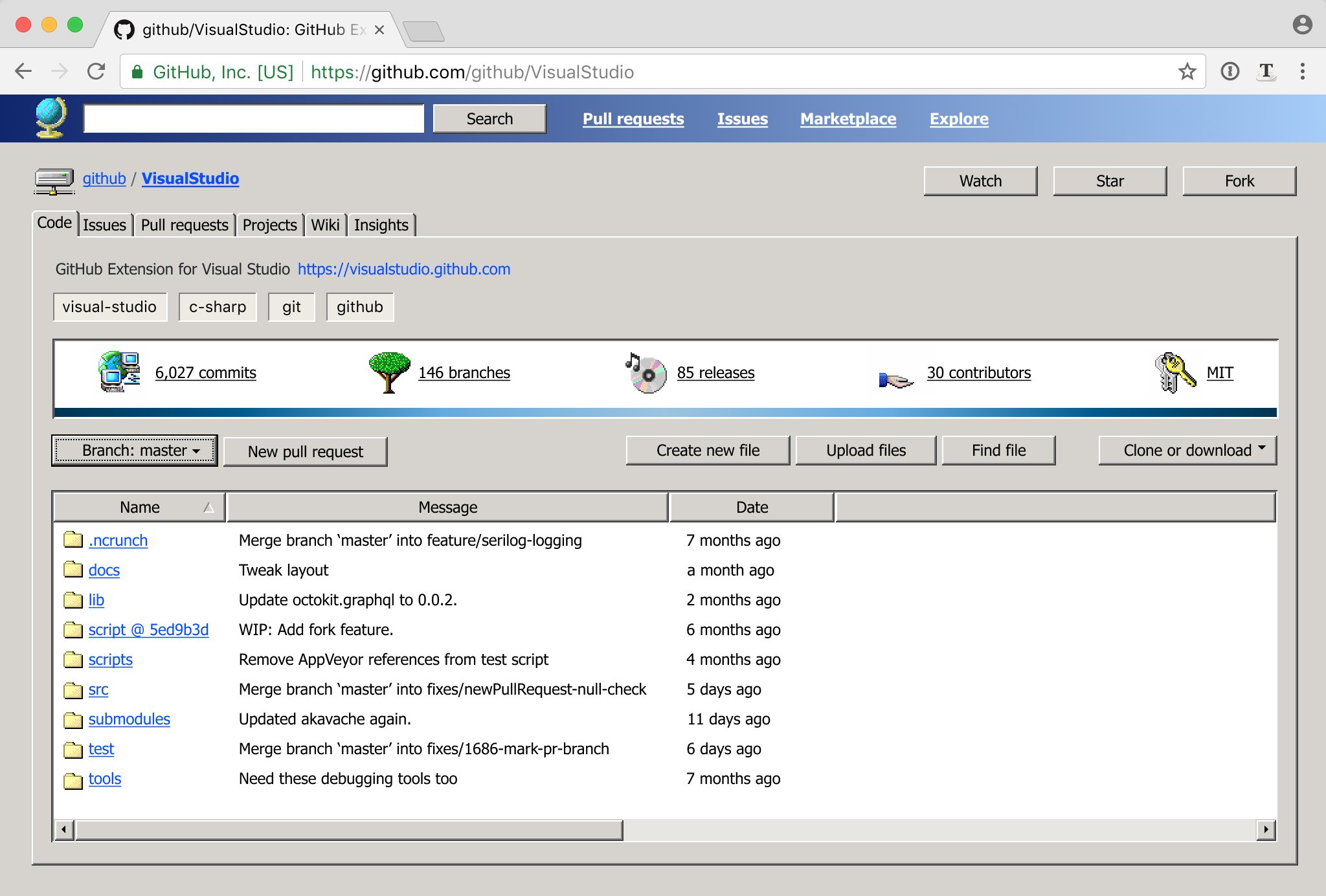
No, no, no, NO!!!11 I've had it with these "sea of floating text on an expanse of white" redesigns, seeing yet another one follow this mindless trend just disgusts me thoroughly. The lines, subtle gradients, and other affordances of the old design serve to organise and direct your eyes into the appropriate sections; without them, everything blends together into a jumbled mess and it almost looks like the stylesheet didn't load fully.
If you feel disoriented, give it a minute.
I've had to put up with such redesigns for literally years now (I don't remember when the trend started --- mid 2010s?) and I don't feel them getting any better --- and eventually get around to making a user stylesheet to make them look better than they used to.
In contrast to the article this is one of the very few redesigns of a site which I actually would like (not mine, previously discussed at https://news.ycombinator.com/item?id=17242367): https://pbs.twimg.com/media/De17PIKXUAE27W6.jpg:large
If you know someone at Github, send them a link to this article. Maybe someone there will like my ideas and eventually get to implement them
Hopefully not. "Don't make me get out the custom stylesheet editor..."
Re: Redesigning GitHub Repository Page
#85First half of the article that redesigns the navigation is actually pretty good. It got me hooked and i find it valuable. When they started touching the content, I got a lot more hesitant. 1. I can't articulate why , but honestly it's extremely useful to see the last commit message on each file. It gives me a sense of which files have changed and if my changes are still the latest ones. It's not foolproof, but it doe…
I use the commit / date bit to work out which is the actual code part of a project and which parts are just config / build tools.
Re: Redesigning GitHub Repository Page
#86The tabs especially looks like a terrible idea. Something that had more than enough space on every screen has now become a huge, long list of options that you have to scan every time to find the one you want. Removal of icons also plays into that since they were the visual hooks you could use to navigate after a little while of usage. Then the final redesign, I’m not sure there’s anything to say about it other than t…
The tabs redesign suggestion are actually one of the things I like best here! I hate the two (it's actually THREE including the top black bar) navbars, I always get confused about where to look to find something or what i'm clicking on, and I've been using GH for years!
Yeah, but if you look at the tabs redesign, they're cheating a little. They are using a very busy repo(which most aren't) so the little numbers next to each tab are acting as a divider. Most repos would be really hard to navigate without some sort of additional separation between the tabs.
Re: Redesigning GitHub Repository Page
#87Why does the star counter have a star icon and also the word star?
Re: Redesigning GitHub Repository Page
#88First half of the article that redesigns the navigation is actually pretty good. It got me hooked and i find it valuable. When they started touching the content, I got a lot more hesitant. 1. I can't articulate why , but honestly it's extremely useful to see the last commit message on each file. It gives me a sense of which files have changed and if my changes are still the latest ones. It's not foolproof, but it doe…
It gives me a sense of which files have changed and if my changes are still the latest ones.
Or as I've had to do with other VCS in the past, "what was the last thing that happened to this file?" is a commonly asked question which that description answers, especially when there is a bug in it.
Re: Redesigning GitHub Repository Page
#89> The traditional Windows File Explorer, together with macOS Finder, have established a simple pattern for file browsing: files on the left, details on the right.
I think the author is a very young guy that doesn't remember computing pre-Windows. Probably everything before Windows has used this pattern...
Even more, it's a perfect example of trying to fix what's not broken. The result will be something else, not better, not sure if not worse, but why change it?
How am I supposed to buy the argument that a programmer has a problem with understanding the difference between a fork, a like, and a watch request? Wasn't GitHub meant for programmers?
> If you feel disoriented, give it a minute. Once you are used to it, you might notice it’s actually easier on the eyes and a bit lighter.
In other words, push through the pain. You'll like it.
Re: Redesigning GitHub Repository Page
#90I was onboard through the navigation redesign (as others have said) but he skipped a whole section! The global nav w/ search at the top. The only problems I've ever had navigating a repo are search related.