Live data from Hacker News

UI Design Dos and Don'ts

developer.apple.com

71–80 of 121 posts

Re: UI Design Dos and Don'ts

#71
post #31

Apple has been a driving force for better UI in a number of areas, but some of their choices are baffling. Even in this page, the "Contrast" section uses a large black header, but a small grey font on a white background for the content. Who chose Shift-Command-] for switching tabs in Safari? Why include the power switch in the keyboard, which makes it challenging to clean? Could their glossy displays be any more refl…

I also feel like iOS has gone downhill. I know they were trying to get away from skeuomorphic design, but I feel they went too far in the opposite direction. Everything is flat, it's hard to tell what is a button that can be clicked on sometimes (usually it's just a blue label with no distinguishing background), and there seems to be a frequent lack of contrast generally.

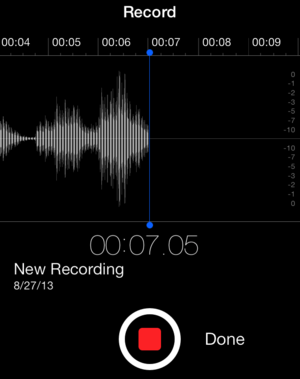
I found it interesting that the button in the link actually has a border. When will we see bordered buttons in iOS again? iOS 10?
Re: UI Design Dos and Don'ts

#72
Interesting that Apple displays the hit targets of the buttons with a border around it, despite the fact that standard iOS 7/8 UIButtons do not come with button outlines/fills by default. https://developer.apple.com/library/prerelease/ios/documenta...

I found this one of the more annoying changes in the iOS 7 redesign. Buttons and tap targets are incredibly difficult to recognize in certain places.

For instance, it is very hard to discern which of these text labels are buttons, and which are titles. http://images.techhive.com/images/article/2013/09/05-tell-me...

Or in the iOS start guide, several of the buttons, don't have large enough tap targets behind them making them annoyingly difficult to press http://screenshots.en.sftcdn.net/blog/en/2013/09/ios-7-welco...

Re: UI Design Dos and Don'ts

#74
post #31

Apple has been a driving force for better UI in a number of areas, but some of their choices are baffling. Even in this page, the "Contrast" section uses a large black header, but a small grey font on a white background for the content. Who chose Shift-Command-] for switching tabs in Safari? Why include the power switch in the keyboard, which makes it challenging to clean? Could their glossy displays be any more refl…

Most likely, that shade of grey was chosen precisely because the section headline is black. If both were black, it would compete with the typographic hierarchy, making it distracting to skim the entire page. Good design is a form of engineering. You have a set of principles and successful patterns– such as the ones on the linked page– but your job is adapting to real world constraints. In this case, the challenge is…

Attention to detail?

http://imgur.com/Q9AhXKI

That font, in the section that talks about the importance of larger fonts, is fucking tiny.

Re: UI Design Dos and Don'ts

#75
post #31

Apple has been a driving force for better UI in a number of areas, but some of their choices are baffling. Even in this page, the "Contrast" section uses a large black header, but a small grey font on a white background for the content. Who chose Shift-Command-] for switching tabs in Safari? Why include the power switch in the keyboard, which makes it challenging to clean? Could their glossy displays be any more refl…

Most likely, that shade of grey was chosen precisely because the section headline is black. If both were black, it would compete with the typographic hierarchy, making it distracting to skim the entire page. Good design is a form of engineering. You have a set of principles and successful patterns– such as the ones on the linked page– but your job is adapting to real world constraints. In this case, the challenge is…

"a foolish consistency is the hobgoblin of little minds"

Re: UI Design Dos and Don'ts

#76
post #63

Earlier quoted context omitted.

OS 10.9 and iOS 7 have taken contrast and thrown it out the window. They are both following current designer trends of less contrast overall while claiming better readability. The low contrast trend started around 2011 to 2012 with web sites. It typically takes Apple one year to catch up with the trends on their operating system releases. Both their recent releases result in more eye strain for me looking for a way t…

Do you suppose that this might be related to the oft-discussed-on-HN ageism that the Silicon Valley-based industry is accused of? Low contrast may be pleasing to twenty-something year old eyes, but unreadable to fifty-something year old eyes, and, if I consider my own attitudes and thinking at a younger age, I would almost certainly not have been considering how UI design choices would impact people with less-than op…

It is probably more a fashion trend like what affect everything around us.

Low contrast works especially well with the retina and above screens we currently on everything nowadays.

Re: UI Design Dos and Don'ts

#77
post #45

"Images that are not @2x will appear blurry" That's quite an exaggeration. "Blurry" is not what most people would perceive. They won't perceive a problem with the site at all and in most cases will never notice or care. Sure it's nice to use hi-res images, but I prefer using just one image that is slightly higher resolution than normal... maybe 1.5x and then increase compression. The result is noticeably better, sati…

What advantage is there to shipping a single asset? On the web, use the "srcset" attribute on img tags. If the device supports @2x, it'll fetch the right version. On an iPhone app, any advantages are far outweighed by the headaches of resizing "@1.5x" assets for each device resolution. Now consider the iPhone 6+, which has @3x resolution. At 1.5x it feels blurry. But forgetting that, would @2x users notice? They won'…

I suppose this article is about iOS apps, so I should stay away.

Nobody is "shipping" anything on the web. I've never understood the use of the word, even for apps. Something that is shipped cannot be touched or modified after release. This isn't the case on the internet.

For the normal operation of a website, needing to make only one image per product item is obviously more economical for whoever is making the content, not to mention the technical hassle faced depending on your CMS and how it handles image assets.

Making the image slightly more hi-res, say 1.5x, and then compressing it more aggressively has the benefit of satisfactory sharpness and quality on high density displays, while compressing to a size similar to the low res. I've confirmed this and use this technique, as others have.

For example instead of the normal 800 pixel wide product image, you make it 1200 wide but compress it more when making the jpeg, say 55 instead of the usual 70. The result is a nice lean and sharp image without the bloat of a "2x" file size, and without any perceivable quality loss from increased compression. The increase in resolution serves to hide the compression artefacts surprisingly well.

I'm talking about responsive of course, so there is no fixed width specified in the tag.

iPhone 6 has 3x res? So what? It's an iPhone with a physically small screen. People hold those screens in their hand - arms length from their eyes. You won't see any difference between a 1.5x 1200px wide jpeg photo and a 3x 2400px wide image on that screen. Not until you get your magnifying glass out, or pinch and zoom will you see a difference.

Not a fan of "srcset", it's not well supported and promotes a clumsy multi-res production workflow, which isn't needed for regular jpeg content images on the web - the point I'm getting at.

Re: UI Design Dos and Don'ts

#78
post #22

Agree with these, but in my opinion, the date selector wheels in iOS are a terrible design. Three rolling wheels just doesn't map to most people's concept of a calendar

What I absolutely hate is minute picker. 60 items is just too much to scroll. For most usages 5 minutes step is enough and 12 items much better.

As for calendar, I never had any problems with it. Of course it's not standard way that most people get used to, but I think any person will understand what to do.

Re: UI Design Dos and Don'ts

#80
post #22

Agree with these, but in my opinion, the date selector wheels in iOS are a terrible design. Three rolling wheels just doesn't map to most people's concept of a calendar

What I absolutely hate is minute picker. 60 items is just too much to scroll. For most usages 5 minutes step is enough and 12 items much better. As for calendar, I never had any problems with it. Of course it's not standard way that most people get used to, but I think any person will understand what to do.

100% in agreement with you. I can't remember the last time I needed to add a time with more granularity than 5 minutes. And the iOS date picker actually [does allow for custom granularity](https://developer.apple.com/library/ios/documentation/UIKit/...) up to 30 minutes.

But I guess there is no easy way to accommodate for both those that do need 1-minute intervals and those who would rather have 5-minute intervals (without adding yet another UI element or yet another setting to toggle).

Post reply on HN