Live data from Hacker News

The Windows 95 user interface: A case study in usability engineering (1996)

dl.acm.org

71–80 of 290 posts

Re: The Windows 95 user interface: A case study in usability engineering (1996)

#71

Designers tend to be less open to feedback than developers. That, I think, helps explain why flat UI persists even though it has shown usability drawbacks. It also helps explain why overall usability feels like it's declining ever year — for instance, macOS Tahoe seems noticeably worse in usability compared to macOS Sequoia. Does anyone think Apple is going to rush out a release that fixes the excessive rounding of w…

On the topic of flat design specifically, developers are likely just as culpable. Back when it was just starting to catch on, by my observation some of the quickest to adopt it were solo developers because it's way easier to build a passable looking app with flat UI since that doesn't require any design talent.

A passable looking modern flat UI has a lot behind it, just like skeuomorphism and anything in between.

Unless something like https://kde.org/announcements/plasma/5/5.12.0/spectacle-noti... is what you consider to be passable looking of course.
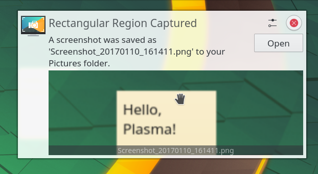
Re: The Windows 95 user interface: A case study in usability engineering (1996)

#72
post #36
post #25

Earlier quoted context omitted.

> Microsoft Office 2007 ribbon Ribbon also has a similar research behind it, just like Windows 95. For what they designed it, allowing beginners to discover all the functionality that's available, it works perfectly. I think most of the complaints from the tech circles are completely unfounded in reality. Many non-tech people and younger ones actually prefer using Ribbon. I also like it since it is very tastefully ma…

> I think most of the complaints from the tech circles are completely unfounded in reality. Many non-tech people and younger ones actually prefer using Ribbon. Well, yes, but that observation doesn't prove the point you think it does. People who were highly experienced with previous non-ribbon versions of Office, disliked the ribbon, because the ribbon is essentially a "tutorial mode" for Office. The ribbon reduces c…

This is it. Ultimately the best interfaces are designed for experts, not beginners. "Usability" at some point became confused with "approachability", probably because like in so many other areas, growth was prioritized over retention. It's OK if complex software is hard to use at first if that enables advanced users to work better.

Really, the most efficient interfaces are the old-style pure text mode mainframe forms, where a power user can tab through fields faster than a 3270-style terminal emulator can render them.

Re: The Windows 95 user interface: A case study in usability engineering (1996)

#73
post #15

Steve Jobs is famous for his 1996 quote about Microsoft not having taste ( https://www.youtube.com/watch?v=UiOzGI4MqSU ). I disagree; as much as I love the classic Mac OS and Jobs-era Mac OS X, and despite my feelings about Microsoft's monopolistic behavior, 1995-2000 Microsoft's user interfaces were quite tasteful, in my opinion, and this was Microsoft's most tasteful period. I have fond memories of Windows 95/NT 4/…

I have good news for you. Even a Linux Mint Mate would make you happy again, let alone some of the windows 95 look alikes.

Re: The Windows 95 user interface: A case study in usability engineering (1996)

#74
post #25
post #15

Steve Jobs is famous for his 1996 quote about Microsoft not having taste ( https://www.youtube.com/watch?v=UiOzGI4MqSU ). I disagree; as much as I love the classic Mac OS and Jobs-era Mac OS X, and despite my feelings about Microsoft's monopolistic behavior, 1995-2000 Microsoft's user interfaces were quite tasteful, in my opinion, and this was Microsoft's most tasteful period. I have fond memories of Windows 95/NT 4/…

> Microsoft Office 2007 ribbon Ribbon also has a similar research behind it, just like Windows 95. For what they designed it, allowing beginners to discover all the functionality that's available, it works perfectly. I think most of the complaints from the tech circles are completely unfounded in reality. Many non-tech people and younger ones actually prefer using Ribbon. I also like it since it is very tastefully ma…

The thing that bothers me more than ribbon itself is how much the performance started degrading once they introduced it.

I got MS Office 97 working in Wine recently, and it's still shockingly capable. There are lots of formatting options, it can read my system TTF fonts, and it's since it's nearly thirty-year-old software, it runs ridiculously fast on modern computers.

I don't feel like MS has added many more features to Office that I actually care about, but I feel like the software has gotten progressively slower.

Re: The Windows 95 user interface: A case study in usability engineering (1996)

#75

Earlier quoted context omitted.

Likely you experienced later gens where they toned it down. ~2010 it was one of the brightest LEDs you could purchase. As in they literally put a torch LED on the all white Intel macbooks of the era and it would shine through the laptop bags, pulsating.

Maybe...

Not Maybe, I owned a 2009 MBP. Everyone with a macbook from that period that I knew had the same issue, they were absurdly bright, you could not keep it anywhere near a bedroom without putting very thick tape over the light.

It was a poorly thought out design of aesthetics over ergonomics.

Re: The Windows 95 user interface: A case study in usability engineering (1996)

#76
post #25
post #15

Steve Jobs is famous for his 1996 quote about Microsoft not having taste ( https://www.youtube.com/watch?v=UiOzGI4MqSU ). I disagree; as much as I love the classic Mac OS and Jobs-era Mac OS X, and despite my feelings about Microsoft's monopolistic behavior, 1995-2000 Microsoft's user interfaces were quite tasteful, in my opinion, and this was Microsoft's most tasteful period. I have fond memories of Windows 95/NT 4/…

> Microsoft Office 2007 ribbon Ribbon also has a similar research behind it, just like Windows 95. For what they designed it, allowing beginners to discover all the functionality that's available, it works perfectly. I think most of the complaints from the tech circles are completely unfounded in reality. Many non-tech people and younger ones actually prefer using Ribbon. I also like it since it is very tastefully ma…

It’s also stupid in terms of screen real estate.

Earlier Word/CorelDraw/etc had a thin toolbar with lots of functionality. Barely occupied any space at just 800x600 resolution.

Nowadays, the ribbon and all other junk occupy a huge portion of the screen, even at 1920x1080.

It’s amazing how little screen area today actually shows the useful part of a document.

Instead of the Ribbon, a thin context sensitive toolbar would have been more useful.

Re: The Windows 95 user interface: A case study in usability engineering (1996)

#77
post #65

Any user interface designer should take a good look at the controls on a commercial airliner. An awful lot of effort goes into making an intuitive, effective user interface. I have disagreements with it, but there's no denying it's very well done. Designing a programming language is mostly about usability. I'll be giving a talk about that in April at Yale. It's a fun topic!

Ok, except operating a commercial airliner literally takes thousands of hours of training, requires an extremely detailed mental model for how air flight works, and heavily relies on external procedures like checklists to ensure safe operation. And fatal accidents due to poorly thought out control systems do occur. https://www.fastcompany.com/1669720/how-lousy-cockpit-design... Also fwiw using the word "intuitive" is…

The 757 cockpit designers did use the word "intuitive" a lot.

The control stick movements, for example, are intuitive. (Early aircraft did not have control sticks!)

For a crazy example, airplane jargon has specific meanings. "Takeoff Power" officially means full power to take off with. Makes intuitive sense, right? Well, one day the pilot needed to abort a landing, and yelled "takeoff power". The copilot heard "take off power" (note the space), chopped the power, and the airliner crashed. The jargon was changed to "full power".

The Air Force, however, had their own jargon and stuck with "Takeoff Power", until one day they had the same accident and changed the jargon.

For another example, the levers for the flaps have a knob on them shaped like a flap. This way, the pilot has tactile feedback that his hands are on the right lever, and he doesn't need to take his eyes off his other tasks.

For a third example, cockpit designers put in a warning horn for a stall warning. It worked great, and so they put in other warning horns, each with a distinct sound. Unfortunately, the pilots would confuse them, and do the wrong thing. So the "horn" is now a voice that says "stall" (or something like that).

Using words for aural indicators still has not percolated out of the aviation industry. You don't have any for your car, for example. Just chimes, beeps, buzzes, and other primitive and hopeless sounds. Oh, lest I forget to mention, the stupid incomprehensible icons.

Re: The Windows 95 user interface: A case study in usability engineering (1996)

#78

Any user interface designer should take a good look at the controls on a commercial airliner. An awful lot of effort goes into making an intuitive, effective user interface. I have disagreements with it, but there's no denying it's very well done. Designing a programming language is mostly about usability. I'll be giving a talk about that in April at Yale. It's a fun topic!

Looking forward to your talk. I feel like there's a taste issue which is similar to tabs vs spaces or other coding styles. Some languages kind of solve this with auto-formatting but just because they choose a standard doesn't mean their standard is as readable as some other. In languages one taste issue that comes to mind. Many languages have the invisible scope issue foo = bar In C++ for example, foo could be a loca…

I think you're going to enjoy my talk!

Re: The Windows 95 user interface: A case study in usability engineering (1996)

#79
post #41

Earlier quoted context omitted.

By your timeline, it means Microsoft only had institutional taste for about 3-4 years. A tiny fraction of the company’s lifetime. (If it helps, I do agree with you about those years being the most… design-coordinated: when Office felt like part of Windows) (I like to think that Visual Studio 2026 proves that the company can still do good desktop UI design; but it doesn’t help that every major first-party product is n…

I think there was a period from Windows 3.1 to somewhere during Windows 98 (maybe right up until the release of Office 97?) where both first-party and third-party Windows apps were all expected to be built entirely in terms of the single built-in library of Win32 common controls; and where Windows was expected to supply common controls to suit every need. This was mostly because we were just starting to see computers…

> On the other hand, what Windows didn't yet support in this era was DirectDraw — i.e. the ability of an app to reserve a part of the screen buffer to draw on itself (or to "run fullscreen" where Windows itself releases its screen-buffer entirely.) Windows apps were windowed apps; and the only way to draw into those windows was to tell Windows GDI to draw for you.

> This gave developers of this era three options, if they wanted to create a graphical app or game that did something "fancy":

> 1. Make it a DOS app.

This vaguely reminds me of WinG[0][1] - the precursor to DirectDraw. It existed only briefly ~ 1994-95.

My vague "understanding" of it was to make DOS games easier to port to Windows. They'd do "quick game graphics stuff" on Device Independent Bitmaps, and WinG would take care of the hardware details.

[0] https://en.wikipedia.org/wiki/WinG

[1] https://www.gamedeveloper.com/programming/a-whirlwind-tour-o...

Re: The Windows 95 user interface: A case study in usability engineering (1996)

#80
post #55

Earlier quoted context omitted.

I recently had to get printing working for a family member on an Apple tablet. I'm not an Apple jockey so it took me a while to sort out and I've being using computers since 1980 and consulting since 1995. You tap an icon that looks like the outline of a rectangle with an arrow pointing up. Then you tap the name of the printer. Then you tap another rectangle with an up arrow and then tap the word "Print". I may have…

It's supposed to be the "Share" menu, but that stopped meaning anything very fast because they just crammed everything into it for lack of other UX for system services. Macs have the problem multiple times over, because now they have the normal menu bar and toolbar, and a Share menu that just gets arbitrary stuff dumped into by App Store apps, and the Services menu that shows up in some contexts but not others, and t…

Apple UI designers wanted to avoid the Android hamburger so much that they doubled-down on the share menu to duplicate hamburger menu functionality.

I guess printing it to paper is a form of sharing so they may have the last laugh.

Post reply on HN