Live data from Hacker News

The Other Linux Logo

ecogex.com

71–80 of 98 posts

Re: The Other Linux Logo

#71
post #51

I am sorry to say this, but this one looks soulless to me.

It looks a bit better with Tux's face: https://pmarks.net/posted_links/tux-weeble.png

lol. That looks like some haunted playground toy found in a backrooms level. The eyes follow wherever you go!

It’s all good though. Most of the “Linux logos” don’t look very good to be honest.

Re: The Other Linux Logo

#72
post #57

I thought this would be about the other Linux logo, that preceeded the penguin: https://www.ibiblio.org/pub/Linux/logos/platypus/llogo.gif

Do you have more information about it? By googling "Linux platypus" the only thing that I could find is that exact URL

If you google for slackware 96 cd youll find a similar one. :)

Re: The Other Linux Logo

#73
post #65

Earlier quoted context omitted.

That's a nazi concentration camp badge of shame, I think? https://en.wikipedia.org/wiki/Nazi_concentration_camp_badge "Political prisoner", in fact.

You're attributing too much It's just a logo that's built around single triangle. It's like saying ACDC band promotes nazi ideology because it has a lightning symbol and gothic looking letters in their logo It's clear these Linux logos weren't done by professionals and by some examples not even with serious usage intent Compare above to: https://meta.wikimedia.org/wiki/Logo_suggestions?useskin=vec... https://meta.wik…

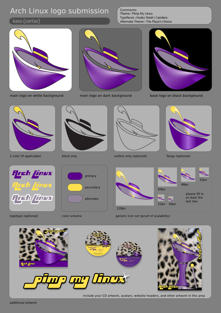
Most of the Arch Linux proposed logos are some dreary variation on the letter A. The pimp hat proposal is more meaningful.

https://pkgbuild.com/~jelle/logo-contest/cerise/2-pimp.png

I also like Skeletor but he is unfortunately © Mattel.

Re: The Other Linux Logo

#74

Earlier quoted context omitted.

Skeumorphism isn't just resembling things from the real world. It's using simulated physical object styling and detail in a user interface to signify affordances in the design. A penguin icon is not a skeumorphism because it being a penguin doesn't tell us anything about how to use the icon. If the icon were a rendering of a physical push-button, then it would be skeumorphic, because the button image would suggest to…

I am not sure the term is so strict and applies only to "controls" in GUIs. Case in point: the Wikipedia page on skeuomorphism refers to objects outside of the domain of GUI language. It also covers physical objects referencing other physical objects (e.g.: skeuomorphic pottery, wood architecture imitating stone, plastic objects imitating metal, etc.)

Yes, but we're talking about digital interfaces right now.

Even when considering faux finishes on real world materials, that standard doesn't apply here. Unlike, say, the wooden shingles cut to look like stone on Colonial era architecture (e.g. George Washington's home at Mt. Vernon) that are trying to convince us they are something they aren't, the penguin icon is not trying to, nor would it ever, convince us it's a real penguin.

Going back to my first sentence, yes, skeuomorphism is a concept older than computer interfaces. When the term is applied to computer interfaces, it has to be adapted. Since current display tech could never create something even close to a convincing simulacrum of, say, a notebook, the term then gets adapted to mean that the use of skeuomorphism attempts to communicate functionally. Much like how "brutalist" Web design has nothing to do with the Brutalist architecture movement.

Re: The Other Linux Logo

#76
post #57

I thought this would be about the other Linux logo, that preceeded the penguin: https://www.ibiblio.org/pub/Linux/logos/platypus/llogo.gif

Do you have more information about it? By googling "Linux platypus" the only thing that I could find is that exact URL

The Tux penguin was suggested as the unofficial logo for the 2.0 release of Linux, which had SMP support and was a big deal. It half-jokingly received Linus' blessing and everyone has used it since.

It's easy to see why, it is an instant classic, very cute, and works in different situations and at different scales. Larry Ewing who drew the picture, a sysadmin and not a professional illustrator, still has a web page up describing it: https://isc.tamu.edu/~lewing/linux/

Before that there were many logos but the platypus one was probably the most used. Walnut Creek, who put out CDROMs with shareware and freeware, used to publish the popular Linux distributions too and they needed something for their covers and used it.

Slackware kept using it for a long time. I believe the idea was that Linux, too, looks like it was put together by disparate parts. Web pages back in 1996 was mostly textual and pictures were used sparingly so the use case was mostly books and CDROM covers. There is a certain cuteness to it and it did look good on T-shirts.
Re: The Other Linux Logo

#77

Comparing this logo to the original reminds me the whole discussion about skeuomorphism (that's when GUI icons imitate closely things from the real world). Icons that strongly resemble things from real life are, quite often, problematic at representation, especially in smaller sizes. They take more time to understand and decode, they're prone to confusion. But anti-skeuomorphic icons also have a problem of their own:…

I cannot unsee Dark Vader now :0

Basking shark vader.

Re: The Other Linux Logo

#78

The small eyes version is freaky for such a logo. With Big eyes it looks friendlier, but still not cute... For something neutral and scalable, having a side perspective could perhaps work better ? Like this one for instance, with very few lines yet looks good. https://encrypted-tbn0.gstatic.com/images?q=tbn:ANd9GcRMINEP...

I had the exact same thought. I wish the eyes were bigger, it looks scary.

Re: The Other Linux Logo

#79
post #53

I was always partial to the Linux logo with the red triangle (from 1994): https://www.ibiblio.org/pub/Linux/logos/raytraced/linux-povl... >. (More old Linux logos here: https://www.ibiblio.org/pub/Linux/logos/!INDEX.html >)

That's a nazi concentration camp badge of shame, I think? https://en.wikipedia.org/wiki/Nazi_concentration_camp_badge "Political prisoner", in fact.

That's just how a lot of logos in the 90s looked, some colorful polygons, shadows, 3D effects...

Re: The Other Linux Logo

#80

Comparing this logo to the original reminds me the whole discussion about skeuomorphism (that's when GUI icons imitate closely things from the real world). Icons that strongly resemble things from real life are, quite often, problematic at representation, especially in smaller sizes. They take more time to understand and decode, they're prone to confusion. But anti-skeuomorphic icons also have a problem of their own:…

I think the word you're looking for is more like avant-garde movement, cubism, surrealism, communist constructivism, post-modern deconstructivism, postmodernism, or something towards that rough general direction towards the MoMA and the Guggenheim museum, rather than skeuomorphism/anti-skeuomorphism dichotomy.
Post reply on HN