I have to say that what I slways loved about these os was the bitmap icons, the colorful tone to stick out I think even today works really well (except when they got the same icon in the backgroundwoth the front icon being different like web browser vs internet settings).
Screenshots from Windows 95
71–80 of 85 posts
Re: Screenshots from Windows 95
#72Earlier quoted context omitted.
I don't even think the CD Player is an optional component, my Windows 95 VM doesn't have it in the Add/Remove Programs dialog. It's just there.
It was in an upgraded version of Windows 95. Not the original: > CD Player was included in Windows 98, Windows NT 3.51, Windows NT 4.0 and Windows 2000 (as Deluxe CD Player). The program was also made available as part of an upgrade for Windows 95. https://microsoft.fandom.com/wiki/CD_Player
That wiki is wrong. (First off, NT 3.51 came out four months before 95, it'd make no sense as an argument that the CD player was too new for 95, yet included in NT 3.51)
The Windows 95 release-to-manufacture disc, files dated 1995-07-11, the /WIN95/WIN95_14.CAB file:
    $ cabextract -s -l -F cdp\* win95_14.cab
    Viewing cabinet: win95_14.cab
     File size | Date       Time     | Name
    -----------+---------------------+-------------
           643 | 11.07.1995 09:50:00 | cdplayer.cnt
         88064 | 11.07.1995 09:50:00 | cdplayer.exe
         20579 | 11.07.1995 09:50:00 | cdplayer.hlp

    All done, no errors.
Re: Screenshots from Windows 95
#73So many vivid memories associated especially with this desktop color, UI of the dial up, email, networking windows ... and until today I have no idea what the hell is "My Briefcase".
Re: Screenshots from Windows 95
#74And now compare that to https://serenityos.org/ :)
They are doing a really good job keeping the old UI style alive.
Re: Screenshots from Windows 95
#75Flat design has destroyed UI readability. I can’t stand modern platforms that make me guess whether any piece of text is a button.
What stands out to me though is how clear and straightforward to use the control panels were for e.g. mouse, keyboard, timezone and display. Their current counterparts are a bit of a mess and I find very difficult to navigate.
Although they did lead to the infuriating click "Apply" then click Ok behaviour that people got into the habit of.
And yes, that Desktop area of 640 by 480 pixels was what we started off with, and we liked it! Once I got a monitor that supported 1024 by 768 then it was just luxury.
Re: Screenshots from Windows 95
#76Earlier quoted context omitted.
Win XP with classic look was pretty decent and useable. There was an option in system settings to disable all theming, 3D stuff, animations etc. just the basic look of that time and a lot more snappy UX.
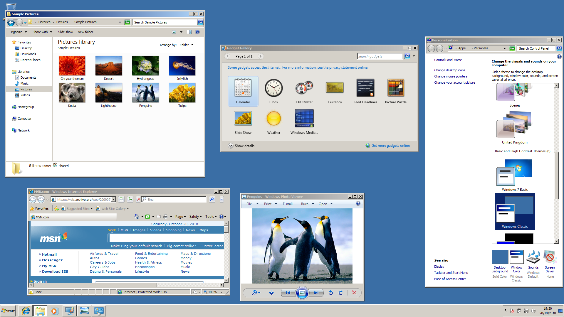
Do you have a picture of what that looked like? I'm curious. When I search for it, I can only find pictures of normal Windows XP and older versions of Windows. I can only imagine it looking like Windows 95 again.
Classic style actually worked up to and including Windows 7:
https://betawiki.net/images/d/da/Windows_7_classic_theme.png
Re: Screenshots from Windows 95
#77Earlier quoted context omitted.
Also took the good parts from Windows NT. I loved using Windows 2000. I remember being really mad when XP came out and it added all the colourful and curvy GUI elements - felt really dumbed down.
> Also took the good parts from Windows NT. It is Windows NT 5.0 https://en.wikipedia.org/wiki/Windows_NT#Releases
And XP was Windows NT 5.1 (as also seen in your link)
Re: Screenshots from Windows 95
#78Earlier quoted context omitted.
I agree with you. Buttons were immediately identifiable as such, menus had keyboard shortcuts visible everywhere, all items always looked the same across all apps, and everything was really snappy. We've really gone backwards since.
Aqua (in early versions of OS X) did a fantastic job of combining all this clear usability with a lot of fun visual flair. Even the old Qt/GTK themes which emulated that look were pretty good. It really is incredible how flat and boring modern macOS is.
And it even matched the hardware back then. You could have the colorful blue Aqua theme to match for example the iMac G3 or the graphite appearance to match the design of the Power Macs back then.
Re: Screenshots from Windows 95
#79Earlier quoted context omitted.
Yeah, it is special how almost every element is somehow looks slightly off-center. It's also pretty much ripped off of NEXTSTEP.
Isn't a much bigger influence on Windows in general the IBM Common User Access material, which NeXTSTEP decidedly was not like? https://en.wikipedia.org/wiki/IBM_Common_User_Access The app UI / interaction model patterns go deeper than "they both have greyscale 3D bevels".
I mean the window close and maximize widgets are pretty much identical to NeXTSTEP... except they had slightly different semantics IIRC
Re: Screenshots from Windows 95
#80Earlier quoted context omitted.
Do you have a picture of what that looked like? I'm curious. When I search for it, I can only find pictures of normal Windows XP and older versions of Windows. I can only imagine it looking like Windows 95 again.
Classic style actually worked up to and including Windows 7: https://betawiki.net/images/d/da/Windows_7_classic_theme.png
Thanks for letting me know. I looked into it, and apparently it's still even possible to activate on later versions of Windows with registry edits and helper software: https://github.com/valinet/ExplorerPatcher/discussions/167