Live data from Hacker News

Death by PowerPoint: the slide that killed seven people (2019)

mcdreeamiemusings.com

71–80 of 204 posts

Re: Death by PowerPoint: the slide that killed seven people (2019)

#71
The first step they went wrong is using a slideshow in the first place. This was a time critical scenario, anyone who needed to be making decisions should have been part of the engineering discussions from the beginning. They should have been having interactive conversations going over what they knew and how they knew it. The engineers had no time to be making slides for a management and that wasn't interested enough to be in the room with them in the first place.

Slides make sense as a way to introduce the outline of concept to a broad audience in a way that requires much less effort than 1-on-1 discussions. They are not a means for coming to decisions. If you need to make a critical, life- and business-shaping decision off the back of a side deck, you should instead delegate the decision to someone who knows more than you.

Re: Death by PowerPoint: the slide that killed seven people (2019)

#72
post #13

Another NASA screw-up that they're trying to pin on the vendor engineers, just like Challenger. The title is not reassuring. Conservatism in engineering is essentially about creating safety margins through conservative estimation. The title is saying we need to be careful because a tile was likely penetrated. Hell, if I remember correctly they were reporting that there was known tile damage on the news before reentry…

> The title is saying we need to be careful because a tile was likely penetrated.

It is a godawfull title. I believe that is how it reads to you but it totally reads the opposite to me. I read the title and it translates in my head as “we reviewed the test results and they suggest that the tiles are built sturdy enough to not get penetrated”. Exactly because what you say the word “conservatism” means to me that a system is designed to meet the loads plus reasonable safety margin. So if the review of test data indicates conservatism that means to me that the test found the test object roboust even with a reasonable safety margin. Otherwise i wouldn’t say that it “indicates conservatism” but that it “indicates lack of safety margin”.

> The reason the slide is laid out the way it is, is because it's describing the thought process

I agree, but that is not a good thing. People think in all kind of haphazard ways, before you communicate to others it is on you to look at your ramblings and make it orderly. The penultimate sentence is the most important one that should go first “flight conditions is significantly outside of test database”. That doesn’t mean that the tile is broken, nor does it mean that it is not broken. It means that we can’t tell from our tests.

Re: Death by PowerPoint: the slide that killed seven people (2019)

#73

I don't buy the title. This is not just a normal, routine presentation. This is an all hands on deck emergency and discussion. And NASA isn't just a bunch of MBA's, but rather people who have spent their entire careers immersed in this kind of stuff. No matter what is one the slide, I expect that the audience asks detailed questions. Even if the slide has just a big thumbs up emoji, I suspect you would still get a lo…

> I don't buy the title.

IDK. I too like to think the discourse and Q&A would have signaled differently than the slide. But, this is also 2003 and people generally had not gotten great at communicating via powerpoint yet. It's still bad now, it was horrible then. A unformatted list of bullet points was obviously still an acceptable slide format which tells me a good deal of how much slide skillz these folks utilized.

So, I do believe the slide title. I feel like it could have just as easily been discussed prior to the slide, it was agreed the test was acceptable or risk was low, and so the title was just trying to indicate that "it's been pre-agreed there is no problem here" then outlines some of the concerns which were considered.

Re: Death by PowerPoint: the slide that killed seven people (2019)

#75
post #17

I just realized that more time has passed since the Columbia Shuttle disaster (19 years), then passed between the Columbia and Challenger disasters (17 years). That seems impossible to me. I remember reading each of the astronaut's bios after the Columbia disaster, and the same thought kept echoing in my head: what a tragedy, what a waste. Seven remarkably talented people. I had no idea until I read this article how…

>Seven remarkably talented people. I had no idea until I read this article how easily their deaths could have been avoided.

In reality, there was likely nothing that could have been done once the damage occurred. Example source (form the 3 months after the disaster) here [1].

At the time no space shuttle was kept ready to launch for rescue (though this changed after this disaster) and their options here were limited. A common thought is 'just dock at the ISS' but the shuttle didn't have the fuel to reach it (future flights would ensure they were in the same plane to be able to dock there).

A more in depth review years later(with a summary here [2]) did find that it may have actually been possible to launch another shuttle in time, but it would have had to have skipped safety checks, and importantly, launch with a known issue on board (the foam strike possibility). And even then, the rescue mission would have had to gone off without a hitch, because even in the absolutely bare minimum amount of time required, the Columbia crew would have been dangerously low on oxygen.

[1] https://www.spaceflightnow.com/shuttle/sts107/030430save/#:~....

[2] https://arstechnica.com/science/2016/02/the-audacious-rescue...

Re: Death by PowerPoint: the slide that killed seven people (2019)

#76
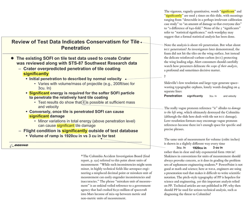
The article doesn't do the slides nor the evidence justice. It might be more illustrative to study the original article by Edward Tufte, which the writer (and I) learned about the issue from, https://www.edwardtufte.com/bboard/images/0001yB-2238.gif

https://www.edwardtufte.com/bboard/images/0001yB-2239.gif

I think it's why I think teaching engineers how to draw and do good design is important. How big is a cubic inch? How big is the crater in the heat shield that we're talking about?

It would have been better to draw comparisons and explore things. Here's a simple sentence that could have done better;

"Sir, our test database was for objects the size of an average icecube. The thing that hit the wing was the size of seven and a half footballs. It's 640x larger!

[chart that shows just how much kinetic energy we're talking about]

We're looking at somewhere between 640x to 1000x more energy than we've ever seen. We have a problem."

A friend and I did an interview with Don Eyles a while ago and he said something that haunts me, "if you see something, say something" https://twitter.com/_areoform/status/1501589762599112704

I'd like to go a bit further. If you see something, design and explain something. Challenger is a great example of this; Dr Tufte covers it extremely well, just laying out the boosters and the blowthrough they experienced from left to right on a chart that has temperature as the X axis, you can see clearly that it gets worse as the temperature drops. But no one at NASA or Thiokol thought about doing that.

No one thought about humanizing the data. They knew how important it was. They tried to say something. But they couldn't express it.

It's not enough to just show people the data. We need to get people to understand it. And that's often social suicide.

It's easy for people to want to remain stuck in their status quo, no one likes the "negative person", but that's what ends up getting people killed in safety critical environments. And that's how we get messes like the ones we're in today.

One particular one that comes to mind is climate change, I am unsure if most people are aware of this, but it's very similar to the failure expressed here. Most of the scientists whose work is consumed by the IPCC and the models that are published by the IPCC know that the "consensus" is wrong. Except, it's wrong in the opposite direction to what certain people want it to be.

The reality is far worse than what the models suggest. The models still don't include the loss of permafrost - what's worse is that they don't model the non-linearity of permafrost loss, methane emission, that then sparks more warming and more permafrost loss etc, https://www.woodwellclimate.org/review-of-permafrost-science... nor do they include effects of how the climate would change of ocean conveyor currents shut down (AMOC in particular is of significant interest, https://www.aljazeera.com/news/2021/11/12/concern-grows-over... ). They also don't model the melting and release of clathrates from the ocean, or the effects of ocean acidification, and several other non-linear processes.

I had a very polite, but heated argument with one of the scientists involved and he told me that they aren't going to include that, because if they do, the numbers will look much worse and they'll be dismissed as apocalyptic loons.

Which brings us, elegantly, back to the point that Dr Feynman made in his remarks about the Challenger disaster,

"For a successful technology, reality must take precedence over public relations, for nature cannot be fooled."

Re: Death by PowerPoint: the slide that killed seven people (2019)

#77
In my experience, it's nearly impossible to convey information so accurately that the the receiver is likely to make the same decision you would make.

There is a simple low-effort high-information solution to this problem - have everyone vote (or bet) on the decision. This, more than anything else, will reveal whether or not you've reached understanding/consensus/alignment.

(This is not to say that the final decision should be made by voting, rather it's to gauge the level of consensus)

Re: Death by PowerPoint: the slide that killed seven people (2019)

#78
post #54
post #42

Earlier quoted context omitted.

You're being downvoted because the entire process that lead to this decision has been massively analyzed and the root causes were determined.

And was it determined that this slide killed 7 people, as claimed in the title? That seems overly dramatic and ignores the other root causes.

No, it wasn't this slide.

Re: Death by PowerPoint: the slide that killed seven people (2019)

#79
post #19

I've seen presentations with Powerpoint that suck the life out of you and also ones that inspire and excite. It's not the tool, it's the presenter and how they wield the tool. Reading word for word off a text-heavy deck in a monotone with no images or diagrams is a recipe for disaster. I tend to have my decks (back when I was doing presentations) be relatively text-lite and involve images/diagrams that back up my tal…

PowerPoint decks for the upper tiers of an organization can take on a whole different character. I shit you not that it's common to pass them around in email as if they were a document format, even for information that is never intended or expected to be presented. As if they were PDFs or something. It's crazy. [EDIT] There's also a kind of horrendous, illegible house style some places, that's expected to be how thes…

@DefenseCharts has a great collection of these for anyone interested.

https://nitter.net/DefenseCharts

Post reply on HN