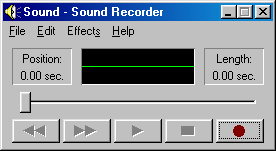
Looks nice, but the shadows on the buttons are wrong: the top and left edges should be white, the other two black. This way, the buttons look more like elements of a status bar, those had the borders reversed to produce an "inset" effect (like in this screenshot: http://173.255.209.242/chhtml/toolkit/demos/Windows/gifs/gad... )
Since it's my lunch break, I put together a PR: https://github.com/chowderman/Hacker95/pull/4
My CSS-fu is very basic, so it might need further tweaks to make button presses look right.