Where oh where did Microsoft get the idea to totally rebuild their mobile OS around the concept of a full-face capacitive touch-screen?
iOS 7 looks familiar
61–70 of 224 posts
Re: iOS 7 looks familiar
#62I don't understand this obsession with complaining about copying or imitating in design. As long as good things are taken and worse things are left behind, the consumers benefit. It's like being upset that the 2014 cars have the same steering wheel and pedal layout, or that a manufacturer "stole" the idea of using a USB port in a car.
I think it has more to do with the particular company. Namely, a company that brags about how original their designs/products and is very sue happy towards anyone who imitates them in the slightest. On top of that, they have a lot of fans who think of Apple as a master of UI and general design (I'm not saying they're wrong) and will associate the design Apple and not the others who spearheaded it. I didn't listen to…
I couldn't care less how original or unoriginal something is, I mainly care about how good it is functionally and less so how pleasing it is visually. I wish more people paid attention to that rather than who created what first. All ideas are based on some other ideas to some degree.
I guess that's the difference. If Apple implemented something I created in their products, I'd be super happy that my idea is doing well and will benefit more people. I care about the ideas themselves, not about receiving credit.
Re: iOS 7 looks familiar
#63You know, I can see that. If Android is ripping off iOS that really means that for iOS to step up and get modern, Android isn't the template to follow -- Android is stuck with innovating off of iOS's past accomplishments...it's innovating while walking backwards. WM, being a ground-up re-imagining of how smart phones work is looking forward...better to co-opt some of those ideas instead...be in a position of innovati…
You obviously have not used modern Android, or are ignorant of Android's own innovations and design language. See here where iOS7 "borrows" a lot of stock Android features and design language.
https://securecdn.disqus.com/uploads/mediaembed/images/516/5...
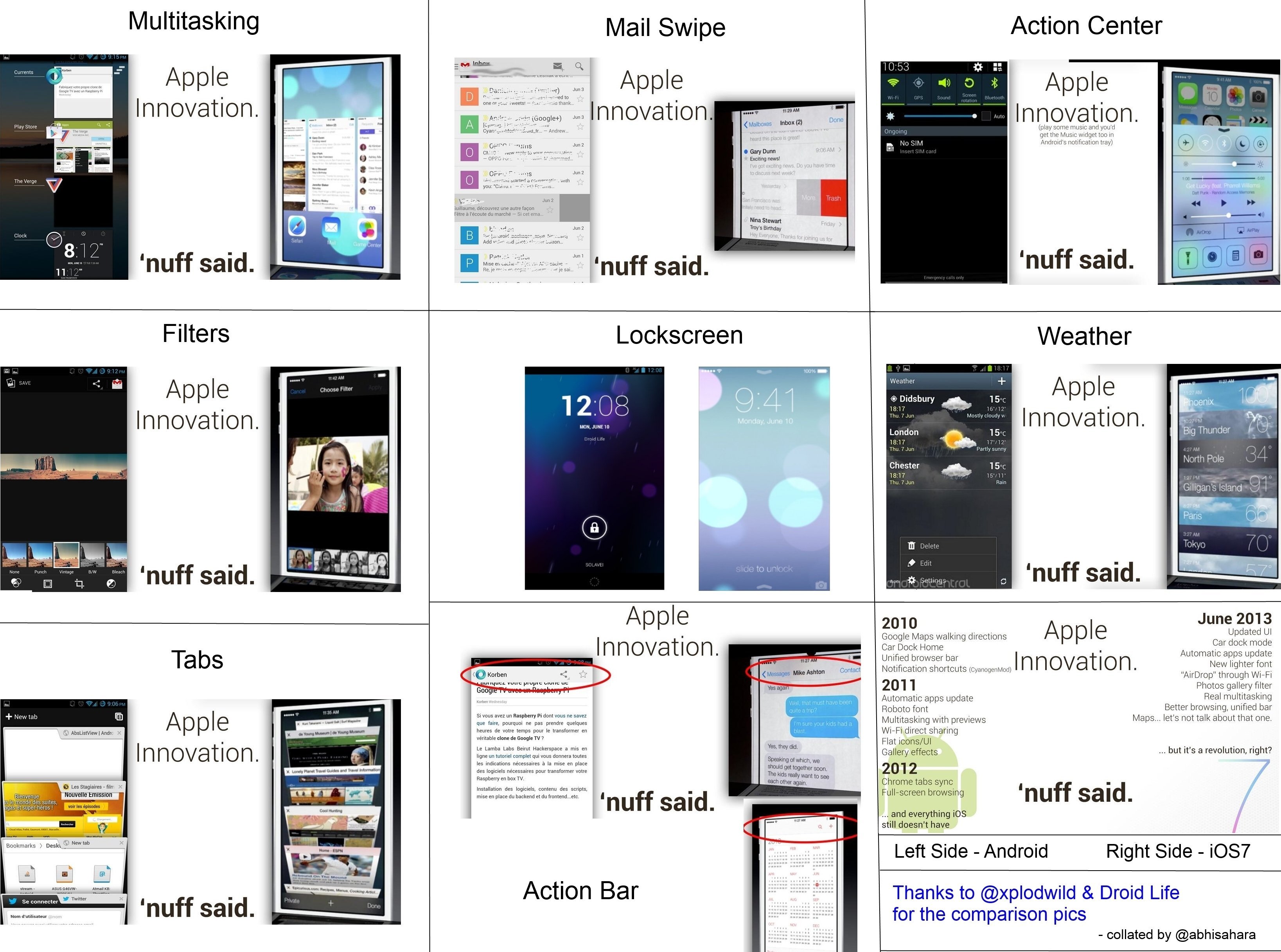
http://www.droid-life.com/2013/06/10/ios7-vs-android-a-quick...
https://plus.google.com/112995668742108647641/posts/dmSKzTwC...
Re: iOS 7 looks familiar
#64Earlier quoted context omitted.
I don't really see how this is a huge step up in terms of usability...
I think I'd actually find it quite distracting while I am typing.
WebOS doees it and it's incredibly distracting; it looks like every key jitters slightly every time I hit the shift key.
Re: iOS 7 looks familiar
#65Where oh where did Microsoft get the idea to totally rebuild their mobile OS around the concept of a full-face capacitive touch-screen?
I don't see what this has to do with iOS7 looking similar to Windows.
Re: iOS 7 looks familiar
#66During the WWDC keynote I tweeted this:
"Not sure what's worse about WWDC keynote days: Apple fans cheering for new features or Android/WP fans saying "we have that already"."
It's boring and repetitive and expected. Yeah, they mimic. Big deal. Get over it.
Re: iOS 7 looks familiar
#67Earlier quoted context omitted.
As I look at the upper-case keys on my 2012 Macbook Pro, I'm not sure why you think they are going to do this.
The keyboard could easily switch between upper and lower case depending on what the user is actually entering. Why wouldn't they do that? It just seems like an easy win.
Yeah, that's what a lot of the premier android keyboards do.
Re: iOS 7 looks familiar
#68Ha. Apple removes some gloss and all-of-a-sudden it looks like OSes that post-date it.
You do realize that there is more to flat design than just removing gloss? If I were to agree with your statement then I would say the opposite is also true. Draw a rectangle, add some gloss and voila.. Apple's design right?
Re: iOS 7 looks familiar
#69I don't understand this obsession with complaining about copying or imitating in design. As long as good things are taken and worse things are left behind, the consumers benefit. It's like being upset that the 2014 cars have the same steering wheel and pedal layout, or that a manufacturer "stole" the idea of using a USB port in a car.
The "Can't quite put my finger on it..." piece is in reference to a common catch-phrase for bloggers who have mocked Android, Samsung, and Microsoft for "copying" elements from iOS. I agree the whole back and forth is a bit silly from both parties. Edit: missed a word
"elements from iOS"
Frequently seen re: MBA and iMac knock offs as well. It's hilarious and worth pointing out in both directions although I think the popular notion that one cancels out the other is false equivalence.
Re: iOS 7 looks familiar
#70These arguments always strike me as coming from people who don't actually understand what design is. The folks who think that design is the font face, the weight of lines, the colors used. Those are all facets of design, but they are essentially just tools to accomplish the goal: experience and engagement. What you are noticing are just trends, and this is nothing new. Look back over the history of even just twentieth century graphic/print design, and you will see how marked trends define periods in time. The fact that one product or group uses the same or similar elements to another does not say that one is the copy of another, simply that they are both products of the same era.
I haven't used iOS 7 yet, so I can't say this with certainty, but based on my experience with Apple, I feel pretty confident to say that they may have integrated similar graphic motifs you're familiar with from other platforms, but the end experience will be leaps and bounds better than others who've tried to implement the same elements. There is real thought put into how a person will best use this product, not just how clean and pretty the UI can look.