Earlier quoted context omitted.
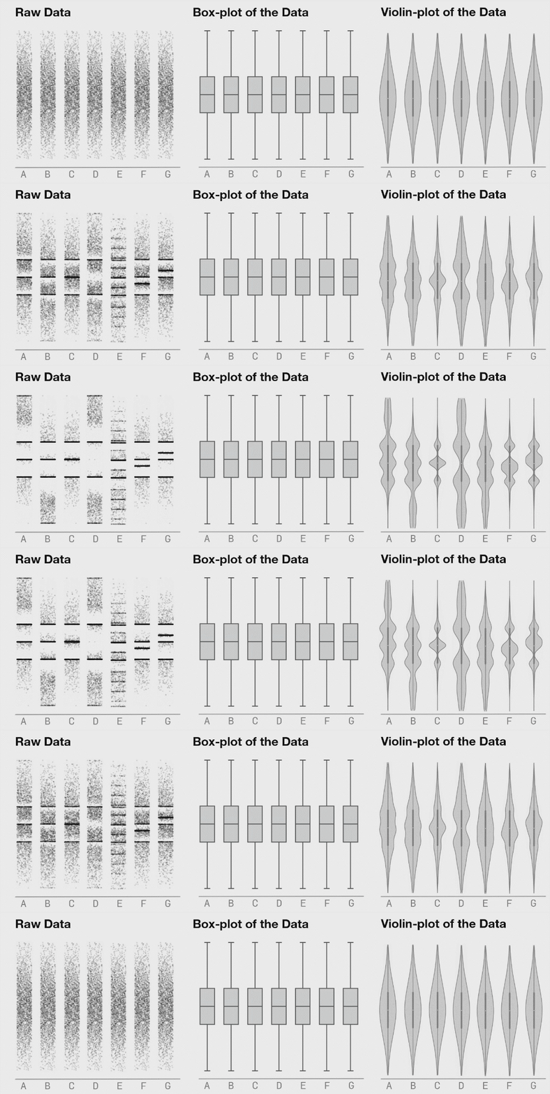
I would caution against this approach in general (unless you’re working with unusually uniform data from a deterministic source — in my world that is rarely the case). Summary statistics are useful but taken in isolation they can mislead. One loses the ability to get a feel for interesting non-aggregated phenomenon. I find it’s important to actually “touch” the raw data even if only in a buffered, random sampling sor…
If you want to use open-source Python-based visualizations instead of Tableau, the following tools allow the creation of custom plots - including the ability to export the underlying code. - bamboolib (proprietary license - acquired by Databricks in order to run within the Databricks notebooks) - mito (GPL license) - dtale (MIT license)
One benefit of having them in actual code is that you can programmatically automate the creation of things like dashboards and reports. For instance, schedule a script to share an interactive plot every Monday morning, or build a live dashboard that updates every 10m. This opens up a lot of possibilities that would be impossible in a traditional drag-and-drop tool.