Live data from Hacker News

Server Mono: A Typeface Inspired by Typewriters, Apple's SF Mono, and CLIs

servermono.com

51–60 of 100 posts

Re: Server Mono: A Typeface Inspired by Typewriters, Apple's SF Mono, and CLIs

#51
post #28

Not sure what the images on this page are supposed to be, they don’t load in iOS Safari. Also I’m not seeing the 1/I/l confusion other people are talking about, so it’s possible the font isn’t rendering in Safari either and it’s falling back to the default monospace font.

Here's how it looks on safari mobile for me. The lowercase l and 1 are exactly the same. https://imgur.com/a/I2r2ZQ6
Re: Server Mono: A Typeface Inspired by Typewriters, Apple's SF Mono, and CLIs

#52

A single weight font doesn't really meet the needs of modern CLI environments does it? And I don't get what the ASCII art have to do with anything. What does it depict? Screenshots from some scifi movie? And finally oh god, l and 1 are literally the same .

Wait what? Do you seriously need bold fonts in your terminal? I find them annoying. I would much prefer a single weight.

It may not be just that. I sometimes end up using the light weight to improve readability, especially on light background, plus in some cases regular is more like semi-bold.

Re: Server Mono: A Typeface Inspired by Typewriters, Apple's SF Mono, and CLIs

#53

So, if you're going to demonstrate the box drawing characters — and in a monospaced font, I would — they should line up? E.g., under "lines", the rows are overlapping; https://i.imgur.com/KnOP2Wu.png ; I would think they're only supposed to just touch, with no gap, no overlap. The boxes, similarly, don't quite line up right. https://i.imgur.com/6pVYh9a.png (Even the 100% box isn't lining up right, although somehow wh…

Number One, Pipe Character, lower case L, upper case I, zero and O, Parentheses and Brackets, are so common pain points on coding and terminal fonts. Those should be painfully distinct.

I've never understood why the lowercase l and 1 so often look the same in monospace fonts. It's not like anyone actually writes an l like that — why not just a small bottom right hook? And maybe a top left hook as well? But a whole base is insanity.

Re: Server Mono: A Typeface Inspired by Typewriters, Apple's SF Mono, and CLIs

#54

Earlier quoted context omitted.

Number One, Pipe Character, lower case L, upper case I, zero and O, Parentheses and Brackets, are so common pain points on coding and terminal fonts. Those should be painfully distinct.

I've never understood why the lowercase l and 1 so often look the same in monospace fonts. It's not like anyone actually writes an l like that — why not just a small bottom right hook? And maybe a top left hook as well? But a whole base is insanity.

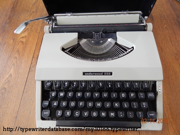
My first typewriter didn't have a "1" key. You were supposed to type lowercase L when you needed a "1".

Underwood 255: https://typewriterdatabase.com/img/gunderwood%20_10166_15186...

Re: Server Mono: A Typeface Inspired by Typewriters, Apple's SF Mono, and CLIs

#57
post #39

For those commenting on the importance of character ambiguity, I completely agree, and offer "DP Sans Mono", a font specifically designed for unambiguous proofreading. https://www.pgdp.net/wiki/DP_Sans_Mono https://www.pgdp.net/c/faq/font_sample.php font download link at https://www.pgdp.net/phpBB3/viewtopic.php?t=70714

Given the emphasis on being unambigious, it is interesting that the capital-eye (I) and lower case-ell (l) are the identical glyph in DP Sans Mono.

Re: Server Mono: A Typeface Inspired by Typewriters, Apple's SF Mono, and CLIs

#58

Earlier quoted context omitted.

To be fair, they did say it was inspired by typewriters, and most old typewriters don't have a '1', so you type a lowercase 'l' instead.

That are really old typewriters.

Actually, it was /most/ typewriters. Having a numeral one (1) key on a keyboard was something brought about by computer input keyboards (where there did, indeed, need to be a distinct numeral one separate from lower case-ell (l)).

But for most typewriters, the ell (l) key also served as the numeral one key.

Re: Server Mono: A Typeface Inspired by Typewriters, Apple's SF Mono, and CLIs

#60
post #57
post #39

For those commenting on the importance of character ambiguity, I completely agree, and offer "DP Sans Mono", a font specifically designed for unambiguous proofreading. https://www.pgdp.net/wiki/DP_Sans_Mono https://www.pgdp.net/c/faq/font_sample.php font download link at https://www.pgdp.net/phpBB3/viewtopic.php?t=70714

Given the emphasis on being unambigious, it is interesting that the capital-eye (I) and lower case-ell (l) are the identical glyph in DP Sans Mono.

They are significantly different!
Post reply on HN