Fascinating, I didn't previously realise you were converting pixel fonts to vectors when encoding them to TTF. I guess that gives some ability to seamlessly scale them for folks who load them into a competent text renderer as well (i.e. not a game engine that mostly just uses pixel fonts 1:1)
I Created 175 Fonts Using Rust
51–60 of 117 posts
Re: I Created 175 Fonts Using Rust
#52Impressive work! In the "mixed-case kerning pairs" quality testing image, I notice that the letter "j" sometimes reaches under the previous letter, like in "Fdj". Sometimes it creates a lot of space, like in "Fjo". Is there a stylistic reason for this? The Fjo spacing is the only thing that stood out to me. Kudos
Nice catch. That's a culprit of the `auto_kerning_min` property that you'll see on a lot of the fonts. this tells the auto kerner not to exceed that. I added this parameter because I fouund that for a lot of fonts, squeezing letters together over a certain distance would just look bad, so I would set -1 or -2 as a cap. It looks like that's just one that snuck past my notice. The word "Fjord" would look strange becaus…
Thanks for taking the time to answer. I don't understand why in the dj combination, j is able to reach under d for what looks like a kerning of about -4, when the auto_kerning_min property is set to -1 or -2, keeping Fj apart.
Re: I Created 175 Fonts Using Rust
#53Fascinating, I didn't previously realise you were converting pixel fonts to vectors when encoding them to TTF. I guess that gives some ability to seamlessly scale them for folks who load them into a competent text renderer as well (i.e. not a game engine that mostly just uses pixel fonts 1:1)
It also just makes them usable in traditional graphics editors like photoshop, indesign, affinity, aseprite, etc. Those tools do not have the concept of a pixel font, so using a TTF with hinting/antialiasing turned off allows you to use them in those apps.
Re: I Created 175 Fonts Using Rust
#54Curious: Once the fonts are made, how are they marketed and sold?
Where do the people who use them become of aware of them and how?
Re: I Created 175 Fonts Using Rust
#55Impressive work! In the "mixed-case kerning pairs" quality testing image, I notice that the letter "j" sometimes reaches under the previous letter, like in "Fdj". Sometimes it creates a lot of space, like in "Fjo". Is there a stylistic reason for this? The Fjo spacing is the only thing that stood out to me. Kudos
Nice catch. That's a culprit of the `auto_kerning_min` property that you'll see on a lot of the fonts. this tells the auto kerner not to exceed that. I added this parameter because I fouund that for a lot of fonts, squeezing letters together over a certain distance would just look bad, so I would set -1 or -2 as a cap. It looks like that's just one that snuck past my notice. The word "Fjord" would look strange becaus…
What I picked up from a lifelong typographer is that kerning should be about the area enclosed by the two letters. The aim is to make that consistent. I think that might help in this kind of case.
Re: I Created 175 Fonts Using Rust
#56Curious: Once the fonts are made, how are they marketed and sold? Where do the people who use them become of aware of them and how?
A combination of word of mouth and itch.io's search system. I have a decent amount of social media followers, many who have used my fonts in the past, so the initial flood of wishlisters put it on the front page for a bit.
After that wave, they get used in various projects here and there, and those projects eventually release or post screenshots. Because it's indie, lots of people also attribute the fonts directly when they post screenshots of their games, posters, videos, and stream overlays where they use them. I am very supportive of people using them, and repost their work, and so it's very casually symbiotic.
They're not lucrative on the scale that you might expect from a company or a popular vector font, but as supplementary income for a solo developer what they bring in helps put food on my table and also helps indie games get made which I think is great.
Re: I Created 175 Fonts Using Rust
#57Cool fonts, and an interesting post.
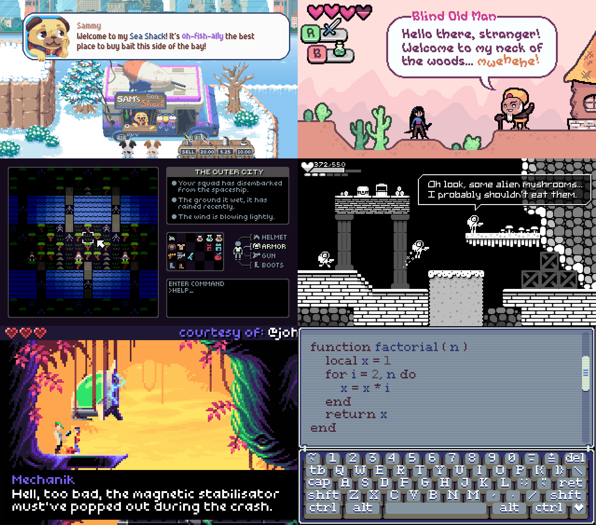
I kind of want the top-right fake game in https://chevyray.dev/blog/creating-175-fonts/old_previews.pn... to be real.
It has a "Wonder Boy in Monster World on the GBA" vibe I think is nice.
I have noticed that the license doesn't allow you to use the TTFs in open-source software, which is something to keep in mind.
> Licensed Content may not be distributed to third parties as standalone files or in a way that unreasonably permits the recipient to extract the Licensed Content for use separately and apart from the Work for Distribution.
> Licensee may not distribute the Licensed Content in any library or reusable template, including but not limited to game templates, website templates intended to allow reproduction by third parties on electronic or printed products.
> Licensee may not distribute Licensed Content in a manner meant to enable third parties to create derivative works incorporating Licensed Content.
To me, a non-lawyer, the last clause reads like it unambiguously forbids it.
https://github.com/ChevyRay/pixel_font_megapack_license/blob...
Re: I Created 175 Fonts Using Rust
#58Earlier quoted context omitted.
Rust is built to be memory- and thread-safe by default. Assuming you follow the prescribed rules of the language, multithreading is “free”. Amdahl’s Law still gets a vote, but at least your app won’t blow up in your face.
> Assuming you follow the prescribed rules of the language, multithreading is “free”. I'm wondering if you're referring to the async await addition from a few years back, to use of Tokio's crate(s), or something else.
IIRC, async/await in most languages doesn't imply multi threading, it just allows other work to be done on the same thread simultaneously.
Re: I Created 175 Fonts Using Rust
#59Very nice! One question: I was curious why you chose this subset of Scandinavian special characters.
There are three extended chars in Swedish (äöå) and Norwegian/Danish (æøå), but your fonts have æ, but not ø, which means you could drop the æ and still support Swedish, or add an ø to also support Norwegian and Danish. Was this an oversight or is there some locale that has just æ and not ø? (and before anyone asks I did not confuse æ with the oe-ligature œ, which is a different glyph used in French, and which the fonts also do support)
Re: I Created 175 Fonts Using Rust
#60Very nice! One question: I was curious why you chose this subset of Scandinavian special characters. There are three extended chars in Swedish (äöå) and Norwegian/Danish (æøå), but your fonts have æ, but not ø, which means you could drop the æ and still support Swedish, or add an ø to also support Norwegian and Danish. Was this an oversight or is there some locale that has just æ and not ø? (and before anyone asks I…
> Was this an oversight or is there some locale that has just æ and not ø?
Well, Icelandic uses ö in place of ø, but also requires ð and ý which are not included.
Æ is sometimes used in older English texts, though, in words like “encyclopædia” or in plurals of latin-derived words: https://en.wiktionary.org/wiki/Category:English_plurals_in_-...