In my app I just have the same little image of a CPU for everything - much more logical
Old People Icons That Don't Make Sense Anymore
51–60 of 279 posts
Re: Old People Icons That Don't Make Sense Anymore
#52There's a good article to be written on this subject, but this isn't it. "folders": we can go back to "directories" if you'd like. It's still what I say most of the time. "wrenches/screwdrivers/gears": This was the most baffling one. Who's never used a screwdriver? And he says it as if it's obvious. "phone": 75% of the US still has a landline (as of a year ago anyway), so I find "you haven't used this in 20 years" to…
The obvious response to all his critiques is that they're all idiomatic. Apple didn't choose a handset icon because everyone is familiar with those old handsets, they chose it because everyone will know that the icon means "telephone." Sure, it's fun to go back one more "etymology generation," but it's not necessary.
Re: Old People Icons That Don't Make Sense Anymore
#53There's a good article to be written on this subject, but this isn't it. "folders": we can go back to "directories" if you'd like. It's still what I say most of the time. "wrenches/screwdrivers/gears": This was the most baffling one. Who's never used a screwdriver? And he says it as if it's obvious. "phone": 75% of the US still has a landline (as of a year ago anyway), so I find "you haven't used this in 20 years" to…
"phone" - The shape he's talking about is this one[1]. While the Wrench/Screwdriver etc. are in common use, the shape here is from the rotary phone, which is not in common use.
The page I linked was literally the first google image result for me, and that top cluster of images includes many recognizeable clip-art phones, all with the same rotary phone shape.
1. http://www.codinghorror.com/blog/2008/01/getting-the-intervi...
Re: Old People Icons That Don't Make Sense Anymore
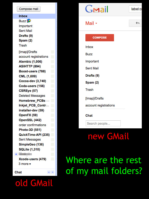
#54This gave me something to think about. When icons fail to be understood, they can fail hard. I spent a lot of time frustrated with the new gmail design until I changed the icons to text.
Even then, the Gmail UI sucks badly:
http://farm7.staticflickr.com/6034/6310566055_4a5f5d4a53_b.j...
Re: Old People Icons That Don't Make Sense Anymore
#55This goes back a lot further than computer icons.
Road signs for railway crossings still show steam trains. Men/Women signs for toilets show women in skirts that nobody wears, on images that hardly resemble people at all.
My car has a snowflake for the AC button, even though snow doesn't come out of the vents when you switch it on.
Interestingly, signs that ban music players in certain areas now look like Gen 1 iPods, even though a modern iPod (or any other player) doesn't have a clickwheel.
The point is that, iconography is meant to be clear and concise. As long as everyone agrees on what something stands for, then it doesn't matter what that is. Generally, that thing refers to a classic image of a thing, because the original shape will always be associated with the modern version.
Re: Old People Icons That Don't Make Sense Anymore
#56I'd love to go to schools and get kids in groups like Or maybe they've learned all these icons and while not getting what they did mean, they understand what they mean now, like letters of a new alphabet. Like how many Asian script characters are descendants of more obvious pictograms of actions. They still have meaning even if they've evolved a bit and even changed.
From the stackoverflow thread linked by rapidnsnail:
> I tried this on my 9 and 13 year old nephews. I asked what does this button mean? "Save" they both answered immediately. Then I asked what the image looks like? They had no idea - not even a suggestion (which is fair since they haven't ever seen a disk). So I guess the meaning has overriden the image itself in the icon so we're stuck with it.
http://stackoverflow.com/questions/1019573/save-icon-still-a...
Re: Old People Icons That Don't Make Sense Anymore
#57Around halfway through I jotted down a few thoughts. I like and appreciate people thinking about this sort of thing however, so I'm not saying any of this to offend. > I don't see any reason that we couldn't be storing our files in abstract squares rather than folders in the sky. ...because they're called folders, and we know how to use them? If I said, "Here, have a square," is your first instinct really to think oh…
>Same goes for the clipboard– hell if I know why MS would use that icon for paste, but in no other software that I can think of is that normal. That's easy. When you copy something you place it onto the clipboard, when you past it you are pulling a copy off the clipboard.
The only real issue I have with it is that it's no more about the clipboard than copy– they're both related but neither one is it. I think in this particular example it's not so obvious that anything is coming off the clipboard. I can see it's being taken off, but it's too subtle for a cursory glance especially if I'm not used to it. I suppose I don't really have a problem with the symbol, just the icon in particular.
Re: Old People Icons That Don't Make Sense Anymore
#58While I support the point behind this article, some of them are... not on point. > Want to indicate Settings or Setup to a twenty something? Show them a tool they've never used in their lives. What have screwdrivers and wrenches been replaced with?
Who cares? A floppy disk nowadays is the thing that indicates "save", and that's it. You don't have to have seen a floppy disk to know that it's the save icon. If that were the case, company logos would be objects. A swoosh is Nike, and that's that.
Sure, but if you're not old enough to know what a floppy disk is, someone would first have to tell you that the floppy disk was the save icon. I think the op's point is that icons are no longer making the user experience intuitive, they are actually adding another step. Young people have to figure out what they represent first before they use them where the point of an icon is to eliminate that step.
Re: Old People Icons That Don't Make Sense Anymore
#59It's not just icons. Phrases are the same.
I'll bet many people here have never heard a broken record, but still have heard the phrase "sounds like a broken record."
Re: Old People Icons That Don't Make Sense Anymore
#60It seems to me that what we are doing is creating new ideograms - that their icon nature will soon enough be beside the point, because they will be something closer to letters, like 漢字.