Live data from Hacker News

An Update on the Lock Icon

blog.chromium.org

51–60 of 169 posts

Re: An Update on the Lock Icon

#51
post #50

It’s a continuation of the trend that led to them removing Extended Validation indicators: https://duo.com/decipher/chrome-and-firefox-removing-ev-cert... Here’s how they used to appear: https://pbs.twimg.com/media/EBxdA7EWsAIQtc0.jpg While I buy the reasoning that consumers simply ignore them, EV indicators would be really useful in a corporate setting to mitigate phishing attempts against employees. It’s much easie…

Long ago I was reading someone registered corp in some other jurisdiction with the same company name which he wanted to impersonate with EV cert. And succeeded.

So what are you proposing is of questionable value.
Re: An Update on the Lock Icon

#53

Such a cryptic lock is even more confusing. I propose a very simple, easy to understand solution: http should simply be RED https should not be indicated at all A curated list, preferably by the gov. should indicate which SSL certificates are allowed to be green.

So as long as you're not color blind or vision impaired or from a country where red doesn't mean danger, sounds fine

Government oversight of TLS certs? No way this could possibly go wrong

Re: An Update on the Lock Icon

#54

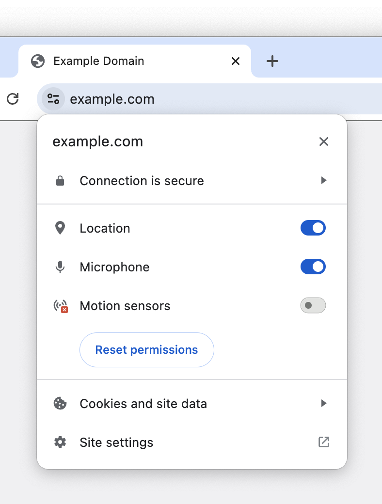
I approve of getting rid of the lock icon, showing only a broken lock for HTTP and no lock for HTTPS. It's always been weird to have site permissions settings revealed by clicking that lock. But the replacement icon looks really strange to me. They're calling it a "tune icon," but I've never seen a tune icon like this, with just two circles and two lines. Looks weird. I'm surprised that it fared well in the experimen…

The tune icon makes a lot of sense. It's unobtrusive. A gear icon would be highly obtrusive.

Re: An Update on the Lock Icon

#55
post #16

If you're using Chrome, right-click the URL bar and check "Always show full URLs", so you can see the https:// prefix like it's 1999. This also fixes a variety of UX problems with editing URLs. By the way, does anyone know of a good alternative to http://neverssl.com ? I had been using this for years, but now it supports SSL for some unfathomable reason.

http://captive.apple.com/ is what iOS uses.

Re: An Update on the Lock Icon

#57
post #56

I wonder how many ordinary users have any notion of what the “tune” icon [0] is supposed to indicate. [0] https://blogger.googleusercontent.com/img/b/R29vZ2xl/AVvXsEg...

It looks odd in isolation but I was surprised how natural it looks in the bar.

https://blogger.googleusercontent.com/img/b/R29vZ2xl/AVvXsEh...

Re: An Update on the Lock Icon

#58
post #16

If you're using Chrome, right-click the URL bar and check "Always show full URLs", so you can see the https:// prefix like it's 1999. This also fixes a variety of UX problems with editing URLs. By the way, does anyone know of a good alternative to http://neverssl.com ? I had been using this for years, but now it supports SSL for some unfathomable reason.

Depending on what you're trying to do one of the "captive" ping urls works eg http://captive.apple.com

This is the url that apple devices ping to get the login box up for things like hotel wifi. There's a mozilla one also which is http://detectportal.firefox.com/canonical.html [1] , but that returns a redirect which may or may not work for your use case.

[1] https://support.mozilla.org/en-US/kb/captive-portal

Re: An Update on the Lock Icon

#59
post #50

It’s a continuation of the trend that led to them removing Extended Validation indicators: https://duo.com/decipher/chrome-and-firefox-removing-ev-cert... Here’s how they used to appear: https://pbs.twimg.com/media/EBxdA7EWsAIQtc0.jpg While I buy the reasoning that consumers simply ignore them, EV indicators would be really useful in a corporate setting to mitigate phishing attempts against employees. It’s much easie…

> EV indicators would be really useful in a corporate setting to mitigate phishing attempts against employees.

Our company puts a big red banner on the top of all emails that come from an external source or don't have DMARC/SPF/DKIM/other security protections. Literally nobody ever checks the banner. It has no effect on phishing click rates. People do not read, or think. They just look for wherever it is expected for them to click something/fill something out, or just click random things to see what something might be.

The only thing that has marginally improved click rates is when we either gamify it, or put all external mails in an external mail folder marked NOT SAFE.

Re: An Update on the Lock Icon

#60
post #50

It’s a continuation of the trend that led to them removing Extended Validation indicators: https://duo.com/decipher/chrome-and-firefox-removing-ev-cert... Here’s how they used to appear: https://pbs.twimg.com/media/EBxdA7EWsAIQtc0.jpg While I buy the reasoning that consumers simply ignore them, EV indicators would be really useful in a corporate setting to mitigate phishing attempts against employees. It’s much easie…

> EV indicators would be really useful in a corporate setting to mitigate phishing attempts against employees. Our company puts a big red banner on the top of all emails that come from an external source or don't have DMARC/SPF/DKIM/other security protections. Literally nobody ever checks the banner. It has no effect on phishing click rates. People do not read, or think. They just look for wherever it is expected for…

If you had a tornado siren go off every 20 minutes every single day of the year, how long before you stopped ignoring the siren? How surprised would you be when a tornado hit 2 year later?

"This product causes cancer" is ineffective when the warning is plastered on everything. Same goes for warning in computer systems.

Post reply on HN