Live data from Hacker News

Liquid Glass Is Cracked, and Usability Suffers in iOS 26

nngroup.com

481–490 of 538 posts

Re: Liquid Glass Is Cracked, and Usability Suffers in iOS 26

#481
post #454
post #280

Earlier quoted context omitted.

The recently presented ChatGPT apps are what Apple Intelligence (and Siri) should've been. Some chat/voice interface, that can access data from installed apps and trigger actions. It should've been a home run for Apple. ChatGPT starts with zero existing apps, Apple has one of the biggest app ecosystem, and with (Siri) Shortcuts they already have most of the necessary interfaces available for years.

I think this will be an Apple Maps situation. Embarrassing initially, but a few years later, there’ll be a perfectly usable product.

I still find Apple Maps to be awful. It consistently gives poor directions. For example the exit you need to take from the closest major road to reach my neighborhood splits once you are on it. If you continue straight you reach a stop light where you can then take a left and then continue 1/8th of a mile to the turn for my neighborhood. Apple Maps will instead have you go to the right when the exit splits and then have you continue another 1/2 mile before taking a u-turn and heading back the 5/8ths of a mile to turn into my neighborhood. Google Maps does the right thing. I now warn visitors to use Google Maps or to ignore these directions from Apple Maps.

I also live near a large city and a couple of smaller cities with busy downtown areas. In each of them the main streets are virtually impossible to perform a u-turn on because of the large amount of traffic. Apple Maps will insist on giving directions which involve taking u-turns on these streets. Google Maps will instead route you the easier way around the block instead of insisting on an impossible u-turn which in the end is slower because of the difficulty in actually performing the maneuver.

Also I find the directions from Apple Maps when taking an exit which further splits into multiple exits to be highly confusing. The spoken directions from Google Maps is much better in these circumstances.

Every new release I try Apple Maps again just to see if it has gotten better in these circumstances and every release I am disappointed.
Re: Liquid Glass Is Cracked, and Usability Suffers in iOS 26

#482
post #478

Earlier quoted context omitted.

I'm also gen Z. For me the reaction to Windows Aero was similar, but I guess that's just how it is because it's what we grew up with. The blog post is talking about imitating materials in general though, and I can totally see how it can be taken too far. Think putting wood PNGs as backgrounds for app elements or adding brushed aluminium textures on sliders, things like those look pretty dated to me now. I'm guessing…

> Think putting wood PNGs as backgrounds for app elements or adding brushed aluminium textures on sliders, things like those look pretty dated to me now. This was a late 90s/early 2000s thing. I remember it on some Win98 and XP applications.

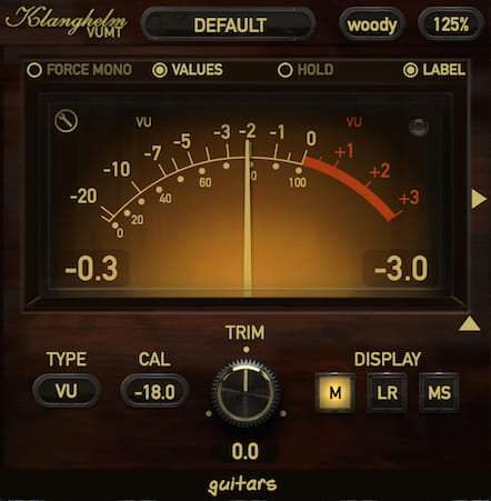
Nah, it persisted in many places, in some to lesser extents than others. It feels like in the 90s it was more of a "look, we can make UIs so flashy now!" thing, which then morphed into an actual design philosophy. See for example the Apple Newsstand app from iOS 6 [0] or lots of VST plugins from any time period, even up to today [1]

[0] https://i.redd.it/9fhcm9ce0ao21.jpg

[1] https://klanghelm.com/assets/img/VUMT/VUMT-2-solo-full.jpg

Re: Liquid Glass Is Cracked, and Usability Suffers in iOS 26

#483

I don't have accessibility issues, but even so I've been a fan of these settings for a few iOS versions now: Settings > Accessibility > Display & Text Size > Reduce Transparency Settings > Accessibility > Display & Text Size > Increase Contrast Settings > Accessibility > Display & Text Size > Differentiate Without Colour Settings > Accessibility > Motion > Reduce Motion Settings > Accessibility > Motion > Prefer Cros…

Can someone please make me understand why does searching for "Accessibility" in settings doesn't return any results? In fact, none of the search accessibility search terms work, like: "reduce", "transparency", "contrast", "motion".

Searching for "Accessories", "General" works, but for some reason no hits for "Accessibility". I can't for the love of god figure out why would this be the case, is it just a mistake that no one caught, or is it an intentional decision, why would this be intentional?

Re: Liquid Glass Is Cracked, and Usability Suffers in iOS 26

#484

I've always had an Android phone, but since my parents have Apple devices, I'm the one who has to help them with any technical issues. I tried to minimize the horrible glass design as much as possible because they couldn't see the text bleeding through the background. In my opinion, Liquid Glass is the worst design I have ever seen. It looks like a crappy GeoCities design from 1999. The team who designed it should be…

I have a sneaking suspicion that the Liquid Glass redesign was something they had to push out the door to distract from the absolute trainwreck that is Apple Intelligence.

Don’t look at that trainwreck! Here’s a different one!

Re: Liquid Glass Is Cracked, and Usability Suffers in iOS 26

#485
post #240
post #31

This update is one of the rare cases where I really dislike the new version. I’m usually happy with Apple updates, even ones the commentators dislike. This time I’m sorta agreeing with them: I don’t like the new iOS. Same with the Mac and iPad: other than being glitchy, I just don’t like the changes. It feels like my screen real estate isn’t as efficiently used, UI elements feel jumbled and the transparency makes thi…

Beyond that, it’s buggy and inconsistent. In dark mode, text boxes suddenly become light mode when they expand to add a second entry line. Buttons aren’t aligned within their containers properly. Some times buttons are in light mode when my phone is in dark mode, or if I open an app, it starts out in light mode and then suddenly switches to dark mode after a second or two. There is a noticeable lag when I back out of…

Sounds like it was QAd by AI.

Re: Liquid Glass Is Cracked, and Usability Suffers in iOS 26

#486

Earlier quoted context omitted.

It looks pretty (sometimes) but I have not found a single usability improvement stemming from the new paradigm.

One thing I’ve noticed is that search fields are now generally at the bottom of the screen which makes them a lot easier to activate. (No more flicking the screen down to search). I disliked the update for a week or so at first, but I have to say I find the liquid animations fun now.

> I have to say I find the liquid animations fun now.

This might be the most harrowing review that you can give without realizing it. UI animations are supposed to get out of the way. If you can recognize them as "fun", the most likely interpretation is that they are forcing you to expend attention, which in this age is one of your most valuable resources.

Re: Liquid Glass Is Cracked, and Usability Suffers in iOS 26

#487
post #348

Earlier quoted context omitted.

On my Mac I almost laugh at how massive the borders are to accommodate the freakishly large corner radius. The next version might have round windows at this pace.

Those corners are just weird. The 3rd party apps are all still doing the old radius which highlights how pointlessly large the new radius is.

I found that there's one upside to it: the empty space "outside" the corner still counts as part of the window, but it also works as a hot corner for drag and drop window resizing purposes.

That said, it's still comically large, and actually intrudes onto app UI in some cases, especially with scrollbars.

Re: Liquid Glass Is Cracked, and Usability Suffers in iOS 26

#488
post #376

Earlier quoted context omitted.

The touchbar was great, but it should have been above the (half height) function keys. Had they done that, it would still be around.

“No one wants an actual touch screen, but they definitely want a really narrow touchscreen directly above their keyboard. It’s contextual .” I had a MacBook Pro with the touchbar for a little while. I found it to be useless. I do agree if they had left the function keys alone it would have been a much better, or at least less annoying, option.

> No one wants an actual touch screen, but they definitely want a really narrow touchscreen directly above their keyboard. It’s contextual

The reason why I don't want an actual touch screen on my laptop (after using two laptops with one) is because it's just not ergonomic. For one thing, operating it strains the arm very quickly. For another, it means covering the screen with fingerprints, although that's less of an issue with modern ultrabright screens (but sometimes I don't want bright).

A dedicated touchscreen that's located in an area where it's actually convenient to use is a very different story though.

Re: Liquid Glass Is Cracked, and Usability Suffers in iOS 26

#489

Earlier quoted context omitted.

I’d rather an app look consistent with iOS than look consistent with an android version I don’t use.

And what about online tutorials, marketing, user manuals, customer support? You probably want your app to look consistent with that too, right? Do you really expect or even want to sift through multiple different versions of tutorials and guides? As long as an app is easy to use, people prefer a single look. No one cares about "looking like the OS", except maybe 0.1% of users.

Most people only have one mobile device, a smartphone. Those that have more than one usually still have those with matched OSes. No-one cares about "looking like the OS", but people do care about looking (and, more importantly, behaving) like all the other apps they use.

And as far as manuals and customer support, what you're saying is that you can't afford to do cross-platform properly, and so you're cutting corners. Which is fine if it's stated explicitly upfront, and having an app that behaves weirdly (for a given platform) is better than no app, but please don't insult your users' intelligence by presenting that as some kind of feature.

Re: Liquid Glass Is Cracked, and Usability Suffers in iOS 26

#490
post #356

Earlier quoted context omitted.

I’d rather an app look consistent with iOS than look consistent with an android version I don’t use.

And devs would rather the opposite.

Apps are for users, not for devs.
Post reply on HN