Live data from Hacker News

Wikipedia Redefined

wikipediaredefined.com

41–50 of 305 posts

Re: Wikipedia Redefined

#41
post #29

Typical "creative agency" - not proofing their own copy. I've seen this kind of thing so many times, and it baffles me that it's allowed to slip through to production sites.

The last image of the US Map caught my eye. San Diego is not located directly below San Francisco. Come on guys, show a little bit of effort here and take 5 seconds to look at a map.

http://www.wikipediaredefined.com/img/45.png
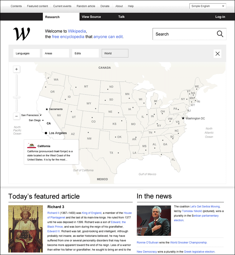
I understand it's a mock-up, but it just shows carelessness. If I can notice it, it's just one less reason for me to care.

Re: Wikipedia Redefined

#42
post #27

You'd probably want any redesign of Wikipedia to start with the understanding that the front page of the English Wikipedia isn't WWW.WIKIPEDIA.ORG, it's EN.WIKIPEDIA.ORG, and that that page is dominated by content --- most notably the WP Featured Articles, which are a core part of the Wikipedia community. Draw the pretty colored lines after you grok the concept. It goes downhill for me as they try to get more technic…

> Also the capital "I" in the font they're using is killing me. This is the main thing I remember after reading what seemed like an otherwise interesting study.

Thought I was the only one. +1

Re: Wikipedia Redefined

#43
I feel like this redesign invests in exactly the sort of brand-ism that wikipedia opposes. These changes seem to do little to improve the actual interface, instead introducing an intrusive menu and pasting a logo wherever possible.

That said, the connection explorer is quite neat and the efforts to ease editing have their heart in the right place.

Re: Wikipedia Redefined

#44
post #37
post #27

You'd probably want any redesign of Wikipedia to start with the understanding that the front page of the English Wikipedia isn't WWW.WIKIPEDIA.ORG, it's EN.WIKIPEDIA.ORG, and that that page is dominated by content --- most notably the WP Featured Articles, which are a core part of the Wikipedia community. Draw the pretty colored lines after you grok the concept. It goes downhill for me as they try to get more technic…

Anecdotally, the overwhelming majority of people who I've observed using Wikipedia go to www.wikipedia.com and then select "English".

Really? I've never in my life went to wikipedia without following a link from a Google search. I don't think I've ever seen the Wikipedia home page.

Re: Wikipedia Redefined

#45
post #27

You'd probably want any redesign of Wikipedia to start with the understanding that the front page of the English Wikipedia isn't WWW.WIKIPEDIA.ORG, it's EN.WIKIPEDIA.ORG, and that that page is dominated by content --- most notably the WP Featured Articles, which are a core part of the Wikipedia community. Draw the pretty colored lines after you grok the concept. It goes downhill for me as they try to get more technic…

Agreed. But I like the highlighting, saving of snippets and history-tracking ideas. I would find that very useful for myself, beyond the "oh sweet I didn't know it could do that" but for real "now where did I once read that?" purposes.

Re: Wikipedia Redefined

#46
Design looks somewhat "tabletized" with oversized controls intended making usage of capacitive touchscreens easier. Desktop version of the site doesn't need such oversized controls - they don't look pretty and unnecessary eat useful space. It's nicely done though for the mobile optimized version.

Re: Wikipedia Redefined

#47
I didn't even have the patience to read their own page because of their poor design choices (mostly, waaay too much scrolling).

I'm glad I don't have to read a Wikipedia designed by these people.

Re: Wikipedia Redefined

#48
It basically looks like a copy of Google's current design. Black bar with other properties at the top, then a big white page full of whatever. It's a fine interface, but I don't have much trouble with en.wikipedia either.

Re: Wikipedia Redefined

#50

Proposed Wikipedia logo: http://www.wikipediaredefined.com/img/4.png Actual WordPress logo: http://s.wordpress.org/about/images/logos/wordpress-logo-sta... (It's not just that both are W's -- they also chose a typeface with a similar distinctive swoosh.)

Yeah, I would be in favor of keeping the existing font face and W.
Post reply on HN