Live data from Hacker News

GMail: designer arrogance and the cult of minimalism

jonoscript.wordpress.com

41–50 of 234 posts

Re: GMail: designer arrogance and the cult of minimalism

#41
I hate the new themes. My question is: why couldn't they have provided themes that at least look similar to the old ones? I tried most of the available themes and there only one that I find vaguely satisfactory is the high contrast theme. Some of them, like "Wood" are laughable -- is this an old Myspace page I'm seeing? And better yet, you'd think a company with Google's talent pool could make the themes configurable at a more granular level.

Thanks, Google, for making me contemplate abandoning gmail for the first time. (I know, I know... it's free, right? So what right do I have to complain? I guess I'm mostly angry at myself for growing so dependent on it (and recommending it to my friends/family.))
Re: GMail: designer arrogance and the cult of minimalism

#42

I can't fault Google for experimenting, but the 'all or nothing' approach they took to the rollout was an example of false choice. The classic coloring could have been offered as a theme to lessen the impact of the UX changes. In case you miss the old color scheme, try this Stylish theme: http://userstyles.org/styles/64637/gmail-google-mail-classic... Follow Jason's post to fix icons and spacing: http://jasoncrawford…

I have no issue with the new design. But I think this is a fair criticism considering how polarising the change has been.

Re: GMail: designer arrogance and the cult of minimalism

#43

It's funny, a couple of years ago I was reading articles about how Google's design teams were supposedly hamstrung by their culture of incessant testing. I remember anecdotes about a/b testing 41 different shades of blue and designers being made to provide data for their choice of border width. Now a whole bunch of people who haven't seen Google's test data are adamant that their redesigns are a usability disaster. U…

Redesigns of a heavily-used UI are always "usability disasters". People spend many hours perfecting their workflow in one environment and FLIP THEIR LIDS when someone changes it. It's not a rational thing (nor, frankly, an unjustified one). What surprises me is that we haven't figured this out yet and rehash the same flame war every time.

The desktop environments show this best: c.f. Gnome 3. Also Gnome 2. And Gnome 1 for that matter (vs. KDE2). And KDE4. And KDE3. And Windows Vista. And OS X Lion.

Re: GMail: designer arrogance and the cult of minimalism

#44

Does anyone else find it humorous that OP's site is ugly and hard to read? it doesn't diminish he's point (I could take or leave the new Gmail) but maybe his credibility.

What did you find hard to read about the site? I was able to read it just fine. (just double-checked).

Nice big text with high, but not too high, contrast. What's not to like?

Re: GMail: designer arrogance and the cult of minimalism

#45
I, like the author, abhor the new GMail interface. Thankfully, I found a workaround, explained at bottom.

In fact, I found it difficult to explain to my parents how to navigate the new interface. They were quite upset at the changes and were considering about how to revert to their old providers (thankfully, I set up an email forwarding domain for them years ago so they can change any time they wish). It really is that appalling!

The contrast in usability to almost any other web mail service is shocking. Check Hotmail or Fastmail.fm or even Yahoo mail and "feel" the difference yourself!

Workaround to GMail's new interface:

0. Make sure you have a browser or plugin that supports site-selective scripting, e.g. NoScript.

1. Disable scripting for google.com

Then when you login, GMail offers a "basic html" interface. This is amazingly straightforward, fast, everything clearly delineated with strong colors, all new information extremely obvious, and just the basic design that matches closely to the old design.

If Google manage to mess up even this basic interface, then I guess, I and my family will have to find alternatives, e.g. switching to mail clients or for those who travel a lot to Hotmail.

Re: GMail: designer arrogance and the cult of minimalism

#46

I really do buy the "change aversion" theory. I never used Gmail before the current design, and now I use it every day without problems. I click an email and I can read it. Importance and starring work as expected. And, the interface is very smart about not moving things out from under me when I make a change, much like Chrome's tab bar. Except for the slowness, I think this UI is a fine way to handle email.

I use it without problems too, and so does the author, but our eyes are not happy and our brains are less relaxed. We never used importance and we don't want it cluttering up our stars. We need visual queues, like lines.

Re: GMail: designer arrogance and the cult of minimalism

#48
I have been using Yahoo Mail for a number of years. I find the interface to be far superior to that of GMail. More usable and practical. In many ways it mimics Outlook. They have some nice drag-and-drop action, right click menu tools and, my favorite, an Outlook-like reading pane. Last time I touched GMail it felt clunky. Because of this I have never felt compelled to use it.

Re: GMail: designer arrogance and the cult of minimalism

#49
The thing that drives me crazy with the new design is the separate scrolling areas, when I use the mouse wheel or hit the up/down arrow keys I want the entire thing to scroll, not whatever chunk I happen to my mouse in. This is especially annoying as I have a low res screen (old computers) and thus I can't much of any of the chat list, I used to just be able to scroll down to see it. I wish knew CSS magics to try and fix it with stylish or something (I'm a c programmer all the way)

Re: GMail: designer arrogance and the cult of minimalism

#50

It's funny, a couple of years ago I was reading articles about how Google's design teams were supposedly hamstrung by their culture of incessant testing. I remember anecdotes about a/b testing 41 different shades of blue and designers being made to provide data for their choice of border width. Now a whole bunch of people who haven't seen Google's test data are adamant that their redesigns are a usability disaster. U…

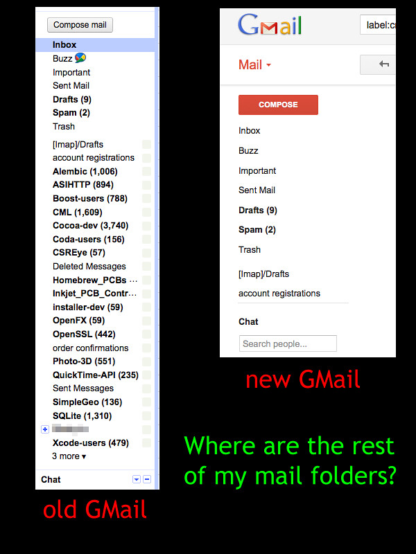
OK. I'll call them inept and pan their design based on months of USE. As far as I'm concerned, there's only one example needed to prove the failure of this new design:

http://farm7.staticflickr.com/6034/6310566055_4a5f5d4a53_b.j...

Post reply on HN