It may be the size on the page, or glyph rendering artefact but this font doesnt look... consistent. Dont get me wrong the font is brilliant, however atleast for me there are some points at which the rendered glyphs are over cut. Another way id describe this is the antialiasing is not consistent. Its like layering the same text on top of the other multiple times.
Routed Gothic Font
41–50 of 60 posts
Re: Routed Gothic Font
#42Sort of related, there's DIN 6776, a German standardized font used for technical drawings:
https://de.wikipedia.org/wiki/Normschrift
https://www.typografie.info/3/uploads/99b804cee64ef8c64ad900...
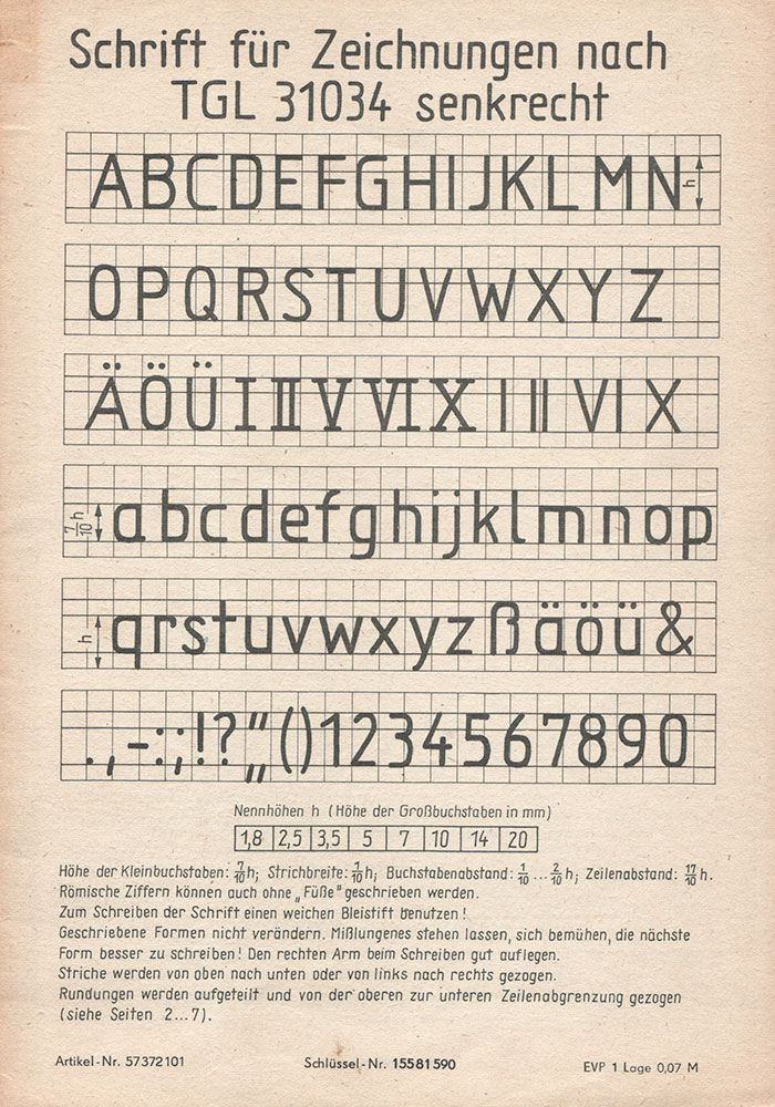
I had to learn that one in drafting class in middle school.
Re: Routed Gothic Font
#43For a newer font in this vein, I'd look at B612, a font designed in cooperation with Airbus specifically for visibility inside cockpits: https://github.com/polarsys/b612/blob/master/docs/B612-Leafl...
...and for an older font, look at Futura and its variants --- whose users in aerospace included Boeing and NASA.
And which might be known for a few as the main body font of the AD&D first edition books -- not the best use case for it.
Re: Routed Gothic Font
#44For a newer font in this vein, I'd look at B612, a font designed in cooperation with Airbus specifically for visibility inside cockpits: https://github.com/polarsys/b612/blob/master/docs/B612-Leafl...
I'm also quite surprised that the symbols for "O" (capital O) and "0" (zero) are very similar, even in the monospace version of B612.
Re: Routed Gothic Font
#45It may be the size on the page, or glyph rendering artefact but this font doesnt look... consistent. Dont get me wrong the font is brilliant, however atleast for me there are some points at which the rendered glyphs are over cut. Another way id describe this is the antialiasing is not consistent. Its like layering the same text on top of the other multiple times.
The author mentions that there’s no hinting, which may explain what you’re seeing.
Re: Routed Gothic Font
#46Would love it in monospace variant.
Re: Routed Gothic Font
#47I learned to write in this style by hand in an engineering graphics / drafting class in college. I too find the high concentration of upper case fonts, especially Courier New, in engineering and especially EE, to be kind of relaxing and pretty.
[deleted]
Re: Routed Gothic Font
#48Sort of related, there's DIN 6776, a German standardized font used for technical drawings: https://de.wikipedia.org/wiki/Normschrift https://www.typografie.info/3/uploads/99b804cee64ef8c64ad900... I had to learn that one in drafting class in middle school.
DIN standards are local derivatives of ISO standards.
There are few widely used "Technical lettering"[0] standards: «ISO 3098»(EU/International), «ASME Y14.5»(US) and «GOST 2.304»(ex-USSR).
There are few FLOSS fonts which cover «ISO 3098»[1,2,3], «ASME Y14.5»[3,4,5] and «GOST 2.304»[6,7,8] technical lettering standards.
[0] https://en.wikipedia.org/wiki/Technical_lettering
[1] https://github.com/hikikomori82/osifont
[2] http://peter-wiegel.de/TGL.html
[3] http://peter-wiegel.de/TGL_0-16.html
[4] https://www.fontspace.com/micronus
[5] https://cstools.asme.org/csconnect/CommitteePages.cfm?Commit...
[6] https://bitbucket.org/fat_angel/opengostfont/
Re: Routed Gothic Font
#49Sort of related, there's DIN 6776, a German standardized font used for technical drawings: https://de.wikipedia.org/wiki/Normschrift https://www.typografie.info/3/uploads/99b804cee64ef8c64ad900... I had to learn that one in drafting class in middle school.
DIN standards are local derivatives of ISO standards. There are few widely used "Technical lettering" [0] standards: «ISO 3098»(EU/International), «ASME Y14.5» (US) and «GOST 2.304» (ex-USSR). There are few FLOSS fonts which cover «ISO 3098» [1,2,3], «ASME Y14.5» [3,4,5] and «GOST 2.304» [6,7,8] technical lettering standards. [0] https://en.wikipedia.org/wiki/Technical_lettering [1] https://github.com/hikikomori82/os…
Seems like ISO 3098 is significantly newer than DIN 6776, so it's the ISO standard that's derivative of the DIN one.
Re: Routed Gothic Font
#50If people aren’t familiar with the Leroy Lettering system here is a video of it: https://youtu.be/GZRvQDMBEOE
This font was also used by EC Comics (their comics included Tales From the Crypt). Here is another font based on that which is more fuzzy: https://caseyburns.com/artwork/font-design/