Earlier quoted context omitted.
Looks like they are getting a good response and more mindshare then they should for a logo. Perhaps this will be the new "new coke/old coke" case study of the future but "now with more crowdsourcing (tm)".
I was thinking the same thing. GAP put out a crappy new logo on purpose (They aren't using it anywhere) knowing it would create buzz. Roll that buzz into a crowdsource contest. And in the end stick with your orig logo.
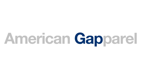
Dear Gap, I have your new logo.
41–50 of 126 posts
Re: Dear Gap, I have your new logo.
#42A bit of background on this. Gap just updated their logo, its getting pretty heavily slammed by the design community (I too think its god awful) More here: http://www.creativereview.co.uk/cr-blog/2010/october/new-gap... BTW the author's twitter feed, @Mike_FTW is one of the funnier feeds to follow.
Anyone know what the business case for this change was? What was wrong with the old logo? I'm having a hard time understanding what the thinking was here.
http://adage.com/article?article_id=146353
I don't think this is going to end well for Gap.
Re: Dear Gap, I have your new logo.
#43Earlier quoted context omitted.
Perhaps 2% of the logos there could be taken at all seriously. The one which makes the A in GAP look like a pair of jeans is at least clever. But wow is there a lot of garbage there. Thanks for sharing the link!
There have been a ton of other designs submitted to ISO50. Some aren't too bad: http://blog.iso50.com/2010/10/06/gap-redesign-contest/
It seems to me that a place called "Gap" should have a gap somewhere in its logo.
Re: Dear Gap, I have your new logo.
#44A bit of background on this. Gap just updated their logo, its getting pretty heavily slammed by the design community (I too think its god awful) More here: http://www.creativereview.co.uk/cr-blog/2010/october/new-gap... BTW the author's twitter feed, @Mike_FTW is one of the funnier feeds to follow.
Anyone know what the business case for this change was? What was wrong with the old logo? I'm having a hard time understanding what the thinking was here.
Re: Dear Gap, I have your new logo.
#45Earlier quoted context omitted.
There have been a ton of other designs submitted to ISO50. Some aren't too bad: http://blog.iso50.com/2010/10/06/gap-redesign-contest/
There are some good ones there. Personally I like number 42. It seems to me that a place called "Gap" should have a gap somewhere in its logo.
Re: Dear Gap, I have your new logo.
#46Re: Dear Gap, I have your new logo.
#47So, what i think is missing is this link that explains exactly what this dude is writing about: Thanks for everyone’s input on the new logo! We’ve had the same logo for 20+ years, and this is just one of the things we’re changing. We know this logo created a lot of buzz and we’re thrilled to see passionate debates unfolding! So much so we’re asking you to share your designs. We love our version, but we’d like to see…
Re: Dear Gap, I have your new logo.
#48Many clever alternate designs (and parodies) have been posted on the ISO150 blog: http://blog.iso50.com/2010/10/06/gap-redesign-contest/
Re: Dear Gap, I have your new logo.
#49A bit of background on this. Gap just updated their logo, its getting pretty heavily slammed by the design community (I too think its god awful) More here: http://www.creativereview.co.uk/cr-blog/2010/october/new-gap... BTW the author's twitter feed, @Mike_FTW is one of the funnier feeds to follow.
Is it just me or is the new design really looking straight from the mid 90s.
http://cache.gawker.com/assets/images/gawker/2010/10/gaplogo...
http://www.eternitemedia.com/blog/wp-content/uploads/2010/01...
EDIT—it looks like someone at iso50 had the same idea: http://blog.iso50.com/wp-content/uploads/2010/10/gapdesign2s...
It's a shame. Their condensed old style serif font subtly reminds me of Nirvana's condensed serif font.
http://www.survivingthestores.com/wp-content/uploads/2010/06...
http://www.midnightincoventry.co.uk/site/images/stories/nirv...
Re: Dear Gap, I have your new logo.
#50Earlier quoted context omitted.
There are some good ones there. Personally I like number 42. It seems to me that a place called "Gap" should have a gap somewhere in its logo.
I'd actually disagree. It's just a brand - your mind should associate the name and logo with connotations and feelings regarding their clothes and their shopping experience (and probably sex, it's a youthful clothing store). You shouldn't be thinking about what the word "gap" literally means - it's orthogonal to the meaning of the brand.