Live data from Hacker News

Screenshots of Old Desktop OSes

typewritten.org

341–350 of 407 posts

Re: Screenshots of Old Desktop OSes

#341

Amazing walk through memory lane, and super useful. One big omission though - starting in the early 1990s, we should be seeing some Linux desktops in there, but I didn’t see any through 1995 or so when I stopped browsing. Also, Irix would be nice to get — although I don’t recall if SGI had much in the way of custom vibes for their window managers, they certainly had amazingly cool 3D demos. A nice vibe coding project…

There is an SGI IRIX screenshot there from late 90’s. I scanned the list to take a look specifically for it.

I once saw 4 of the SGI Onyx2 RealityMonster supercomputers in a post-production house’s render farm in London.

They were so expensive, ($1m+ per computer) that it was only financially viable if they were engaged on client work 24/7/365. Damn gorgeous things and they turned the display of those into almost an art piece for wow-ing film studio execs.

Fun times.
Re: Screenshots of Old Desktop OSes

#342
post #316

Amazing walk through memory lane, and super useful. One big omission though - starting in the early 1990s, we should be seeing some Linux desktops in there, but I didn’t see any through 1995 or so when I stopped browsing. Also, Irix would be nice to get — although I don’t recall if SGI had much in the way of custom vibes for their window managers, they certainly had amazingly cool 3D demos. A nice vibe coding project…

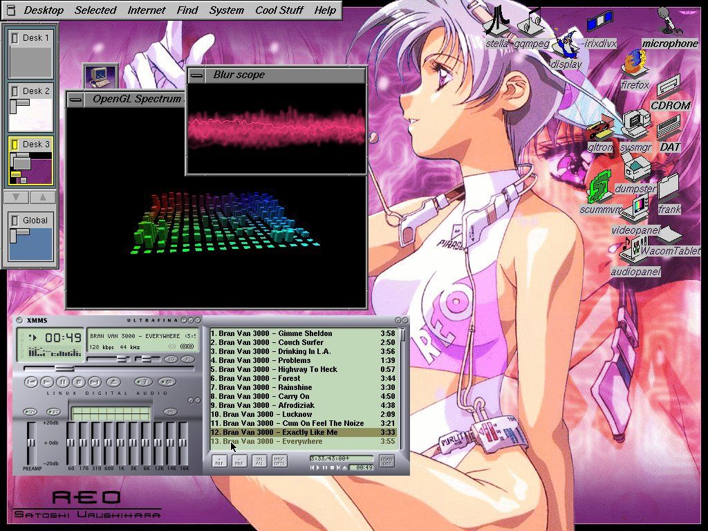
> Also, Irix would be nice to get — although I don’t recall if SGI had much in the way of custom vibes for their window managers, they certainly had amazingly cool 3D demos. IRIX used the 4Dwm window manager, which is a lot more polished than other UNIX desktops. Few screens I found: https://deskto.ps/u/fathonix/d/3p6fkk https://files.catbox.moe/cognfj.jpg https://guidebookgallery.org/guis/irix/screenshots

> https://files.catbox.moe/cognfj.jpg

That screenshot shows songs from the band "Bran Van 3000" playing and "Drinking in L.A." is in the list, now that is trip down memory lane! (late 90s)

Thank you so much for that, haven't listened to that in a very long time.

Re: Screenshots of Old Desktop OSes

#343
post #175

Earlier quoted context omitted.

The UX designers copied the look, minus the colors, and without functionality. Whoever thinks, that an 1px border for a resizable element on a 4k display is ok, is insane.

The hotkey to allow move and resize from anywhere in a window is my favourite *nix window manager convention. Windows finally implemented it via PowerToys: https://learn.microsoft.com/en-us/windows/powertoys/grab-and...

I must have missed that being added. I'll have to play next time I'm in front of one of my windows machines.

Re: Screenshots of Old Desktop OSes

#345
So happy to have been along for that ride.

This collection is a great complement to the everything-x86 PC workstation jungle of the day.

I built a huge tower PC server to run NeXTStep in 1993, but I had no idea how difficult hardware comparability would be. It was a journey. But things improved quickly. So I installed lots of these: OS/2, Windows NT, NextStep, BeOS, Linux, various BSDs.

I found a Computer Shopper from that time. I'm pretty sure I bought one of the tower cases from page 786. Great stuff. Tell them I sent you!

https://archive.org/details/computer-shopper-march-1993/

Re: Screenshots of Old Desktop OSes

#346
post #335

I remember using some kind of software around the time of windows xp i think, that could replace the chrome/shell so you could design your own GUI entirely – but I can't remember what it was called! I spent a lot of time iterating and experimenting back then, replacing iexplore.exe or whatever the main process was called.

Are you thinking of WindowBlinds / Stardock?

https://www.stardock.com/products/windowblinds/

I seem to remember it was available at the same time as the Winamp skins / viz craze.

Re: Screenshots of Old Desktop OSes

#347
post #175

Earlier quoted context omitted.

Windows 2 had plainly visible borders, with decent contrast depending on your colour settings, so you could see what ended where.

The UX designers copied the look, minus the colors, and without functionality. Whoever thinks, that an 1px border for a resizable element on a 4k display is ok, is insane.

Even back when we had much fewer pixels on most displays, people knew 1px drag targets were a bad idea. Some UIs dos have single pixel borders, but tended to have extra decorations at the corners so there was something larger to interact with there, and/or implemented something like a control key making any point in the window a size/move target.

Re: Screenshots of Old Desktop OSes

#348
post #317

Earlier quoted context omitted.

It's not just what we've lost, it's an incredible disservice to "non-nerds" - old DOS programs may have been annoying and cluttered, but everything was right there and more importantly, it didn't change so you could learn what you needed and just work with it. We could go back and forth on things like "the ribbon" being better or worse, but the fact that it changes depending on window size is an incredible sin. Hello…

It's like a compromise was made at some point where they decided that in order to get what they predicted would be slightly higher adoption, it's okay to usher in a world where most consumer-facing software is essentially impossible to become a 'power user' of, because of abridged ('decluttered') functionality, lack of keyboard shortcuts, extreme lag caused by excessive animation, and a UI that changes for fashion re…

I’m always reminded of the old text UIs at Fry’s Electronics - a salesman could slam in all the keystrokes necessary to print your pick slip before the screen had even finished loading the first inventory. It was pretty impressive.

Meanwhile I live in a world where opening five Salesforce tabs locks them all up.

Re: Screenshots of Old Desktop OSes

#349
post #311
post #263

Earlier quoted context omitted.

But if we didn’t use ••• menus everywhere then some parts of the UI might be cLuTtErEd!!! The worst sin of computing. To think that we used to trust mere mortals - without even a signing certificate or developer membership - with the power to customize every toolbar in a Microsoft application, and to set every font and color for the whole UI of the system. People made their computer environments ugly in some cases. A…

The UI wouldn't be cluttered if the keys on the...keyboard...did stuff. Now that vibe-coding has broken me out of my decades-long irrational fear of GUI programming, I've recently been circling back on all the UI patterns I have just accepted. One missing one is all those F1...F12 keys. I remember those doing stuff in the DOS days. I fantasize about a computer where the menus are at the bottom of the screen and line…

I’d love to use those keyboards that can light keys to flash the key combo for the menu items.

It seems now it’s not worth learning the keystrokes because everything is a website or changes randomly. Ah, for the days when Excel supported Lotus 1-2-3 shortcut mode for decades.

Re: Screenshots of Old Desktop OSes

#350

Amazing walk through memory lane, and super useful. One big omission though - starting in the early 1990s, we should be seeing some Linux desktops in there, but I didn’t see any through 1995 or so when I stopped browsing. Also, Irix would be nice to get — although I don’t recall if SGI had much in the way of custom vibes for their window managers, they certainly had amazingly cool 3D demos. A nice vibe coding project…

Notably, NeXT scrollbars were also on the left edge of the window, the logic being that (at least for left-to-right languages) most people focus on the left side of the document more often. I remember liking it. I wonder why Apple swapped back to the right-hand scrollbars with OS X. I guess just because that's what classic MacOS and nearly everyone else did.

My thoughts:

1. There were far more users of the classic Mac OS than there were users of NeXTstep/OPENSTEP. Mac OS X has many of OPENSTEP’s underpinnings, but it wasn’t OPENSTEP 5.0; it was Mac OS X, a continuation of the Mac but with new underpinnings. The interface was different enough to represent a new direction for the Mac but without turning the Mac UI/UX into that of NeXT.

2. At the time NeXTstep was under development (mid-late 1980s), the case law surrounding UI look-and-feel and how much borrowing and inspiration one could have before it became infringing wasn’t settled. Apple had lawsuits with Digital Research and Microsoft over whether GEM and Windows infringed on the Macintosh’s look-and-feel. Recall that NeXT was formed after Steve Jobs’ failed coup at Apple against then-CEO John Sculley. Apple sued NeXT due to Jobs’ poaching of key Apple employees who worked with him on the Macintosh and allegations that NeXT was going to use Apple’s intellectual property (in some ways NeXT could be thought of as the evolution of the “Big Mac” project Steve Jobs worked on before his departure). They ended up settling out of court, but given Apple’s litigious nature and given the history of how NeXT came to be, it was very wise for NeXTstep to feature a UI/UX that was a radical departure from the Macintosh. While I don’t think a lawsuit about right-hand scroll bars would succeed, having them on the left helps defend against allegations that NeXTstep ripped off the Mac.

Post reply on HN